
When designing your own logo for your business, you can’t just rely on what you want or how you want it to be able to come up with a great logo design. Only a small percentage is involved for that and another from the suggestions and feedback from coworkers. Designing a logo should involve many other factors, and these factors are called elements. Then of course, you should always know your company well before you can get started in designing your logo.
On this page, we will be listing down the five most important elements involved when designing a great logo. For an overview, a great business logo design should be simple, unique, memorable, have a workable font, and can be recognized with or without color. If you know your company very well, and you take into consideration the different elements of a logo, as well as gather suggestions from other people, then you can easily craft your own logo for your business in no time.
Simplicity
The idea of being “less is more” is highly applicable to logo designs. Simplicity means better than having to go to the extremes with creativity. Your logo serves as the foreground image that introduces people to your business, and it will also help generate people’s initial impression of you and your business.
Because of this, you should keep your logo design simple and straight to the point, you should avoid from using distracting color schemes, and you should also avoid from making your logo look disorganized. Some would even suggest to go with a design that only uses a single object to symbolize the business, and not include any typography of possible. But if you need to, be sure to limit its use. You may want to check out list of some iconic logo designs to give you an idea.
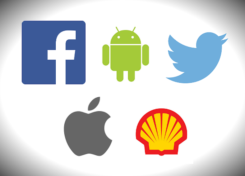
The logos shown above are perfect examples of great logo designs that lean toward being simple.
Advantages of Having a Simple Logo Design
- People are now living in a world where it’s all about moving at a fast pace. Everyone is in a hurry most of the time. When these people look for the products and services that they need, they would rarely look deeper into the details of those products and would usually just look at the logos. If a logo is simple, then it is easily recognizable, and people will often go for those products bearing a logo that they can recognize.
- A simple yet professional logo design is able to convey the message intended for your audiences to provide them with an idea on the nature of your business. A confusing and chaotic logo will less likely attract audiences since it gives the impression that you don’t really know what you’re doing in your business.
Uniqueness
There is of course, the uniqueness of the company logo design. It’s always been advised that for a logo to stand out, the design should always be different and unique from others.
Among businesses, especially those with a similar nature, one should at least have their own unique quality to be able to attract certain audiences. Similar can be said with regards to logo designs, that it should be unique or at least have some unique factors to stand out and be distinguished. Uniqueness can be achieved by staying away from cliches or those that have been overused by other logos.
Do a research on logos of other businesses, most especially those that offer the same type of services as yours, and check carefully for features that have been overly used. Once you see these, try to avoid those and make up with something unique. If you are able to achieve this effectively, then your logo (and probably your business, as well) will stand out from among the competition.
Tips to Make Your Logo Design Unique
- Don’t copy logos from other companies. This one is a no-brainer. Logos are owned and copyrighted by the company, and copying their logo may be an easy-peasy way of having one for your business, but it will surely get you into trouble. So as much as you want to learn what and how they did their logos that made it successful, you should never ever copy it.
- Design Your Own Typeface. Use a typeface that is less likely being used by other companies. And how can you achieve this? By making your own, of course. A lot of pre-designed fonts can be found all over the internet, but if you want your logo to stand out, then why not make your own font that you can apply to your logo? This way, it will take the statement “adding your personal touch” to a whole new level.
Typography
When adding a typography on your logo design, make sure to use a font that is not too distracting to the audience’s eyes unless it serves as the main feature of your logo. There are five common types of logos: symbol, wordmark, lettermark, combination, and emblem—only one (symbol) among those five doesn’t make use of any typography, and two (wordmark and lettermark) actually place its emphasis solely on the text.
If ever you choose on using either wordmark or lettermark, then making the typography creative would be the best way to make your logo noticeable, just as long as it can still be read and it will not look messy. But if you choose to go with either a combination or an emblem logo, the main feature of the design would be the symbol/icon and that the typography will only be a second priority. With these types of logos, you will need to make your typography simple so as to avoid overpowering the symbol. You may want to check out a few typography fonts for inspiration.
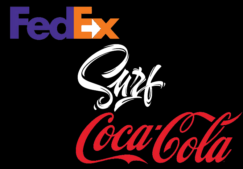
Here are a few examples of famous logo designs that make use of typography very effectively.
Knowing the Basic Font Types
Before proceeding to the more complex and creative font faces, it is best to be familiar with the simpler and basic ones.
Listed below are the most common basic fonts that are being used by a lot of businesses on their logos:
- Serif. The most formal font type that is being used to represent elegance, sincerity, and professionalism. This type of font is commonly being used by highly respectable and reliable businesses.
- Sans serif. Taken from the old French language which translates to “without serif”, this type of font is a modern variation of the traditional serif. While this font is still being commonly used by big and stable companies, it provides a more modern look to a text.
- Script type. This font type is inspired by those being written by hand, and is usually used by businesses to convey creativeness, affection, and elegance through writing.
- Decorative. These font types are the most illustrative and unique from among the others, wherein the design of the letters holds its own meaning.
Memorability
For businesses to grow and be successful, they will need to be remembered by their past customers. Having a memorable logo will help achieve this purpose. A logo should effectively make an impact in people’s minds to become memorable, and this does not necessarily have to include the name of the company. It could either be the simplicity of the design, the impressive use of colors, or the design itself.
When your logo design is memorable, it can also be used by people when trying to promote your business to others. When they talk about your business, they can easily identify you by way of describing your logo, and a logo design that is memorable is easy to describe, they may even be able to describe it thoroughly. Therefore, it is very important to make your logo memorable since it will also lead to your business becoming memorable as well.
Tips to Making Your Logo Memorable
- One way to make your logo memorable is to keep it simple, of course. The more elements are added to a logo, the more complex it will become; and the more complex a logo is, the less likely it gets remembered. So limit the features of the design to a minimum if you want your logo to be memorable.
- Achieve balance in the logo design, and this can be done either by color or the placement of the features. A logo that is organized or balanced is much more pleasing in appearance, and people will tend to remember those images that they think pleases them. Also, if a logo design is balanced, it will help in creating emphasis to certain elements that need to be focused.
Versatility
When it comes to logo designs, being versatile means the ability of the logo to look good across different platforms. When trying to design your own logo, you should always try to check how they would look when printed on flyers, posters, business cards, as product packaging, on glass, or even on digital media.
You should even consider how your logo will look with or without color since there may be instance wherein you will be force to print your logo in black and white or in grayscale. To sum it up, a great and versatile logo design works well when printed on multiple platforms, and is not dependent on color to be able to achieve its purpose. When using colors for your logo, make sure not to use more than three in a single design to prevent it from looking too distracting.
For more information, you may want to read about the process by checking out our simple steps to creating a logo.
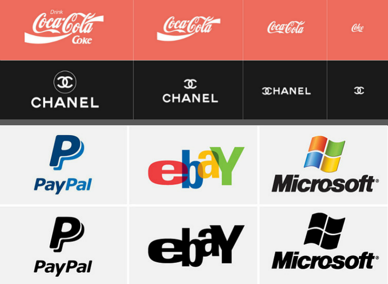
And here are some examples of versatile logos designs. Starting from the top, the first 2 designs are able to work well regardless of the size, and the last 2 are able to stand even without color.
Checking for Your Logo’s Versatility
- Can your logo be resized freely? One thing your should do when trying to check for your logo designs versatility is to resize it and try printing it on both small and big materials. A versatile logo will look good on small mediums such as business cards, as well as on large ones such as banners.
- Can your logo stand without color? As mentioned earlier, a great logo should still be able to convey its meaning and still look attractive enough even when printed without color.
Honorable Mention: Relevance
The purpose of a logo is to represent the business in one symbol, so it is very important that the design should be appropriate, and by appropriate, it covers various aspects. The logo design should be relevant to the nature of your business or the kind of services you are rendering to your customers.
Another is that your logo should be appropriate to your intended audiences. An irrelevant-looking logo will most likely give audiences the wrong impression about your company, which is definitely not what you want for your business.
Were you able to learn something from the five elements of logo designs that we have listed down for you? We sincerely hope you did, and that you would take those elements into consideration the next time you make a logo whether for a business or an organization. Just be mindful that your logo is what customers, prospects, and other businesses will see first from your company, and their first impression about you will be based on what they see on your logo. So it is best to greet them with a pleasing and professional-grade logo design to be able to start building your company’s reputation.
Refer to our list of logo design strategies to further help you out in designing your own logo.
Related Posts
14+ Law Firm Logo Designs to Celebrate International Justice Day
8+ Volleyball Logo Designs
11+ Beautiful Origami Logo Designs
10 Infinity Logo Designs
13+ Personal Logo Designs
12+ Website Logo Designs
16 Cool Logo Designs
14 Brand Logo Designs
18+ Text Logo Designs
20 Colorful Logo Designs
16 Shirt Logo Designs
11+ Modern Logo Designs
18 Team Logo Designs
12+ Diamond Logo Designs
15+ Truck Logo Designs