CrossFit training has become very popular to those fitness enthusiasts, especially athletes, body builders, and those who simply want a physical makeover to look and feel good. CrossFit involves high intensity cardiovascular exercises as well as weight and resistance training to create improvements to the physical well-being in all aspects. CrossFit training may be intense, but it is geared not only toward muscular people but also other individuals with different body sizes and weights.
On this website, we have gathered seven highly appealing CrossFit logo designs for all types of fitness gyms, and can be used for various purposes. These fitness logos range from simple designs to those that are more on the artistic side, which gives you more than enough to choose from. If you want to see the logos yourself, go ahead and start scrolling down.
First off, a CrossFit logo design inspired by dog tags, or badges. This logo design is in a landscape orientation, which provides you with more horizontal space for your text or other features that you can add to further enhance the design’s level of appeal. As you can see from the typography used on the design, there are uneven scuff marks all over the text to give it a worn and torn appearance, which, in turn, gives it a more genuine metallic feel.
Flat Emblem CrossFit Logo Design
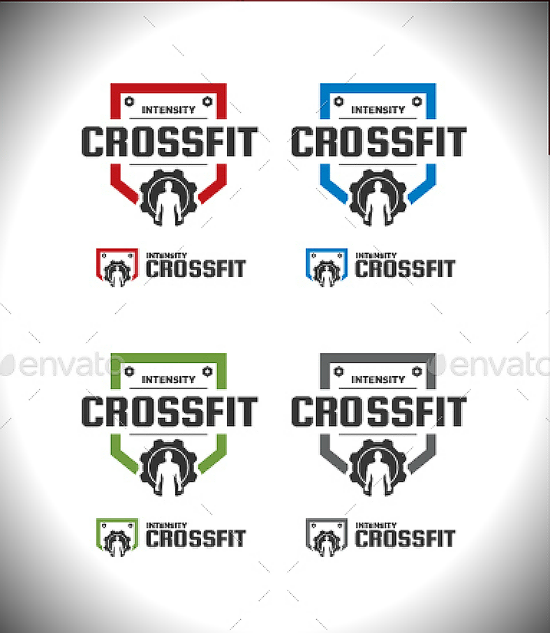
For the CrossFit logo shown above, it leans more toward flatness and simplicity with its straightforward design and the minimal use of colors on it. As far as the flat logo design is concerned, it appears to be composed of a metallic emblem with bolts screwed on to the upper corners and a gear on the bottom portion of the emblem with a silhouette of a muscular person. Within this emblem is the typography that clearly indicates that this logo represents intense CrossFit training.
For a unique CrossFit logo design, check out the one shown above. This business logo design leans more toward being a lettermark type but done in a more creative way as evidenced by the letter F written backward so that the logo will resemble a rectangular shape. Below that logo is where the complete name of the fitness regimen is written, placing emphasis on the letters C and F since these are the two letters being used on the symbol/icon.
Kettlebell Emblem CrossFit Logo
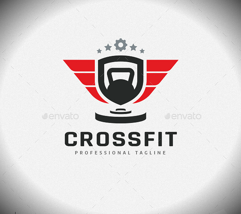
Here is another flat yet symbolic logo design for CrossFit training that you might be interested in. For this design, it still gives us a flat image of an emblem with a kettlebell illustrated inside it to symbolize one of the most commonly used equipment in CrossFit training. Below that emblem are what appears to be weight plates, which symbolizes weight/resistance training, and these—along with intense cardiovascular exercises—are what CrossFit training is all about.
If you are looking for a minimalist logo that is sure to attract people’s attention, check out this simplistic CrossFit logo design that is heavily inspired by road signs. This logo design consists of two separate elements that work together as a single logo but may still work when separated. The element on the upper half of the design shows us a diamond shape sign that has a black silhouette of a person lifting a barbell upright. On the bottom half is a rectangular sign that has the same color scheme as the other logo element, and this sign is where the thick, solid typography can be found indicating that this logo design represents CrossFit. To help you get through the process of making your own logos, you may check out our guidelines on how to design the perfect logo.
Linear Gear Symbol CrossFit Logo
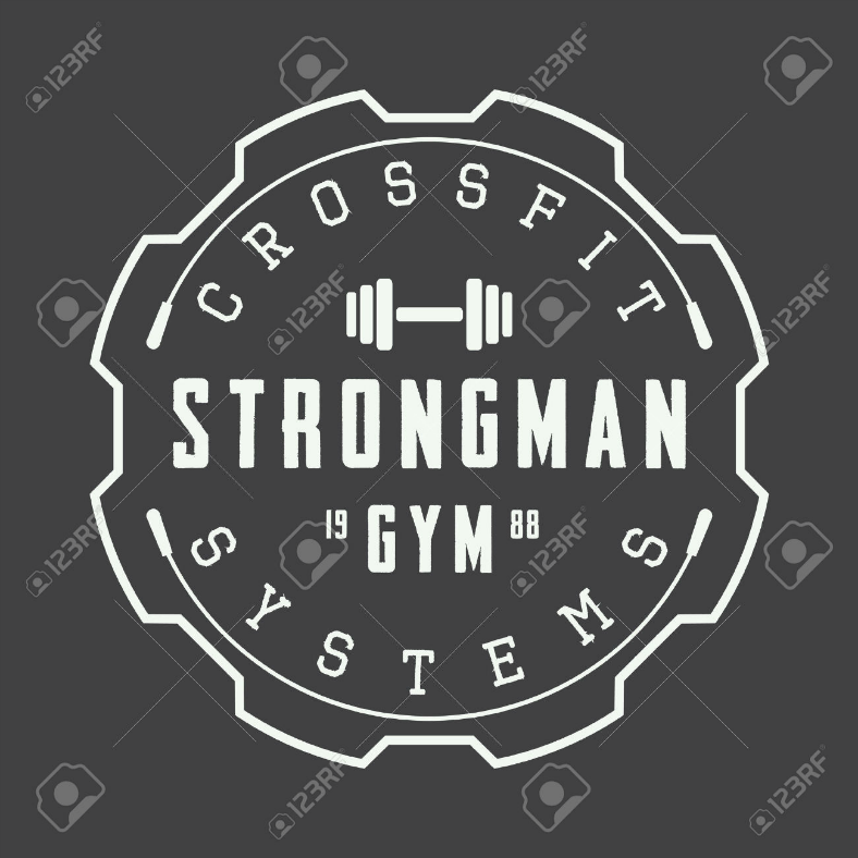
The professional logo design above consists of a white symbol and text that is illustrated over a dark background for contrasting colors and to provide visibility to the image. The entire symbol of the logo resembles a gear illustrated through line art, and inside this symbol are texts stating what the logo design is all about. On the outermost portion, inside the gear is where you can find the name of the regimen that, on the sample above, states “CrossFit systems.” On the middle area is where the name of the fitness gym is written, and you may even write somewhere along this area the date, or at least the year, when you established your fitness gym.
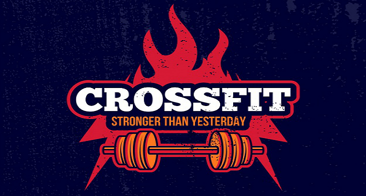
Lastly, here is a creative logo that focuses more on the typography rather than the symbols or other features. For the sample design shown above, the illustration resembles a barbell or dumbbell with the CrossFit label written along the area where the handle should be. This may also be considered a combination type of logo since it is composed of both a symbol and a text, but as mentioned earlier, it places more emphasis on the text since it is of a larger scale than the barbell/dumbbell symbol.
As you have seen from the CrossFit logos shown above, the designs that we are offering you range from minimalistic ones to the more artistic, and from achromatic designs to those that involve various colors. The designs on these business logos are unique from one another to provide you with various options to choose from, with at least one of these bearing the features that you want for your fitness center’s logo design.
These awesome fitness logos have been collected from various reliable websites, and these were done by professional graphic artists who have had a lot of experience in the field. With regards to editability, these logo designs are fully customizable, which means you can do as much modifications as you want to be able to come up with the logo design that you need. Lastly, as for these logo design’s quality, you are assured with sharp and high resolution logos that are able to retain its quality even after making alterations and resizing. Now, start downloading a design so you can also start making your own logo.
Related Posts
14+ Law Firm Logo Designs to Celebrate International Justice Day
8+ Volleyball Logo Designs
11+ Beautiful Origami Logo Designs
10 Infinity Logo Designs
13+ Personal Logo Designs
12+ Website Logo Designs
16 Cool Logo Designs
14 Brand Logo Designs
18+ Text Logo Designs
20 Colorful Logo Designs
16 Shirt Logo Designs
11+ Modern Logo Designs
18 Team Logo Designs
12+ Diamond Logo Designs
15+ Truck Logo Designs