The world of design is fascinating and infinite. Perspective and creativity keeps introducing new elements to this world. Since design can be applied to anything and anything, today we decided to be specific and focus on Logos. Logos create an identity for a brand or an organization. Most of the things and services that are sell able have a logo. Logos are intriguing, a tiny piece of design that becomes the identity of a product. There are a lot of approaches that are applied to logo designing and today we have some excellent example of logos that are based on symbolism.
1. Guild of Food Writers
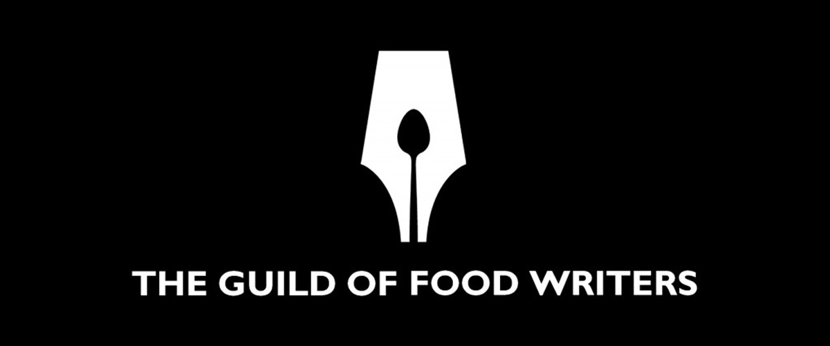
Here is the logo for Guild of Food Writers which is a professional association for food writers and broadcasters in the United Kingdom. The logo is interestingly designed with a spoon inside the nib of a pen. It clearly relates itself to food and writing. Simple but clever!
2. Lion Bird Strong Hold
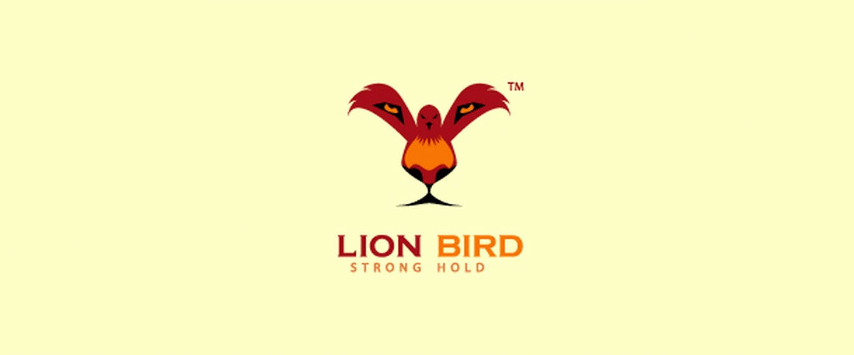
You might not be able to catch it instantly, but if you look closely and carefully you’ll see Lion’s eyes coming to view from the wings of the bird. And if you take a closer look you’ll see that the bird also forms the features of the Lion.
3. ED’s Electric

Perfect use of the Gestalt principle! Gestalt principle states that when different design elements can be made to appear as unifies by arranging them in a certain way, without intersecting them. In the the white socket and plug have been arranged in a way that forms an ‘e’ of the negative black space between them.
4. Coffee Night
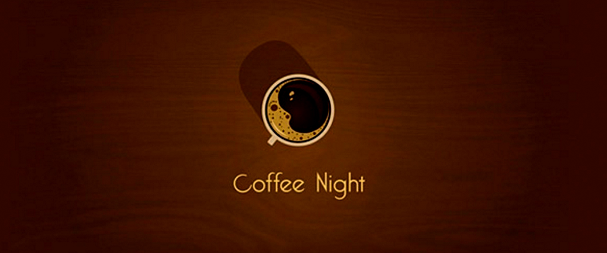
This is a beautiful logo and also has symbolism in it. The cup of the coffee shown in the logo has the Moon’s crescent formed in it out of the foam.
5. Flight Finder
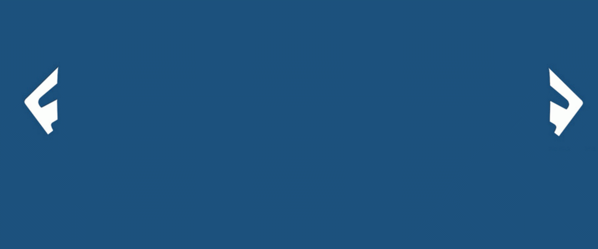
This is an intelligently crafted logo. Again the use of gestalt principle to form a clean, cohesive and minimalistic design. The airplane has been formed in the negative by bringing together F’s from either sides. The two F’s also represents the abbreviation of Flight finder.
6. Mister Cuts Barbers Shop
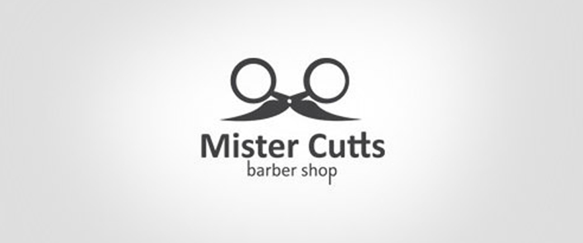
The logo uses strong symbolism like a mustache to identify the service for a specific gender. Also, the mustaches are formed out of a pair of scissors that which represents the service that has been offered.
7. Families
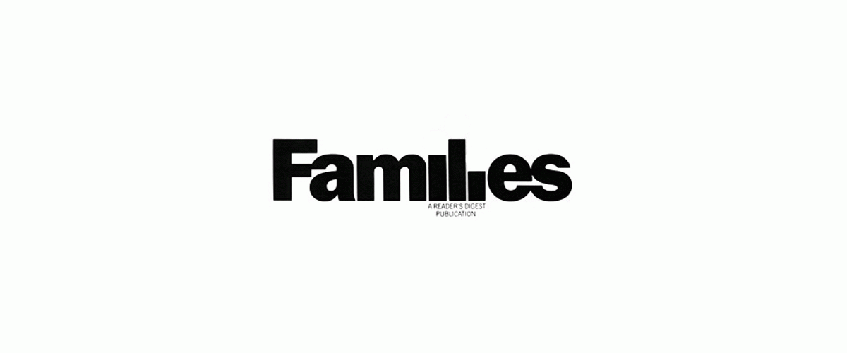
Here is a logo that plays beautifully with typography to create a symbolism in the design. The I’s and L’s in the logo have been played with cleverly to form an illustration-like appearance depicting 3 people as a family.
8. Magic Coffee
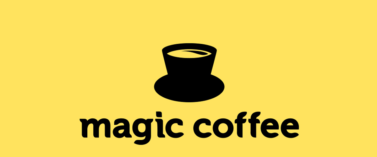
You think you got the hidden symbolism? Are you sure? Not until you look at the image upside down. The logo is designed as a cup of coffee and it you tilt it upside down it changes into a magician’s hat. The logo cleverly justifies the name of the brand.
9. Killed
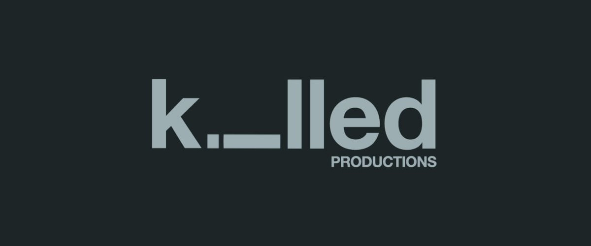
A small and simple adjustment can sometimes define a remarkable creation. The logo here used effective typography to bring out a creative logo design. The ‘i’ in Killed has been tilted at 90-degree angle and looked like a fallen/ dead person. Makes sense, right?
10. Song Cake
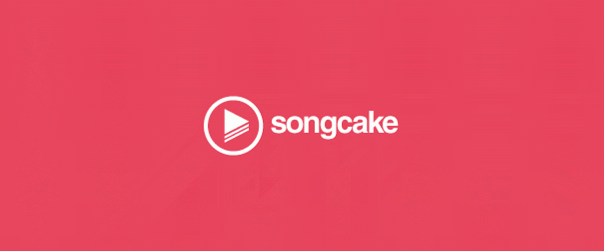
This is a minimalistic logo design that makes use of the symbol to create the meaning out of the logo design. Song Cake’s logo has a play button designed to represent song in general and the play button has layers that makes it look like a piece of cake. Minimalism at its best!
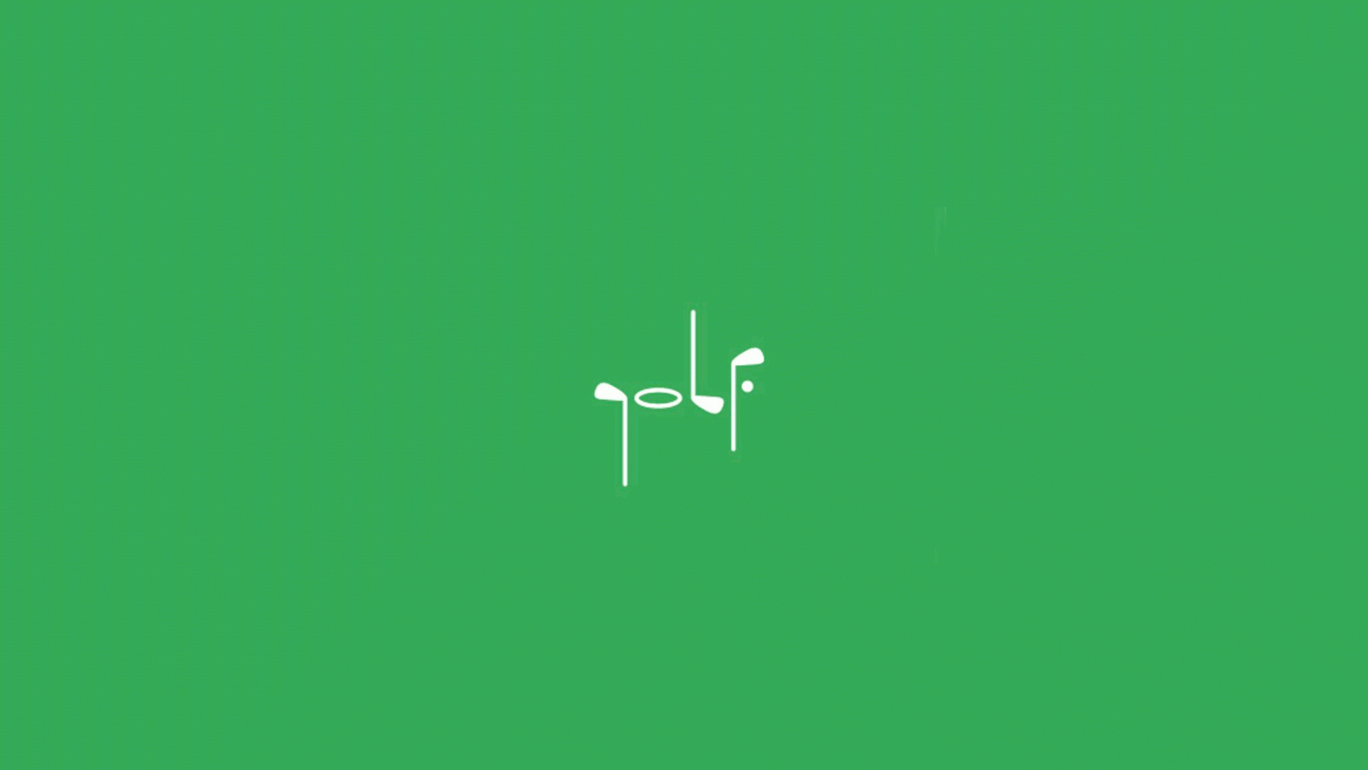
11. Golf

We don’t need to say much about this logo except that until now we witnessed logos that used typography to bring out illustration, this logo, on the contrary, has smartly used illustrations to form typography.
Related Posts
20+ Book Logo Designs, Ideas, Examples ...
18+ Lightning Logos - Free Editable PSD, AI, Vector EPS Format ...
19+ Donut Logo Designs, Ideas, Examples ...
20+ Camera Logo Designs, Ideas, Examples ...
20+ Dove Logo Designs, Ideas, Examples ...
30+ Hair Salon Logo Designs, Ideas, Examples ...
10 Iconic Company Logo Designs - Premium PSD ...
31+ Best Rocket Logo Designs, Ideas, Examples ...
21+ Music Logos - Printable PSD, AI, Vector EPS ...
27+ Globe Logo Designs, Ideas, Examples ...
30+ Jewelry logo Designs, Ideas, Examples ...
25+ Shark Logo Designs, Ideas, Examples ...
45+ Company Logo Design - Premium PSD, Vector ...
49+ PSD Logo Designs - PSD, AI, Vector EPS Format Download ...
29+ Tiger Logo Designs, Ideas, Examples ...