A logo is a very small design identity but that doesn’t make it easy to execute. Anyone who has presented their logo design to any client would agree with us on this. Designing a restaurant logo is no different. Apart from the menu, the food and the ambiance, a logo is something that helps in establishing your restaurant image. It happens only when you create something distinct and interesting that can hold your customer’s’ attention. There are some restaurants that have managed to do it and we have a list of them here with us. Check out these restaurant logo designs for inspiration.
1. Dine Out
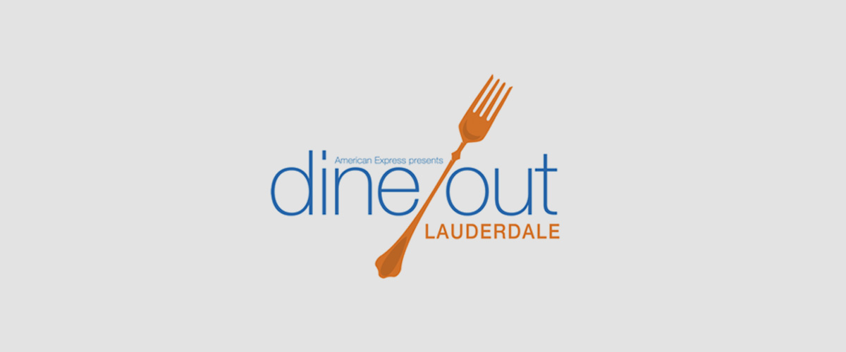
The logo is simple but classy. The designers did not try to create any clutter with too many elements and kept it clean and proper.
2. Pet Restaurant

This logo would surely connect with every person who owns a pet. For the times when you wanted to have your favorite meal but felt terribly guilty for having to leave your fur baby at home. The logo can instantly put a smile across your face.
3. Bridges
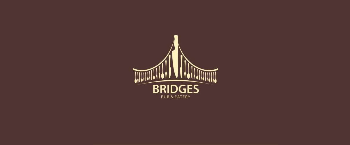
We love the play of words and it becomes all the more interesting when it is done through graphics. Here is an example. The names bridges might not sound like an ideal choice to name a restaurant but when you see the logo, it instantly connects and helps you register the name and the service/product.
4. Blue Feast

The reason people visit restaurants is not solely for food but also to have a good time. The logo here surely guarantees that. The idea of using a fork as a fretboard is great and has been executed well.
5. Masala Craft
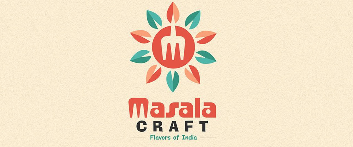
You can sense the flavors through the logo here. The color combination is great and we love the subtlety of the design in spite of it trying to represent a hot and spicy cuisine.
6. Sushi Today
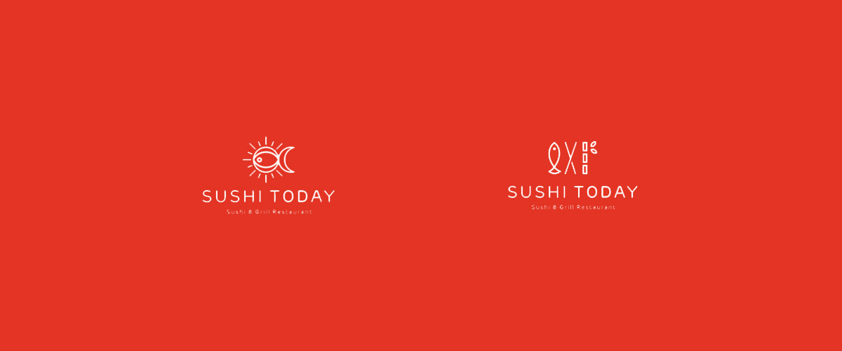
We could not decide on one so we included both the logos. We think they are equally good. With almost similar design the major difference is of the fish that holds an important part in the logo. It has been used cleverly in both the logos.
7. Amavelda

The idea was to represent the restaurant as a place to enjoy food and music and the logo design do that perfectly without any chaos in the design.
8. Chicagos
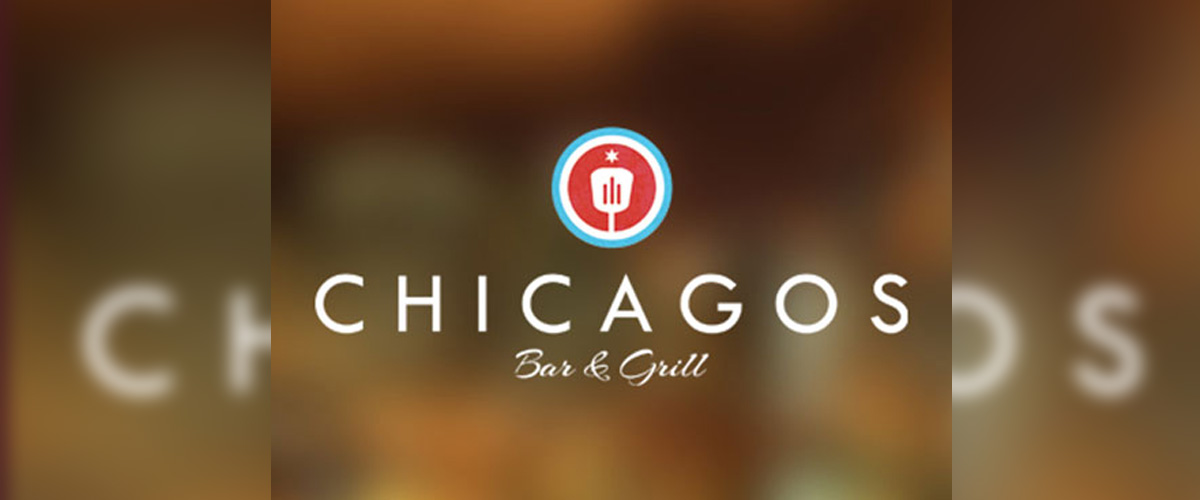
The logo design is simple and has done magic with the typography. You can sense the restaurant vibe through the typography.
9. Burrito Bros
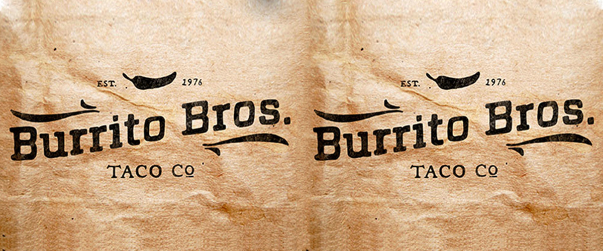
The first thing that comes to mind when we look at the logo is- Vintage! This is a restaurant that has been long established and therefore the logo stands perfect to represent the restaurant.
10. La Touche de Provence
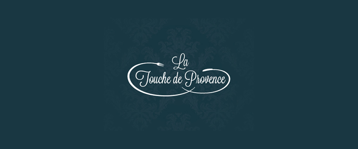
According to Angus Ewing, the designer of this logo, the brief provided by the client was to create something contemporary and “oh la la la”! We think the logo very well captures the essence of the belief that was provided. The romantic font, the royal colors and minimalistic use of design elements perfectly designs the classic french cuisine.
11. Fork’et Me Not

It indeed is difficult to forget this logo! The name, the logo design, the typography everything is well synchronized and that is what makes this logo interesting and clever.
12. Mogi Mirim

Minimalism at its best! The logo is aesthetically pleasing. The hint of colors has added a lot of brightness to the overall design.
13. Tony’s Seafood
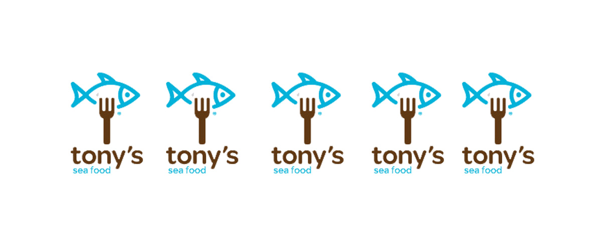
The color combination used is something you rarely see in logo design and it works perfectly. The use of san-serif typography goes very well with the illustration.
14. Food Lover

Simple and straightforward! Be it love, food, design or all of them together… this is how it should be done!
15. Sushi

It is not an easy task to mould a simple thought into a logo design. For something as simple as Sushi, the logo here does a wonderful job of representation.
16. BBQ Mafia
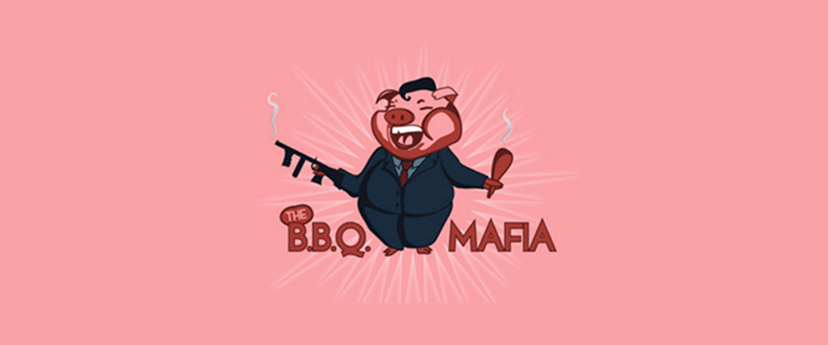
A little humor never hurts! For a name like BBQ Mafia, the logo design is an intelligent choice.
17. Coffee Mug
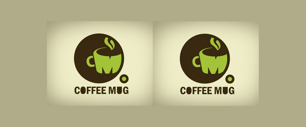
With the name as simple as Coffee Mug, the designer has still managed to play with lots of design elements for the logo design.
18. Soup and Pickles
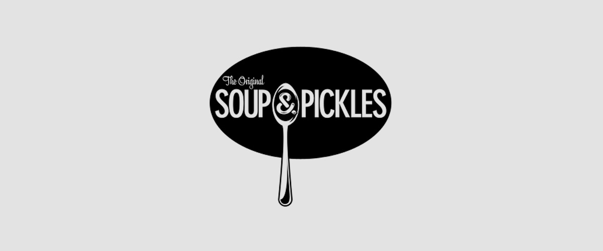
No matter how much the design techniques have evolved, black and white will remain an all time designer’s favourite color, as a combination as well as individually.
19. Pastamasta

The name is a little wired but the logo clearly sorts out the confusion.
20. Pecmopahhibu Peumuht

Most of us cannot understand the name and the meaning behind it. But with the logo it is easy to figure and that’s what an efficient logo design do.
Related Posts
Business Logo Designs
25+ Chef Logo Designs, Ideas, Examples ...
24+ Awesome Wave Logo Designs, Ideas, Examples Design ...
20+ Bull Logo Designs, Ideas, Examples - Premium ...
49+ PSD Logo Designs - PSD, AI, Vector EPS Format Download ...
33+ Colorful Butterfly Logo Designs, Ideas, Examples Design ...
31+ Best Rocket Logo Designs, Ideas, Examples ...
32+ Compass Logo Designs for Inspiration ...
23+ Amazing Ninja Logo Designs, Ideas, Examples ...
35+ Creative Golf Logo Designs - Premium PSD ...
35+ Rose Logo Designs, Examples, Idea - Premium ...
25+ Best Scissors Logo Designs, Ideas, Examples ...
40+ Kangaroo Logo Designs, Ideas, Examples ...
38+ Music Logo Designs, Ideas, Examples ...
33+ Creative Bee Logo Designs - Premium PSD ...