Usage of abstract lines in a specific arrangement and pattern can sometimes result in the most creative designs. And today in connection with the beauty of lines we are going to discuss 10 such logos which used line art as the focal point to create minimal and clean designs that are not just eye catching but also artistic in its technicalities.
Enjoy the simplistic beauty of the logos through the below mentioned 10 designs.
1. New Wave Design Co. by Nathan Thomas
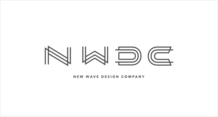
New wave design company logo by Nathan Thomas is minimal and simplistic in its appeal. Using simple straight strokes the logo reflects on the company’s initials with three stroke design.
2. Logo Design Marketing Company by Redneck Superhero
This 4th wise consulting logo is aptly designed with circular line by Redneck Superhero. The logo will instantly remind you of the Fantastic Four movies in one go.
3. Mind Games Academy Logo Design by Michal Kulesza
One of the most creative of the lot this mind games logo designed by Michal Kulesza shows a line maze drawn in an intricate pattern. The logo holds a strong connect with the name of the academy and with the colour white used against a backdrop of red makes the logo shine out in colour as well as the pattern.
4. DNA Data Line Logo by Nobuaki Honma
DNA data line logo is simply reflected with the basic idea of outlining the pattern of a DNA in bold line and using minimal strokes in between.
5. Made In Norway by Lars Baek
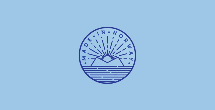
Made in Norway logo by Lars Baek takes inspiration from the fundamental idea of Norway being the land of midnight sun, reflected sharply through the use of lines to show the sea, sun and the mountains. The logo is placed neatly and comprehensively inside a circle, making all the elements hold a connective thread between them.
6. Drip King Coffee Logo by Tyler Osegard
Drip king coffee logo designed by Tyler Osegard holds a clear appeal with the visual description showing a drop placed between the word drip and king, reflecting on the idea of dripping, and the shape of king’s crown placed above the typography.
7. Process – A and L Creative Concept Logo by William Dos Santos
A and L creative concept logo by Santos exhibits smart usage of both the letters illustrated together in one type with three stroked design that is creative and appealing in its style.
8. That Family Kind of Friendship by Laura Bohill
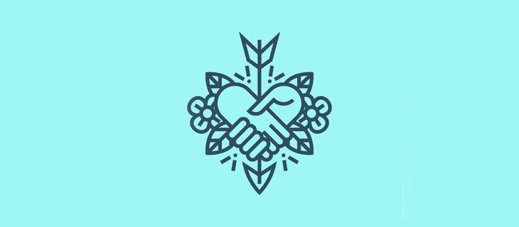
Creative and a feel good logo designed by Bohill indicates the very idea of that family kind of friendship with simple line strokes forming a handshake that doubles up as the shape of the heart. Usage of flowers is the outer edges makes the design soft in its nature and appearance.
9. Moth Logo by Nick Kumbari
Moth logo by Nick Kumbari takes inspiration from the creature and draws it simplistically with the major bold outline forming the shape of the moth. The design relates instantly with the nature of the name.
10. Observatory of Childhood and Early Childhood by Velove Studio
Another creative design by Velove Studio reflects on the simple nature of childhood with the creative usage of line art. The circular line here draws the figure of the kid observing the world through her perspective. The straight lines use to draw the fingers of the hand with the eye popping out of the vacant space in middle makes the design a creative genius.
Logos are the first visual element to create an impact with the audience. Therefore, never underestimate the strength of a clear and simple design, as they can be the first step to creating a memorable connect with the target audience.
Related Posts
Top 11 Email Marketing Trends for 2023
The Best New Portfolio sites, March 2023
Best Poster Designs 2023: Ideas and Tips
Hit and Miss of Olympic Logo Designs from 1924 till 2023
10 Iconic Moments Photographed in 2023 Rio Olympics
Top 5 Logo Design Trends of 2023
2023 Packaging Design Pentaward Winners
Digital Design Trends for 2023
Best Travel Apps for 2023
9 Script Fonts for 2023
10 Best Free Fonts for 2023
10 Best Mobile Games of 2023
Logo Design Strategies for 2023
Top 9 Web Design Trends for 2023
10 Most Popular Graphic Design Trends of 2023