With the Olympic fever running high on everyone, we thought of consolidating the best and worst logos designed for Olympics till date. We have also included the favourite logos selected by legendary graphic designer Milton Glaser and critic Alice Rawsthorn.
The Olympics were launched in 1896 and the five iconic Olympic rings, created by Pierre de Coubertin who is also the co-founder of the games were first introduced in 1912. The iconic logo gained popularity in the 1930s with the attention being paid to the typography and extensive use of graphic illustration. The 1924 Olympics finally revealed the first typographic and graphical official logo.
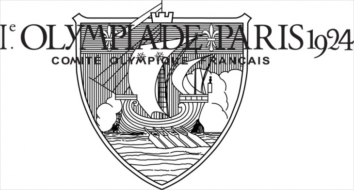
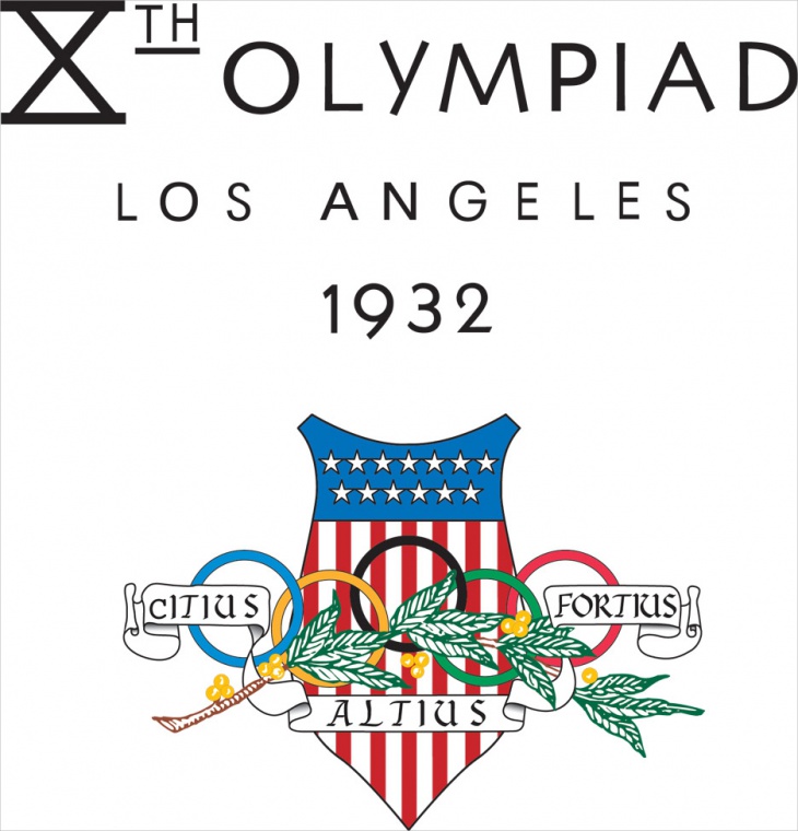
The logo shaped in the form of a shield, acting as a boundary for the ship in the centre was referred as a bad beginning and unreadable in a recent interview with the American Institute of Graphic Arts (AIGA). Los Angeles hosted the summer Olympics in 1932, becoming the first American city to do so. The logo features the star covered flag banner and the interlinked rings placed along with the motto of the games- “citius, altius, forties”. L.A. hosted the Olympics a second time in 1984.
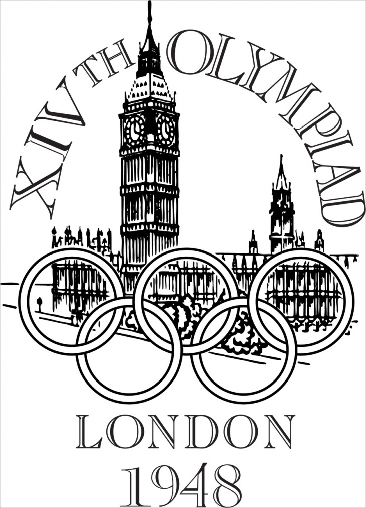
The 1948 first post-war Olympic logo features the five rings placed over the London’s parliament building. Glaser for the logo says not all images work well together.
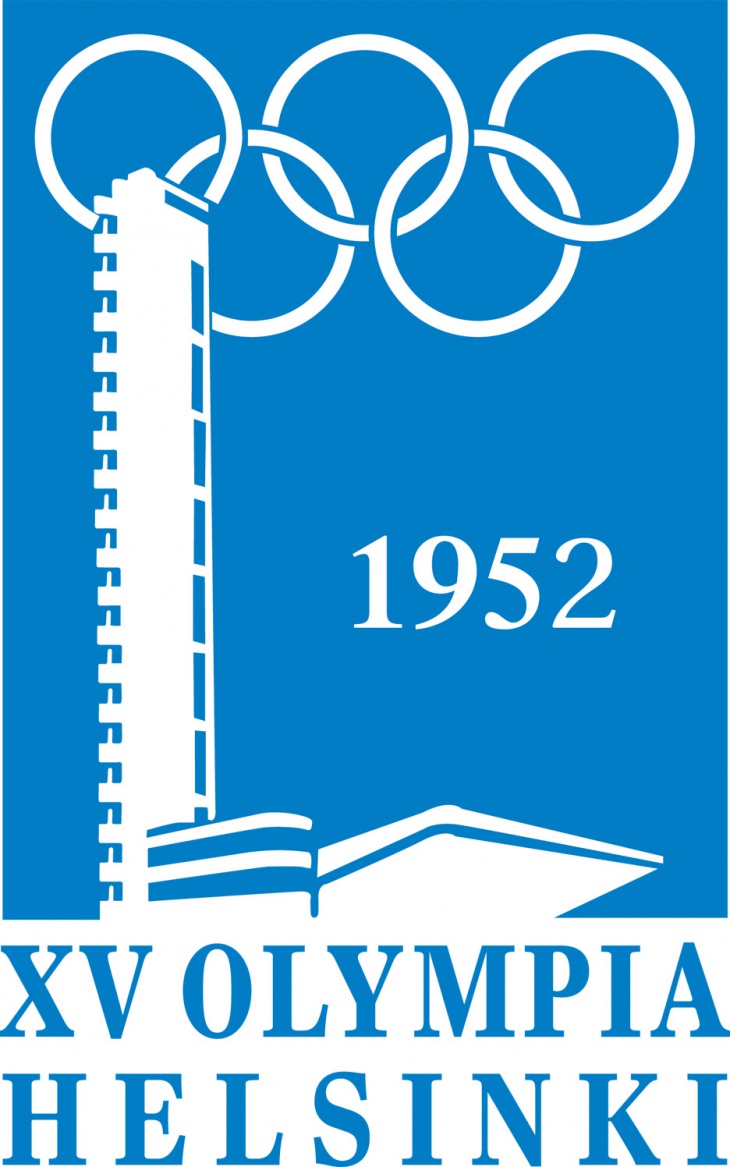
The blue and white 1952 Helsinki summer Olympics logo took inspiration from Finnish flag. Along with its usage in the logo design, the design was also printed on the badges worn by dignitaries and important guests of the games and ceremony. The logo has the iconic five rings placed above the Olympic Stadium’s tower.
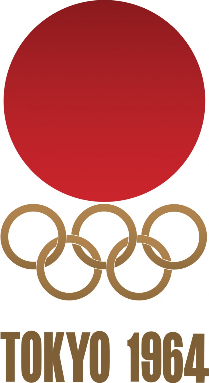
The 1964 Tokyo Olympics logo features a bright red sun, symbol of Japan placed above the iconic interlinked rings with the words Tokyo 1964 written in the big bold block letters. The logo gained a perfect score of 92 out of 100 by Glaser in his AIGA rating. The logo for the Olympics was jointly designed by Japanese designers Masaru Katsumi and Yusaku Kamekura.
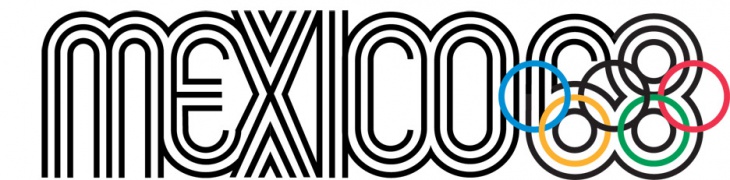
Mexico’s 1968 Olympics logo designed by Lance Wyman centres around the multistroke typeface with the rings incorporated in the number 68. During the promotion of the event, various patterns with curved lines were used in the several places of the city.
1972 Olympics in Munich were not just memorable because of the games but also because of the tragic attacks that took place during the event. The logo widely graphic in its nature was created by German designer Otto Aicher. The Munich games logo was the first to not use the rings in its logo.

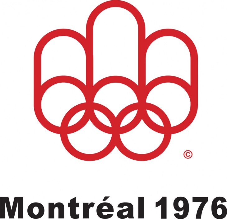
The Montreal 1976 games saw the Olympic rings transformed into the letter M for Montreal. Glaser said that logo was more appropriate for the manufacturers of paper towels. The logo was designed by Canadian graphic designer Georges Huel who also designed the 1976 Olympic torch along with industrial designer Michel Dallaire.
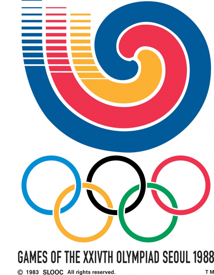
Glazer defined the Seoul 1988 Olympics logo as harmonious with bold lines forming concentric circles above the standard rings.
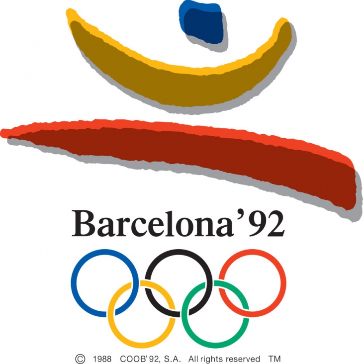
The 1992 Barcelona Olympics logo designed by Spanish artist Josep M. Trias reflects the figure of a leaping athlete. Despite the choice of colours and shapes, the logo creates a symbolic relation with the text and rings below.
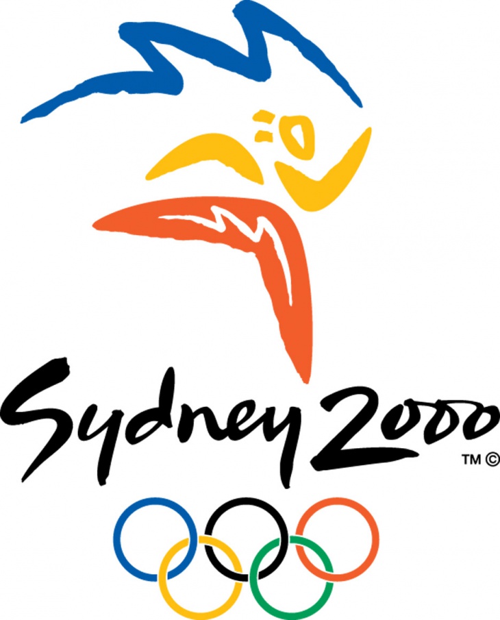
Sydney 2000’s Olympic logo is another favourite of Glazer because of the creative typeface and the illustrative drawing that makes the entire feel of the logo beautifully inventive says, Glaser. The games were remembered by the public for the use of iconic Sydney Opera House, designed by Jørn Utzon. The outline of the house has been reflected in the background of the logo.
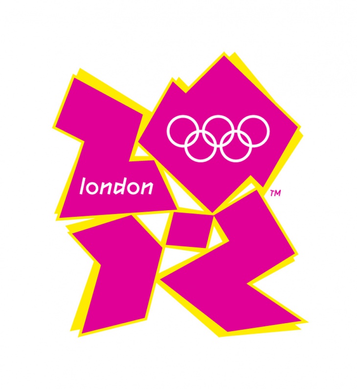
It is no surprise to anyone that the 2012 Olympics logo turned out to be controversial. With clumsy typography and gaudy shapes, the logo has obviously been memorable for the wrong reasons. The logo hit the rock bottom when some viewers complained to the BBC that animated version of the logo had caused epileptic fits in some cases.
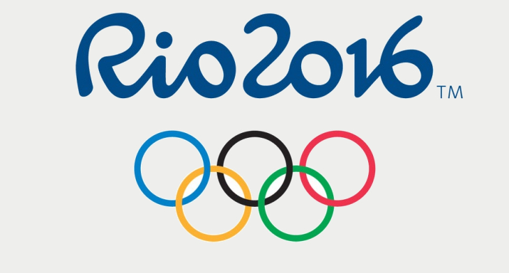
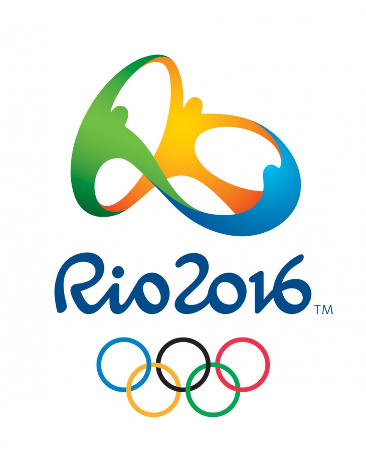
This year’s logo for Rio Olympics Games felt fresh and new. Designed by the Brazilian agency Tatil, the logo was finalised after a lengthy process of putting 139 designers compete against each other for earning the commission.
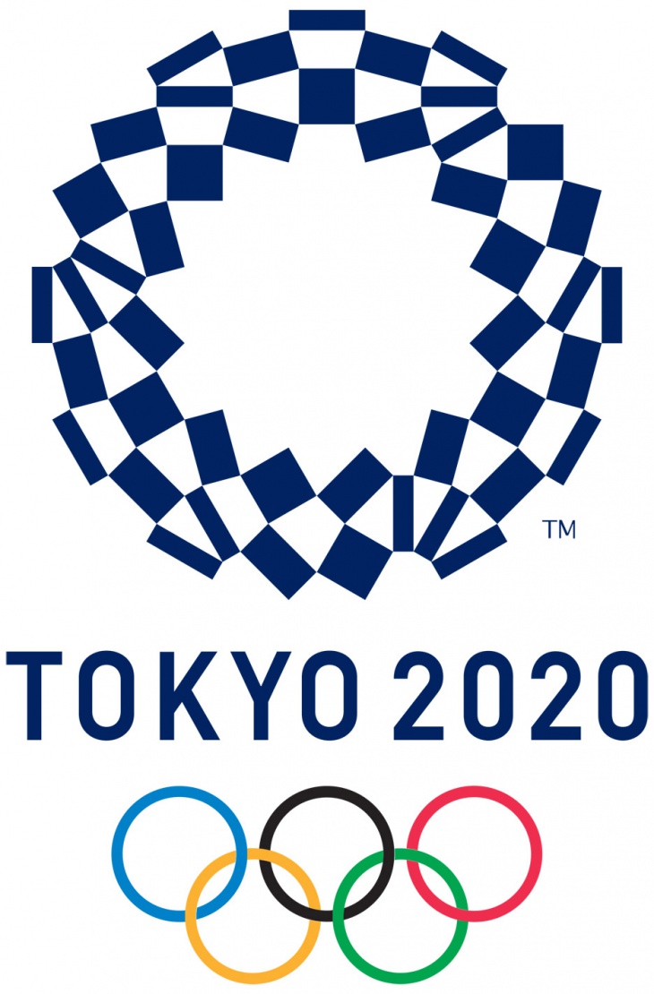
Still four years down the line, the Tokyo 2020 Olympics have already started to be the focus of controversy. The organising committee had to take down the original logo designed by Kenjiro Sano because of the allegations of plagiarism. Two new logos have been unveiled earlier this year by Tokyo-based artist Asao Tokolo.
Related Posts
Top 11 Email Marketing Trends for 2023
The Best New Portfolio sites, March 2023
Best Poster Designs 2023: Ideas and Tips
10 Iconic Moments Photographed in 2023 Rio Olympics
Top 5 Logo Design Trends of 2023
2023 Packaging Design Pentaward Winners
Digital Design Trends for 2023
Best Travel Apps for 2023
9 Script Fonts for 2023
10 Best Free Fonts for 2023
10 Best Mobile Games of 2023
Logo Design Strategies for 2023
Top 9 Web Design Trends for 2023
10 Most Popular Graphic Design Trends of 2023
Visual Design Trends to Look Out in 2023