Candies, what could go wrong with candies? They are simply delectable and full of happiness-inducing flavors. How do you stop a kid from crying or having tantrums? Just hand them a piece of candy and you’ll see their mood change right before your eyes. Candies come in a variety of forms which include peppermint drops, lollipops, to chocolate bars; candies are enjoyed by adults just as much as they are by children.
But then again, when trying to put candies out in the market, there will be a lot of competitors—especially in the candy industry—and you will need to make your products stand out from the competition. But how can you do this? By sales-talking your way to the crowd and telling them how delicious your candies are? Maybe. But the best way to promote your sweet treats is to take advantage on what the people can see right away from your products, which is the branding or packaging. We have given you our collection of awesome coffee branding mockups, now we will be showing you ten examples of creative candy branding that you may want to take inspiration from, check them out below.
Candy Craft Branding
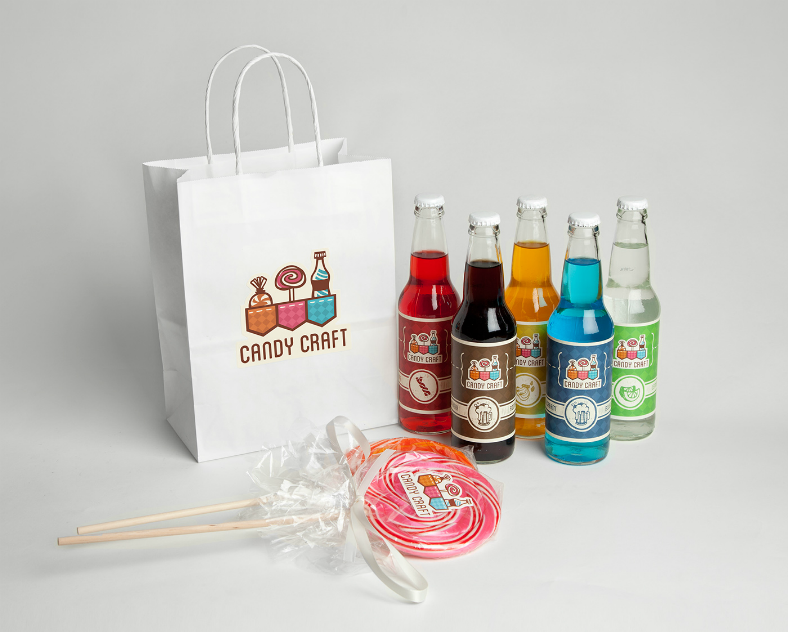
The first candy branding example on this article features hand-drawn inspired images of candy icons in vibrant colors that are sure to capture people’s attentions. This branding design is quite simple yet effective, and you can assure yourself that the symbol will be enough to get you the sales that you need.
Sweet Botanicals Branding
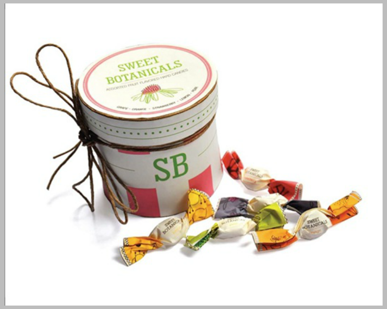
While many minimalists prefer to go with branding styles that limit the use of colors, it is actually a factor that can help in making a design stand out. Just think about it, a monochromatic design will look like a completely different entity when colors are applied to it, and that is already enough evidence to prove that colors can make a huge difference. The pleasing colors reflect the candies being sold and will potentially help in attracting more buyers.
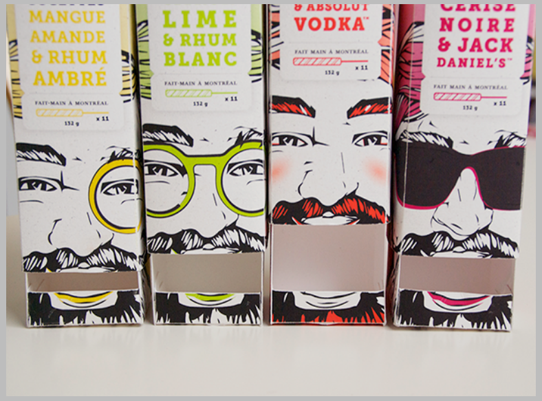
Sugarpova Branding
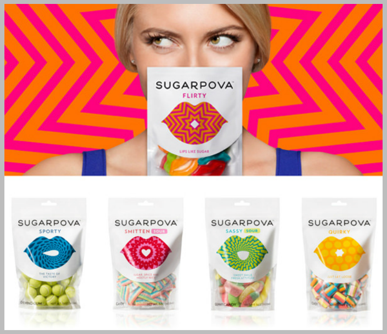
With this branding style, it’s simply all about the lips since the prints on this contain various lips to represent different personalities. Come to think about it, when we say someone is sweet, it could either be because of something they did or something they said. But when we say something—for example, a piece of candy—is sweet, it is primarily determined by our mouths. So our lips and the entire mouth can definitely say a lot when it comes to being sweet.
Chop Pop Branding
Don’t ever be fooled by the manly design on the packaging on this one, because this awesome branding design definitely packs a punch (in a good way). And besides, who ever said lollipops were only for children? This one sure does break a lot of rules (again, in a good way).
Happy Pills Branding
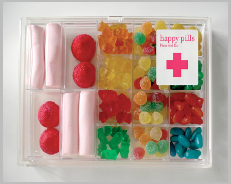
When you’ve got a cabinet full of your maintenance medicines at home that you’ve grown tired of taking every single day, why not choose a branding style that gives a more positive image at those medicines? With the Happy Pills branding, you not only get a bunch of neatly-arranged sweet treats, but you also get to have a beautifully-designed packaging that you can use for other purposes. I’m sure after this one, you’ll be a lot more excited to sink your mouths on your “medicines.”
Candy King Branding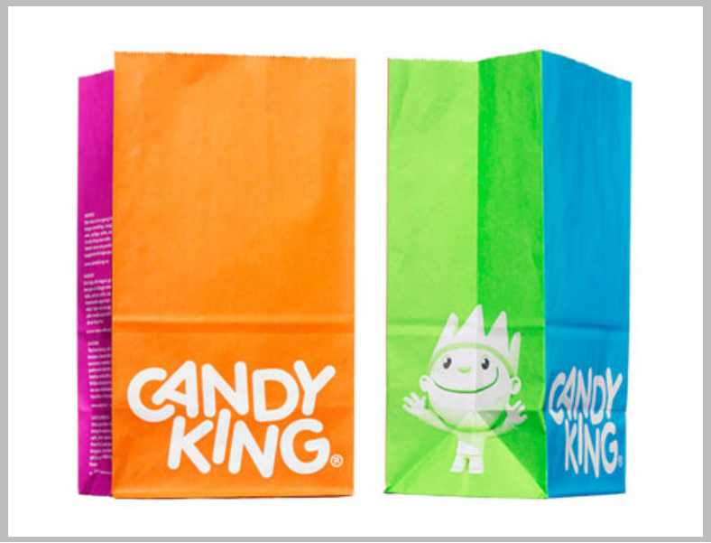
What else do we need to say about this design? This branding style is minimalistic and simply emphasizes how candies are the king at solving our everyday worries. When we’re feeling a bit hungry, grab a candy; when we’re a bit sad, grab a candy. What else do you want us to say? Just stop asking questions and go grab a candy. If you want to incorporate a logo on this branding design, go grab one from our collection of candy logo designs.
Candy Stripe Snack Branding
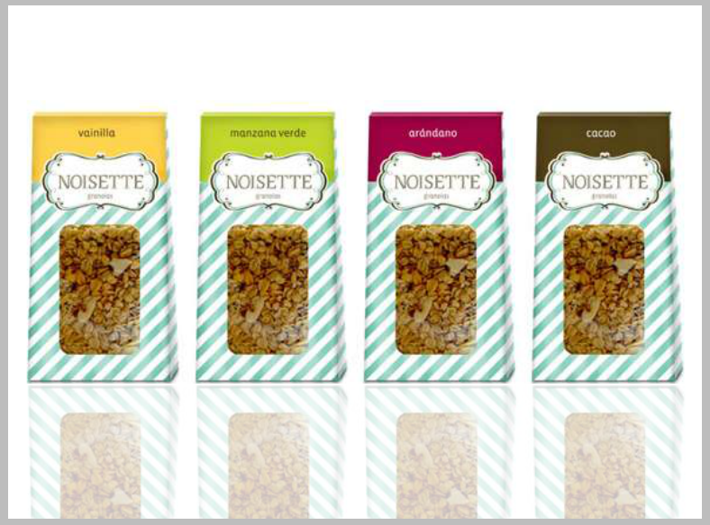
When it comes to candy branding and packaging, the stripes will never go out of style, and it will only differ on the color scheme for the brand to be distinguished from its competitors. The motif used for the design above follows a minty green series of color stripes that run diagonally all over the packaging, and even when it’s simple, you’ll know it’ll never fail at attracting customers because you know that when they see the design, they are in for an awesome sweet ride.
Colorful Cutout Branding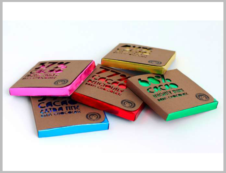
If you prefer to go for a rather simple look for your branding but also something that is somewhat artistic that it would stand out and get a wow from the public, this cutout-inspired branding design would be perfect. You actually don’t need to do much to pull off this style, just two layers of paper (or any material) with contrasting colors, and simply cut out the letters from the top layer to expose the bottom one. With this branding style, you’ll find out that even the simplest ideas will have very stunning effects.
Blooming Candy Box Branding
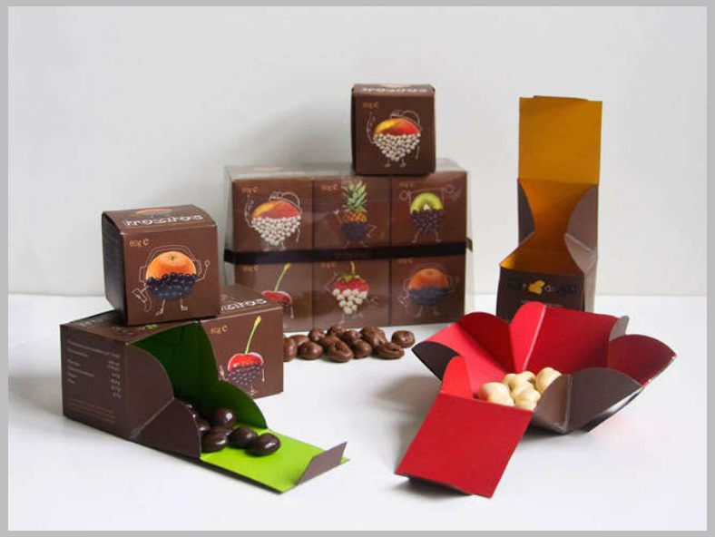
Here is an origami-inspired branding style, which focuses not on the design being printed but on how the candies are being packed. To those who are not familiar with origami (but who isn’t, really?), it is the Japanese art of folding paper into various forms. For this one, from the name itself—blooming—the person will need to open the box in such a way that it will resemble a blooming flower. Once the box has fully bloomed, the goodies will then be revealed much to our heart’s desires.
Accordion Eco Box Branding
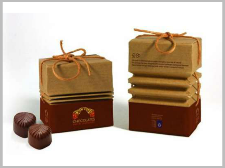
Today, it is all about reducing the use of natural resources and recycling old materials for the prevention of damaging our environment. This branding style puts heavy emphasis on reusing old materials to be able to come up with this packaging, and for the look to stand out, it resembles an accordion that can be collapsed depending on the amount of candies inside it. After the contents are being consumed, this box can also be further reused for other purposes. Remember the three Rs: reduce, reuse, and recycle. Now that you have seen our collection, you may also be interested in checking out some branding trends in 2016.
Related Posts
The Best New Portfolio sites, March 2023
Best Poster Designs 2023: Ideas and Tips
Hit and Miss of Olympic Logo Designs from 1924 till 2023
10 Iconic Moments Photographed in 2023 Rio Olympics
Top 5 Logo Design Trends of 2023
2023 Packaging Design Pentaward Winners
Digital Design Trends for 2023
Best Travel Apps for 2023
9 Script Fonts for 2023
10 Best Free Fonts for 2023
10 Best Mobile Games of 2023
Logo Design Strategies for 2023
Top 9 Web Design Trends for 2023
10 Most Popular Graphic Design Trends of 2023
Visual Design Trends to Look Out in 2023