From the billboard advertising to the big ads on TV, the marketing approach has evolved in 2016 to become much more simpler yet effective with the graphical design ads on company websites and over the net. Some of the top 10 changes witnessed in 2016 in graphic designing include:
1. The card based advertising
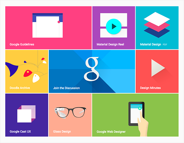
The website cards make a powerful impact on the customers. The graphical cards are creatively carved and floated in various social sites. This is a perfect way to drive customer attention faster, manipulate or even interact with the customers. Google has introduced “material design” for card designing to give a realistic appearance.
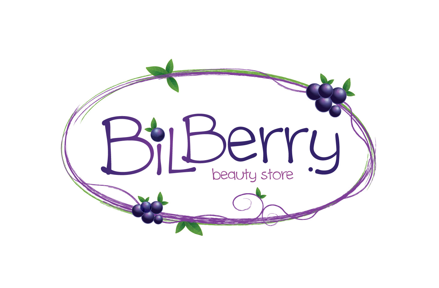
2. Bold logos and fonts
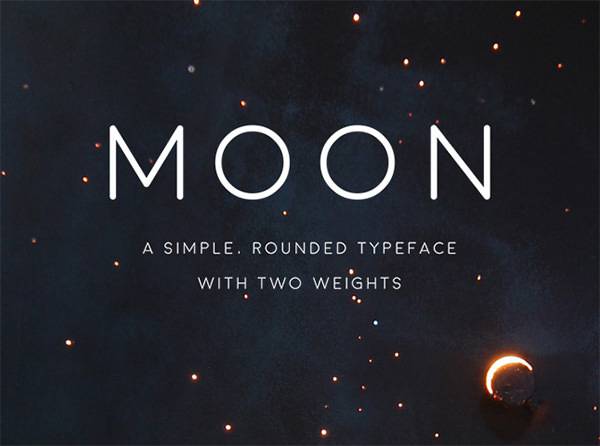
The logos in 2016 has seen a shift in shape, colors and also are less flashy. Use of designer fonts are creating a superior identity of the brand. The script is given the most dramatic twist. In many cases, shades used in the fonts and logos trace back to the retro period and are appealing.
3. High resolution background images
The huge, high resolution background images on the web pages are mushrooming on a number of modern day websites. The basic motive is to increase the web visibility and engagement power of the brand without too much cluttering and distraction.
4. Motion ads and GIF’s
Whether a GIF or a full page web motion advertisement, this is nowhere going to fade in its value even in 2016. In fact, more and more graphic designers are being more adept to think from the user point of view when designing these videos and making it humorous, spectacular and eye catchy.
5. Flat web design
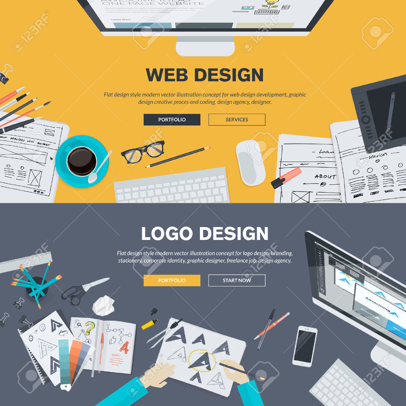
The flat has overtaken the flashy and 3-D graphics in 2016. The flashiness is also brought down by cutting overloaded tones of colours in logos and icons. The shadow and layered approach in icons and brand logo designing is essentially a great step ahead in terms of improvement in graphical designing 2016.
6. Use of pastel colours for appealing the eyes
The colors are given higher importance to please the eyes in websites, logos and icons. Use of pastel shades and colours dating back to the retro style has fixed on the minds of the companies in 2016. The same colours also work well for the office interiors for creating the right environment at work.
7. Higher animation use
The animations, teasers are something which click and register faster in the customer’s mind. The gentle movements in the GIF’S, or product moving 360 degree with info graphics are certain strategic animations which are being likened by the customers.
8. Digital prints and posters
The prints and posture designs though may seem to go out of date due to the internet and digital marketing have not lost its charm. However, the prints can be very effective and outstanding if they replicate the digital media graphics in terms of conceptualization.
9. Graphical micro-interactions on apps
The companies are trying to maintain an originality in every message they try to convey by best use of graphics. The apps and mobile responsiveness has increased and the graphical messages as micro interactions like a welcome message on the app gives a human touch to the brand and the company app.
10. Google font use and use of negative space
Google has allowed the companies to shun the old, boring text fonts and adopt interesting elegant strokes with different font styles and sizes. The brand name is elegantly designed using calligraphy or the modern Google Fonts. The negative space around is also used for interesting logos.
Related Posts
Best Designs for Album Covers 2023
12+ Best Web Designs for 2023 – Word, PSD, AI, EPS Vector
Top Best Font Style that Can Be Used in 2023
Best Digital Design Trends of 2023
Magazine Design Trends 2023
Top UX Design Trends 2023
Exceptional Packaging Ideas in 2023
Visual Design Trends 2023
Branding Design Trends 2023
Top 11 Email Marketing Trends for 2023
Best Poster Designs 2023: Ideas and Tips
Hit and Miss of Olympic Logo Designs from 1924 till 2023
10 Iconic Moments Photographed in 2023 Rio Olympics
Top 5 Logo Design Trends of 2023
2023 Packaging Design Pentaward Winners