Do you want to stay ahead of the curve? If so, you need to be able to track trends. A trend can be described as a ‘general direction in which something is changing.’ Alternatively, you can just call it a fashion choice. Trends are everywhere and involved closely in the myriad of details of our lives. Typography designs are among said details. As much as certain things stay the same for designers, there are so much more that will come and go. It may be in as long as a decade’s time, as quickly as a few days, or perhaps something that is not quite drastic, like once a year.
You can bet your bottom dollar that the top trending designs of 2017 have changed now that we are in 2018, and they are bound to change even further by the time 2019 rolls by. Experts are already making speculations as to what is to come, so if you want to stay on top of everything, here are some of the potential trending designs for typography in 2019:
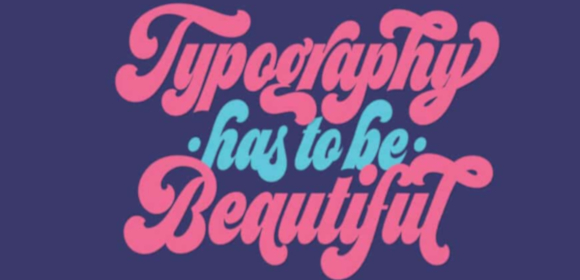
Considerable Vivid Colors Popping Up More Frequently
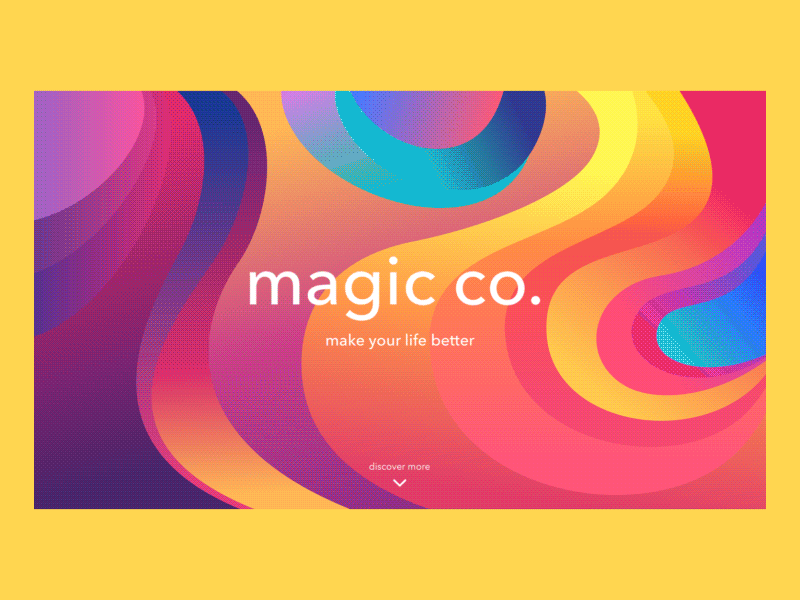
As you might have already noticed, but designs are starting to become more and more colorful. Those who are thoroughly enjoying this will be glad to know that this may serve as a mere beginning. In the year 2019, you can expect to see more splashes of bright, electric yellows; vivid blues and bright corals are just the tip of the iceberg that may do away with some of the more reserved color trends from our very recent past. Tune in to continue seeing more and more brands churning out brighter colors from here on out.
To those who are not very familiar, vivid colors can be described as those with a lighter hues meant for attention-grabbing or a sharp increase of intensity. Some prominent examples would be certain light shades of pink, red, and blue. In any design or typography examples, you are bound to catch an entire palate of vivid colors, which are sure to leave a mark on you. There are those who believe that this trend is a direct rejection of the minimalistic trends that popped up early in the decade. As more and more designers fight for the attention of the masses, greater design risks had to be taken.
The Dominance of Function Over Complex Designs
Although color may be doing all it can to grab your attention, there is another trend that looks to be going in the opposite direction somewhat. In terms of overall design, there now seems to be a bias towards both functionality and simplicity, to the point where it seems as if some designers no longer care what a logo will look like. The significance is now on the direct impact of the design as opposed to the minute details. With that said, a less is more approach looks to be in the near future of 2019.
There are some that may decry what seems to be the loss of individuality, at least in favor of more classical options. As far as trends go, this is not something that will lead towards successful for all brands or businesses, since this is more likely to be relevant for industry giants with an already stellar reputation. Those are the brands identity who can afford to lose some individualism due to the fact that they are already recognizable in various other factors. Brands that are not as prominent may still be wise to keep this trend in mind, however.
The Continued Rise of Bold Typographical Focal Points
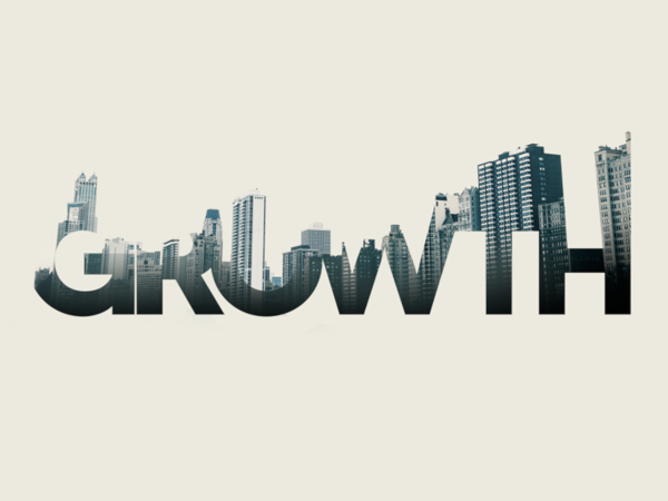
Although we are looking at trends for the coming year, this is one trend that already started years ago but continues to go strong with no signs of slowing down anytime soon. You have most likely seen this from major brands such as Adidas and Samsung. Having bold fonts make it quite easy to have your text read on your social media feeds as well as when you are using your mobile devices. As far as its message is concerned, you can expect an instant projection of strength, individuality, and innovation.
What must be taken note of is that in this trend, the bold font tends to be a supporting partner to various other design elements that really makes the typography designs pop. It is speculated that in the coming year, bold fonts will finally move out of its supporting role and become a true focal point concerning various graphics. This would be particularly useful when it comes to grabbing a reader’s attention in just a few seconds. There is no denying just how powerful this can be considering how well it stands out. If you are a designer and you want to make a statement in 2019, then bold font-based designs will help you do so with utmost confidence.
Futuristic Elements
For the last trend we will look at, it must be said that looking into the future is fun for a lot of people for various reasons. Even in design, elements noted to be ‘futuristic’ in nature are slowly becoming more and more prominent. This trend does not look like it is going to die down anytime soon and will only become more mainstream in 2019. What can you expect from this? A considerable amount of futuristic patterns, ideas, and colors commonly associated with the concept of the future. Having this trend helps in coming up with more unique content that is more than capable of standing above the usual social media noise.
Well there you have it. The year has not even come close to ending yet, but it already looks as though 2019 will be just as interesting, if not more, than this year has been so far. Of course, few things are set in stone and there may be a couple of surprises left, ready to take us all unaware. One this is definitely certain though: the trends discussed here are sure to make the next year an exciting one for designers everywhere.
Related Posts
Best Poster Designs 2023: Ideas and Tips
Hit and Miss of Olympic Logo Designs from 1924 till 2023
10 Iconic Moments Photographed in 2023 Rio Olympics
Top 5 Logo Design Trends of 2023
2023 Packaging Design Pentaward Winners
Digital Design Trends for 2023
Best Travel Apps for 2023
9 Script Fonts for 2023
10 Best Free Fonts for 2023
10 Best Mobile Games of 2023
Logo Design Strategies for 2023
Top 9 Web Design Trends for 2023
10 Most Popular Graphic Design Trends of 2023
Visual Design Trends to Look Out in 2023
Google Play Best Games and Apps for 2023