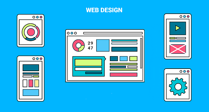
Web designs, just like other classifications of designs, which includes fashion and interior designs, is constantly evolving. Over the years, there have been changes in the trend—what may have been trending at one point in time may no longer be popular today, and a trend in this generation may or may no longer be a trend in the next.
If you are a designer, you will need to constantly update yourself with these trends to keep up with the competition because you wouldn’t want your website to look outdated. On this site, we have a list of some of the many trends in Web design for the year 2017, and we even have a list of trendy pre-built websites to save you the hassle. Go ahead and check out the list below to determine if your website (if you have one) contains these trendy features.
Asymmetrical and Broken Layouts
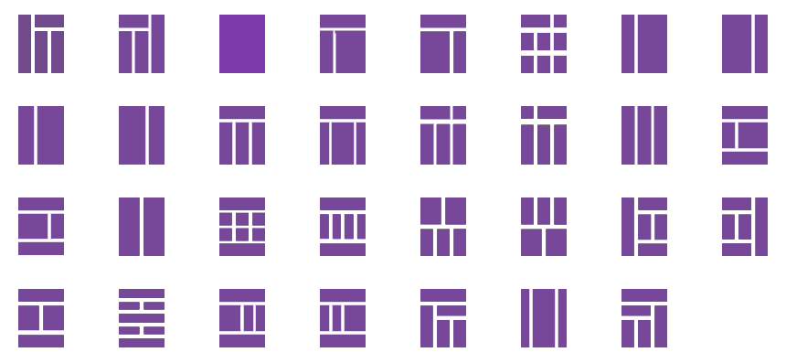
The previous year marked a big change in the world of Web designs. Web developers decided to go the unconventional way by making the layouts of their websites asymmetrical and broken, and the risk they took actually made a big impact among them and easily became a Web design trend, until now. When we speak of asymmetry, we can think of something that is not equal or balanced, which is actually the case with the layout on these websites, the left and right sides of the layout are not perfectly balanced. In Web design, an entire page is usually into rows and columns—otherwise known as grids—to guide developers on where to place their contents, and with broken layouts, these contents and features are placed not within the grids but outside them. For reference, you may want to check out our list of the best sources for Web design inspiration.
During the evolution of designs (though it is still evolving constantly up to this day), many Web developers assumed that the Web designs would get more and fancier as the years go by and technology becomes even more advanced. But then, when the time came, these developers realized that the more important contents of their landing pages have become overshadowed by the many features put into the site, and this has also made the landing page look chaotic. Because of this, Web designers went with the classic and much more simple look for their landing pages to give emphasis on the features that are far more relevant for their visitors.
Video or GIF Backgrounds
Online video streaming has become very popular over the recent years with the existence of streaming service websites such as YouTube, Metacafe, and Vimeo just to name a few. Because of the popularity of video streaming—and that people are really into watching videos in general, whether these videos are short clips or full-length movies, and in devices that range from media streaming boxes to mobile phones—Web developers have incorporated these into their websites. Take travel websites, for example, many would incorporate videos on their background. Just check out our list of inspiring travel websites to give you a clue. Since uploading a video may take time and would consume a certain amount of memory to process and load, some developers would choose the more convenient way and use a GIF file instead. This way, the processing time of these files will be much lesser than with videos, and GIFs also don’t use up too much memory.
Darker or Dimmer Tones
Over the recent years, it has been observed that the use of bright white backgrounds have become less and less popular, considering that we have already mentioned about minimalist landing pages earlier in this article. Just because the use of white has slowly diminished, it doesn’t mean that you need to start using really dark colors for your website; you can simply use slightly dimmer tones. This means that instead of using white, you can use light gray instead. Many may disagree to this claim since colors have always been vital in designs to be able to make the features stand out and become noticeable, except maybe for those that prefer the use of an achromatic color scheme. Though if you want to give this a shot, you can always shift the colors of your website from bright, high-contrasted ones to a slightly dimmer shade, and then you can see whether or not the effect suits you.
Vibrant Color Gradients and Patterns
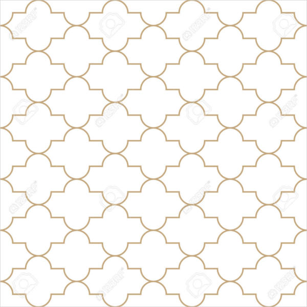
While we wouldn’t want your website to look overly cluttered, we also wouldn’t want it to look empty as well. The use of color gradients and textures or patterns in backgrounds have significantly increased over the recent years, with some sites incorporating these decorative details as minor enhancements only, though there are also websites that use these elements heavily. Gradients, textures, and patterns are recommended to prevent the site from looking dull, most especially to websites that lean heavily toward simplicity with their other features, and we may just have a collection of vector patterns that you can download.
Decorative Details
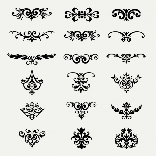
Here is another feature that has slowly become a trend in Web designs recently, especially with websites that are more on the minimalistic side. Same as with the previous trend on this list that mentioned about color gradients, the purpose of this one is to make the website much more presentable by putting in minor additions on the design to keep it from looking dull. These decorative details that may help enhance the appearance of a website may include straight or curved lines, ornate decors, and even geometric shapes. These details don’t need to have large scales to be able to achieve its purpose, even the smallest of these decorative details can go a long way. But if you want to save yourself the hassle, you can check out our collection of easy Web themes and templates that you can download.
Rich, Large-Sized Typography
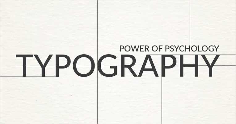
The typography is one of the most important features of a website, with the graphics and images only coming in second, go ahead and check out some the typography fonts that we have gathered here. The reason behind this is that the typography serves as a powerful medium both for providing information as well as enhance the appearance of a Web page. With typography, they are able to provide a reader with the details they need regarding something, and this, in turn, is the purpose behind websites, to provide their visitors with relevant information. Some websites would use other types of graphics and images to decorate their website, while some would simply use text in large scales for the same purpose, and this has become a trend in Web designs. Because of this growing trend, expect to see a lot of websites that use big text or letters to increase their level of visual appeal.
While it has always been a trend to use custom-made typography on Web designs to make your text appear unique from those on other websites, but the use of traditional Serif and typewriter-inspired typefaces actually outweigh them. Some may prefer to use the Sans Serif typeface, which is basically the same but without the flourishes at the end of the strokes, though many would choose the Serif typeface since it appears more elegant and decorative. And for typewriter-style typefaces, specifically the Courier font (though there are other similar typefaces), these look almost the same as Serifs but are more rounded, especially around the ends of the strokes. But if you are looking for something else aside from Serifs and Couriers, you can check out our list of some creative typography fonts.
Overlapping Typography and Images
Back then, when a Web page contains both images and text, there would a space designated exclusively for the images while the remaining space will be used to write down the text. The reason behind this is that web developers want the readers to focus on one feature on the website at a time. This means that if they are looking at images, there shouldn’t be any text that might block an important part of the image, thus creating a distraction. On the other hand, if they are reading the contents of the website, having an image behind the text might create a conflict between the colors, and this could make the text slightly difficult to read. But as time went by, it has been proven that overlapping images with text can still work out as long as you know how to arrange them, and this technique has become a trend in the recent years. If you are looking for more templates, you may also want to check out our collection of Web template designs.
Unique Scrolling Effects
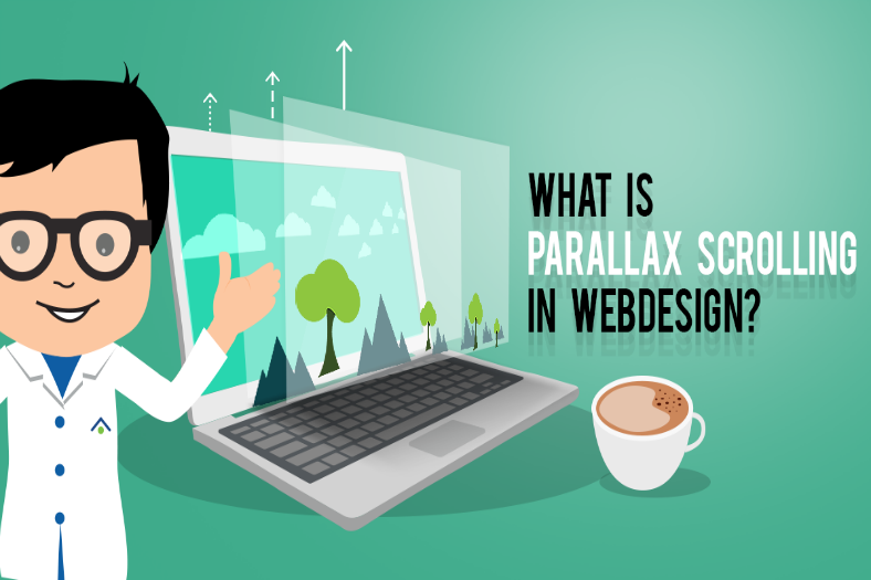
An unconventional scrolling is the result of the Web developers taking advantage of effects from mouse inputs, specifically with the use of the mouse’s scroll wheel. Instead of the traditional up and down movement of a Web page when it is scrolled, they would choose to make it more visually stunning. One example of a unique scrolling effect is parallax scrolling, otherwise known as asymmetrical scrolling, and this is when the background moves at a slower rate than the foreground. There are also other creative approaches to how a Web page moves, and this includes horizontal movement upon scrolling, transition effects such as fades or page flips, and many other unique ways that allow users to proceed from one area of the website to another.
So far for this year, there have only been a few new trends discovered and most of the trends on this list were those from 2016 that was just carried on. Who knows? Most of these trends may also be able to make it to 2018, or there may also be an entirely new set of trends. It solely depends on the impact a Web design can bring to Internet users, and this may be according to the website’s responsiveness or it may also be the attractiveness.
If you already have a website, would you say that the design bears trendy features? Or does it need to be revamped for it to become trendy and be able to get the audience it deserves? But if you are still about to put up your own website, then this would be a good reference to make a website that is worth visiting, and you may even refer to our list of the best website builders on the Internet.
Related Posts
Best Digital Design Trends of 2023
Magazine Design Trends 2023
Top UX Design Trends 2023
Evolution in Graphic and Print Design Trends 2023
Exceptional Packaging Ideas in 2023
Visual Design Trends 2023
Branding Design Trends 2023
Top 11 Email Marketing Trends for 2023
The Best New Portfolio sites, March 2023
Best Poster Designs 2023: Ideas and Tips
Hit and Miss of Olympic Logo Designs from 1924 till 2023
10 Iconic Moments Photographed in 2023 Rio Olympics
Top 5 Logo Design Trends of 2023
2023 Packaging Design Pentaward Winners
Digital Design Trends for 2023