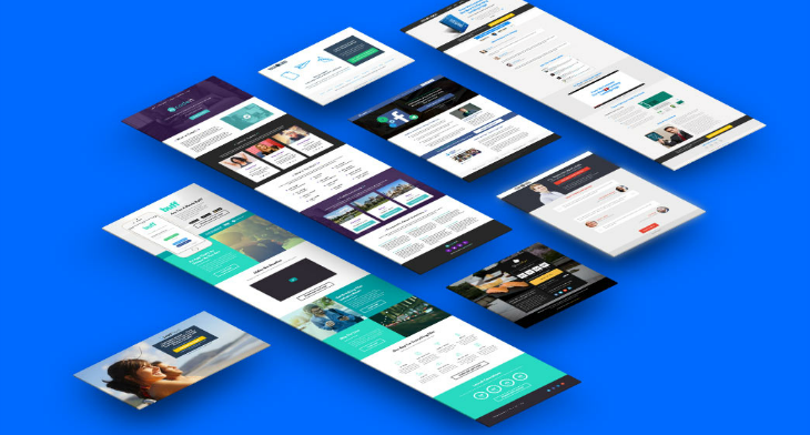
Have you ever thought how famous websites of today got their break? Like all things, they should have started at the bottom before they were able to climb up to where they are now. And, have you ever wondered how they did it? One very probable answer to that is by making their website, most especially their landing page, highly appealing to their visitors, and they can do this by making their landing page keep up with the trend.
The landing page is where visitors arrive once they click on a link or enter something on the address bar, which means it is the first page that people see when they go to a website. Landing pages should already be able to create a good impression to a visitor for it to work. So why not give them that impression by showing them something that’s trendy? And we may just have a list of some trends in landing page designs that you can refer to, as well as a separate collection of cool landing page designs, go ahead and check them out.
Minimalist and Clean Design
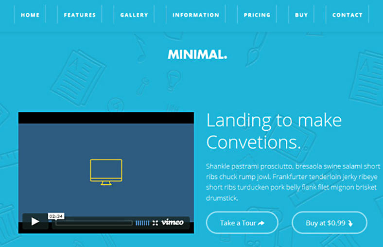
The trend of having simple and minimalist designs have been around for a while, and it is very likely that this will continue to be a trend for a very long time. When people visit websites, their reason for visiting will most likely be for gathering information or ideas about something. Even if the website is more on images and not so much on text, just like Pinterest, sites like these provide people with knowledge, which may include project ideas and how-tos.
To be able to achieve a clean and minimalist look on your landing page, it should have at least some of the following features:
- Maximized white space
- One color for the typography
- Dark-colored call-to-action buttons
- Minimal graphics
- Large and legible headlines
- Organized elements
If you have those features on your design, then it can very much help in making your landing page look uncluttered, and having a neat-looking website has been proven to gather a lot more visitors than those with overly cluttered landing pages.
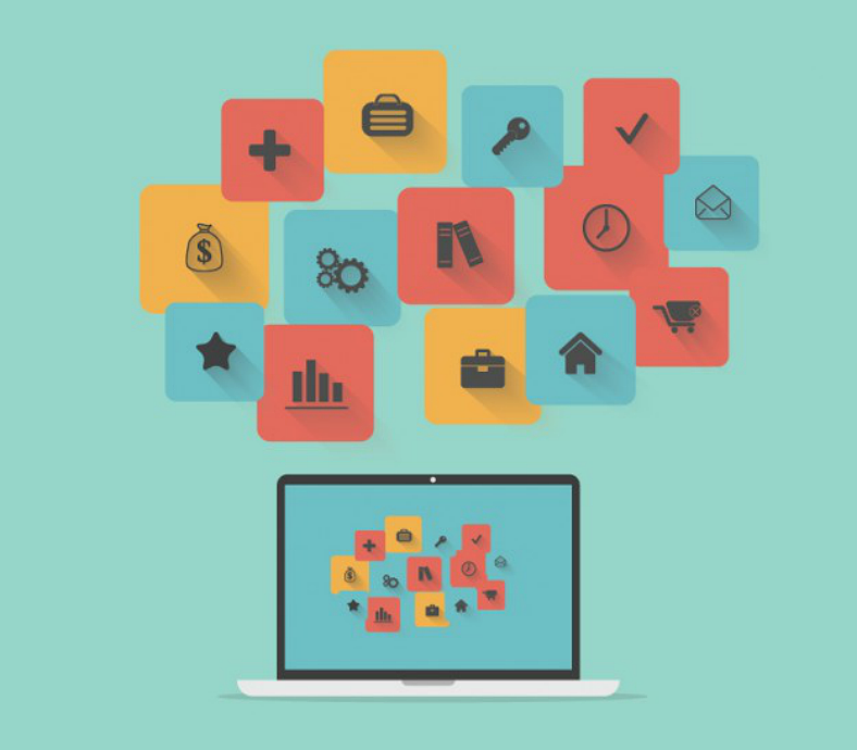
Flat Illustrations and Icons
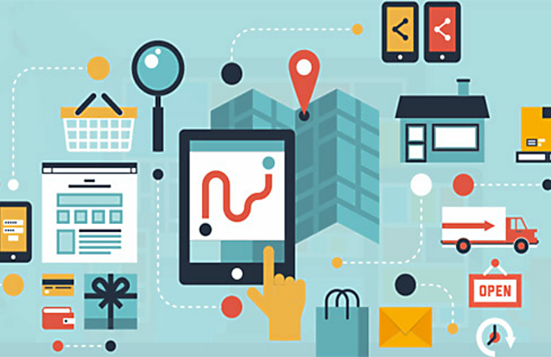
In relation to minimalist designs for landing pages, having flat icon designs, illustrations, and other features can add to the simplicity in the appearance of the landing page. A couple of years ago, mobile device operating systems have shifted from using icons that involved a lot of shadings and reflections to a much simpler and flatter look. This shift in style immediately became such a hit that websites incorporated the look onto their icons and other features.
What Are the Advantages of Having a Flat Design?
- Flat designs are highly adaptable and can easily be made responsive
- Flat designs removes all the unnecessary features on the design, allowing the visitor to focus on the more important aspects
- Flat designs help make the visuals of the landing page look clean and neat
- Flat designs are least likely to lose its sharpness
Intro Pop-ups
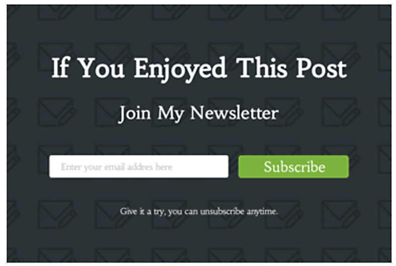
When we hear the word pop-up, we commonly think of those with unwanted ads that we are constantly trying to block with the use of pop-up blockers or other security tools. However, the pop-ups that we are trying to describe here are different because these are actually related to the website.
These pop-ups, otherwise known as welcome mats, are used either to promote the website or its contents or for surveying purposes. If the latter is the purpose for these welcome mats, it is to help the developers determine what people want to see from their website, or it could also be to give them an idea on how to improve their website.
Even if the idea of having intro pop-ups on landing pages is still new, it has been proven to have garnered around three times as many registrations and sign-ups. So, regardless of the simplicity of your landing page, a welcome mat can go a very long way to contributing to the improvement of your website. Go ahead and check them out.
Split Screen Mode
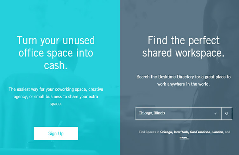
A good way to organize your content, making it easier for readers to find the specific information they need, is by using a split screen for the landing page. With multiple columns on your landing page, you can include various types of information while still keeping it arranged and easy to navigate.
If a landing page is organized well, then visitors of the site will be enticed not only by the visual attractiveness of the website but by the convenience of the information provided to them. And in turn, if gathering information from a website can be done without too much stress, then it will very likely be able to draw in a lot of visitors, which is a very good thing. While this may be quite intimidating to do, you may refer to trendy pre-built websites just to get you started.
AutoPlay Videos
Explainer videos, as most Web developers would call it, are a very good way to convey information to your visitors without having to write a lot on the landing page. With explainer videos, it will seem like you are actually communicating directly to your audience, and the latter will actually have to watch something being explained than just having to read it.
But you can actually do more than just post an explainer video on your landing page, and this has already become a trend for quite a while. You can make your videos play automatically once a visitor gets to your landing page. Doing this can save your visitors the time in doing it themselves, which can help in making them more productive since they can do other stuff while the video is playing.
Another way you can use these autoplayed videos is by making it as your landing page’s background. Just set your video to automatically play and loop in the background as your visitor goes around your landing page. This way, the looping video background can help in making your landing page look livelier and more attractive.
Fewer Photos, More Illustrations
While using actual still photographs on your landing page is still a very good choice for provided information as well as enhance the look of your site, many Web developers have geared toward using illustrations, and this has become a trend in the recent years.
With illustration designs, you may be able to make use of your creativity and be able to present your information in an unconventional yet playful way. Below are just some of the differences between having a still image and having an illustration on your landing page:
- Still photos will force you to stick with reality while illustrations will allow you to get beyond what is real.
- Still photos will actually require a lot more effort especially when presenting various information than with presentations.
- Illustrations are much more interesting to look at than still images.
Interactiveness
Of course, audiences will always prefer to visit websites that allow or encourage them to engage with its features interactively. Rather than settle with having your visitors just scroll around the landing page and read its contents, you can get them involved by providing them with something that they can interact with.
One very good example is what BuzzFeed is doing on their website. There, they have interactive quizzes such as “What Career Should You Have?” or “Put Together The Perfect Burger And We’ll Tell You What Kind Of Friend You Are,” and these have garnered a significantly large amount of shares on social media sites.
Without a doubt, people will always be enticed by something unique that they see, especially if this can help them in gathering the information that they are looking for. Therefore, the more you make your landing page interactive, the more it can help invite audiences.
Call-to-Action Buttons
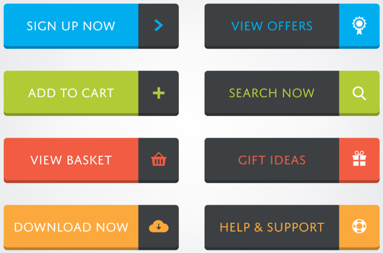
When making advertisement tools such as flyer designs, it is highly recommended to include a call to action to encourage people to get involved, and the same concept can be said with landing pages. Another way that you can encourage visitors to interact with your landing page is to provide them with CTA (Call-to-Action) buttons, and while you may always just put one for your visitors to click on, you can also provide them with multiple CTA buttons to allow them to choose.
Though this may not always be applicable, since there are times when only one choice of action is provided. But if there is an open opportunity to let visitors choose from among multiple actions, then take advantage of this opportunity by using one CTA button for each action.
One good example of doing this is when presenting a theme template to your visitors. You may be able to give them an option between downloading the theme, or just try it out to determine if it suits your preferences. Below are a few golden rules for an effective call-to-action:
- It offers a trial mode.
- The button provides thorough instructions.
- It asks for an immediate response.
- It should not be uninspiring as telling the visitor to just “Click Here.”
- The color of the CTA button should stand out and scream for attention.
Illustrated Process Structures
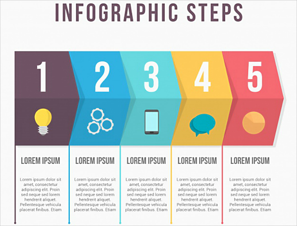
Simply writing a step-by-step process about the structure have become a thing of the past, and while it can still be useful in providing people with guidelines on what to do, many people today prefer to have a visualization to support each step in the process. This illustrated step-by-step process structure has become a trend among landing pages that Web developers would incorporate it when given a chance to explain a process.
Explaining a process as clear as crystal is what people want, and having a supporting illustration can help in making the process much easier to understand even if the process is actually very complicated. Through this, it can help your visitors in eliminating their apprehension in taking the learning curve. And to keep it simple yet attractive, many developers would choose to use flat illustrations for this, you should too.
Free Online Tools
Again, in relation to the landing page’s interactiveness, you can always provide them with something that they can engage in on your website aside from the CTA buttons. These tools should not be something that is unrelated to the nature of your landing page, and should be something that supports your content.
An example of this is the body mass index calculator on Mayo Clinic, and another is the free word translator and unit converter on Google’s landing page. With these free tools made convenient, visitors will initially try them out for a couple of times before finally deciding to sign up and fully subscribe to their services.
Social Media Integration
The social media is one of the very essential tools for every person nowadays, and this is because these allow people to connect with those that are physically far from them, as well as reconnect with people who they have never been in touch with for a long time. Because of the wide recognition and use of social media sites, it has become a trend to integrate them with websites.
This way, if users are able to find something interesting on a website, they can easily share it with the people connected to them just by clicking on the corresponding social media button included on the page. Nowadays, social media are not merely for connecting people, but it can also be used for sharing information with others. If you wish to include this on your landing page (which you should), you may want to check out our social media icon designs.
Testimonials Section
Lastly, the inclusion of a feedback or testimonials section, which has become a trend even before social media sites became highly popular. But to prove how much this has made an impact to designers and developers, this trend still continues to be in existence up to this point.
An advantage of having a testimonials section on the landing page is that it can right away show what people think about the website when they “land” on the page. Instead of having them look for it from your website, you are actually bringing it to them, which is a lot more convenient, and this can be very beneficial to your website.
Advantages of the Testimonials Section:
- Visitors of the landing page can read actual feedback coming from other satisfied visitors
- This may help give a good impression about your landing page
- This will very likely make your website trustworthy, which can help in gathering more visitors
If you weren’t able to find your inspiration here, you may be able to find it on a different page. We also have a different list of the trends in Web designs that you may want to check out.
Related Posts
Best Digital Design Trends of 2023
Magazine Design Trends 2023
Top UX Design Trends 2023
Evolution in Graphic and Print Design Trends 2023
Exceptional Packaging Ideas in 2023
Visual Design Trends 2023
Branding Design Trends 2023
Top 11 Email Marketing Trends for 2023
The Best New Portfolio sites, March 2023
Best Poster Designs 2023: Ideas and Tips
Hit and Miss of Olympic Logo Designs from 1924 till 2023
10 Iconic Moments Photographed in 2023 Rio Olympics
Top 5 Logo Design Trends of 2023
2023 Packaging Design Pentaward Winners
Digital Design Trends for 2023