As a graphic designer, you must be well aware about the concept of minimalism that has been taking over the world of design recently. And it is not just graphic design but also design as a whole, be it packaging, interiors, fashion, etc. The concept is easy to understand and can be derived from the literal meaning of the word itself. The difficult part is the application or execution.
The idea is to exclude everything that is unnecessary and only include the essentials. A lot of practice and hardware goes into perfecting this art. Therefore, we have few excellent examples of minimalistic design for graphic designers to have a better understanding of the application.
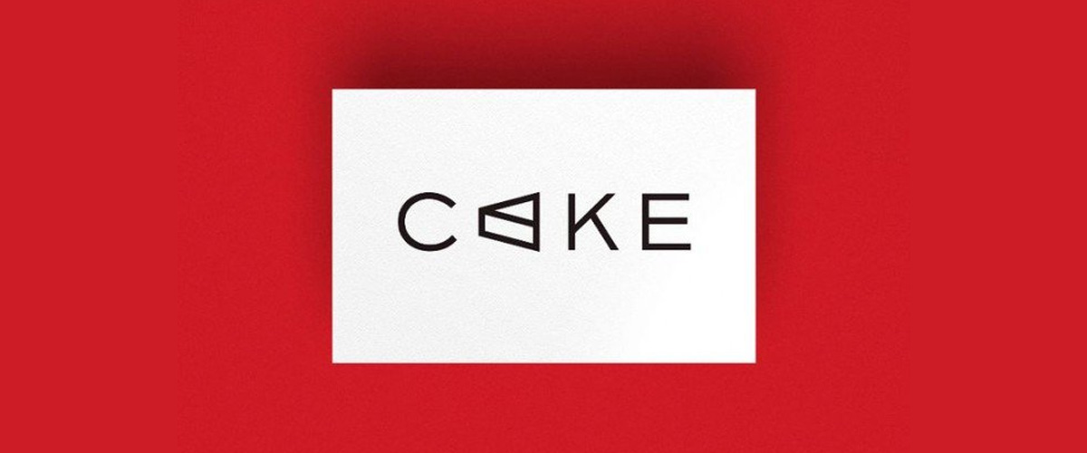
Here is a perfect example of how to combine illustration and typography effectively. Free Creative designed this branding for a PR service agency called Cake. The illustration here points out to what the typography means to express. Minimalism is about leaving the maximum impact, saying the most with minimal design.

Minimalism certainly cannot be achieved by following the conventional norms of design. It is of course, important to know the rules but it is only when you know the rules you break them to create something better. Given above is an example of logo type designed by Ruby Wight. There are not many designs that look so simple and so innovative at the time. This is what happens when minimalism is applied right.
Never hesitate in keeping the white space. By white space, we mean the remaining space that doesn’t have any design. It provides a breather to the onlooker and avoids clutter. White space also known as the negative space leads to minimalistic designs.
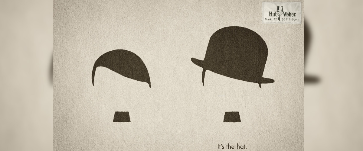
Design is about explaining with visuals and minimalistic designs do the same except they do it even more clearly. The above poster makes the message very clear even if you don’t read the text. It is only if you are interested will you go ahead with the text.
Minimalistic designs are about efficiency. A bit of creativity and presence of mind and you can have a designing masterpiece not in terms of aesthetics but in terms of communication. The image given above is a solid example of how to create a minimalistic design that is focused, to the point and communicates in a minimal yet efficient fashion.

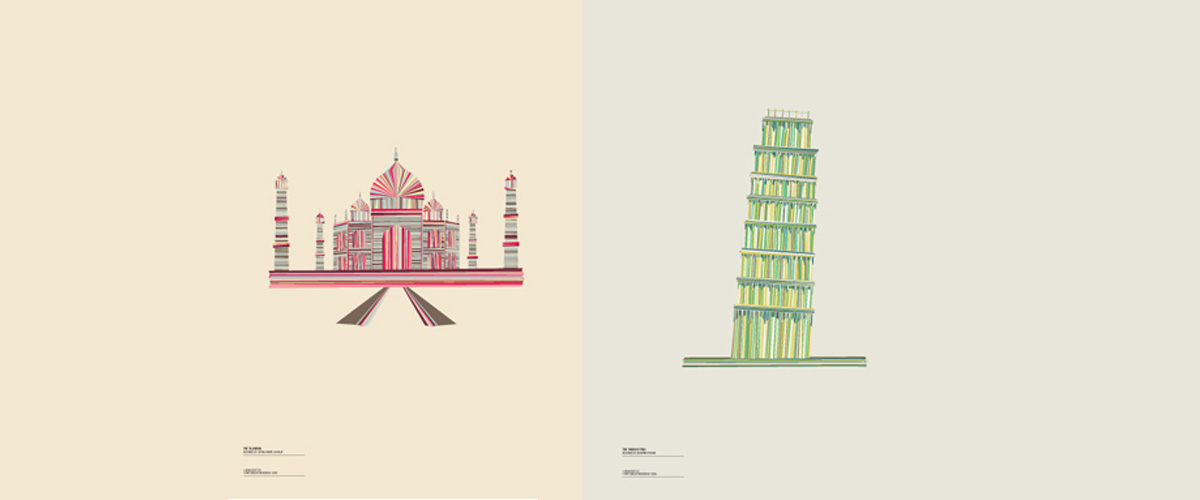
Textures, as we all know, adds depth to the design. A common notion about minimalistic graphic designs is that they are created by simple, plain, solid colors but that’s not true. A minimal design can well be created with the help of texture. Checkout the images given above to see how to adopt texture in minimalistic design.
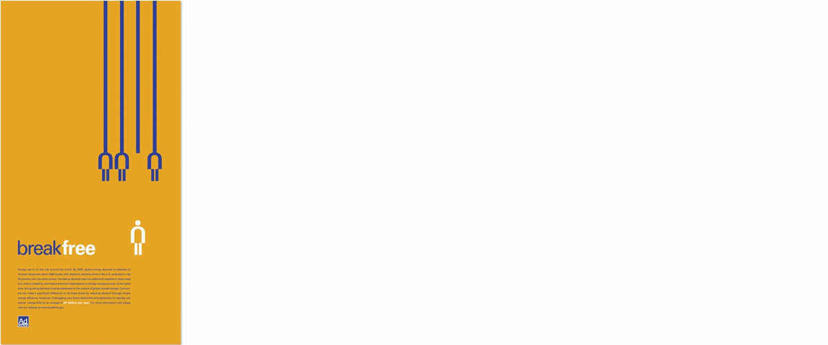
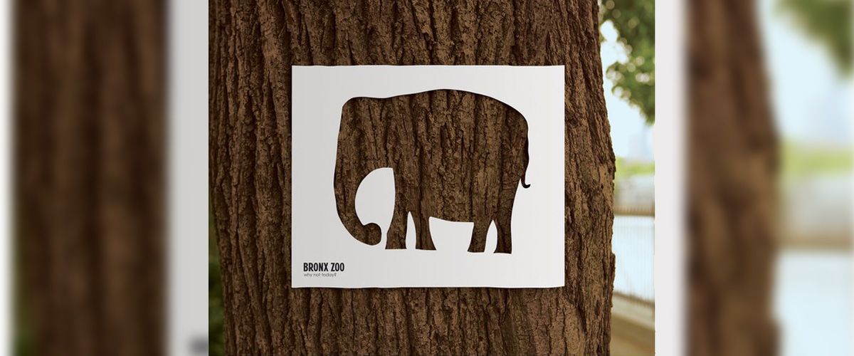
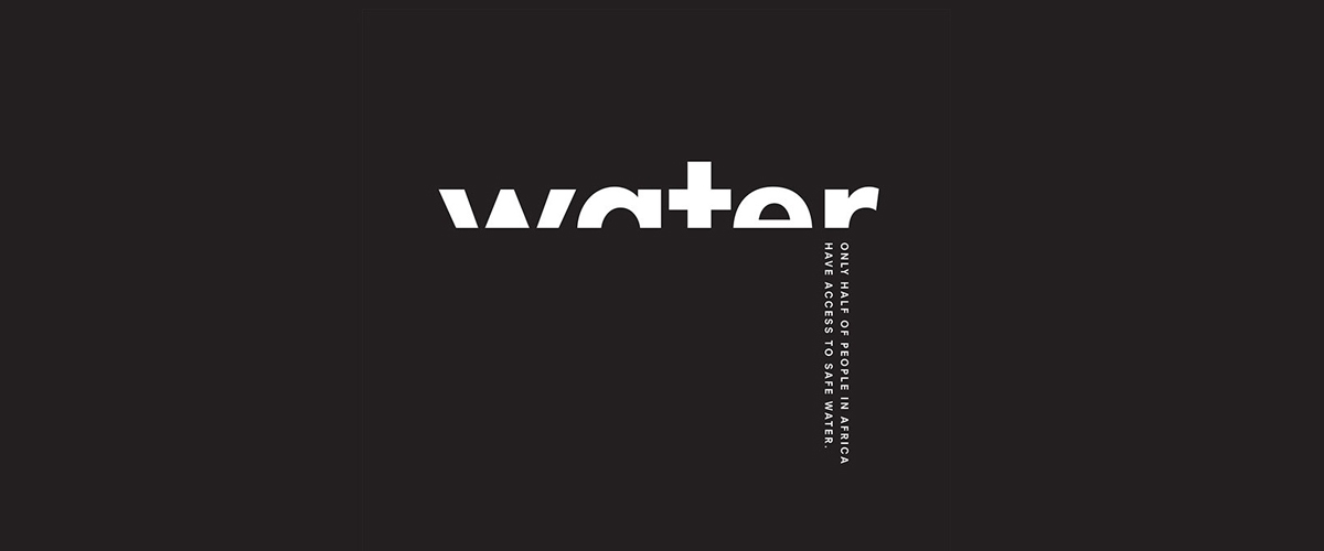
One way of getting better at minimalist design is by deriving meaning and symbols and putting them in your design. Through symbolism you can get rid of the unnecessary design and text and can put the message through one symbol. The example above shows the visuals metaphorically illustrating the text and the concept.
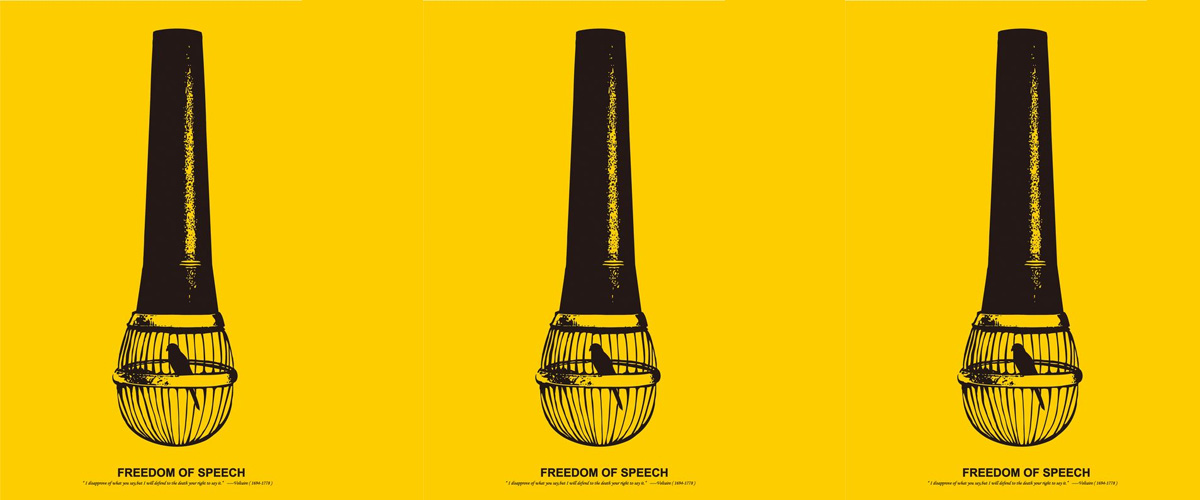
Color and contrast is also an important element of minimalistic designs. The use of colors and contract can instantly attract attention. Use of solid contrast colors makes the design more engaging than a black and white design. Look at the image and you’ll understand the impact that colors and contrast bring in a design.

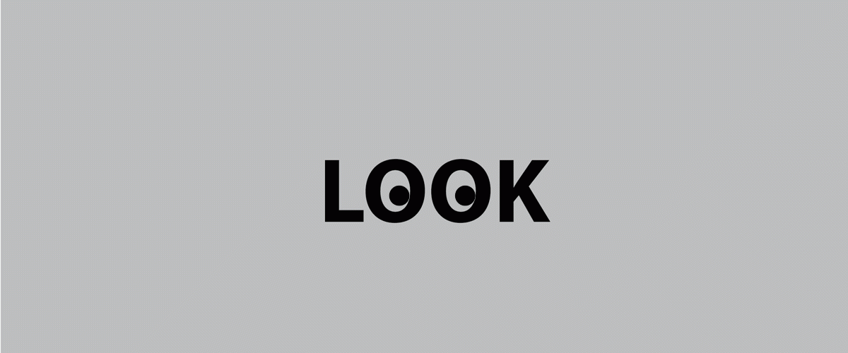
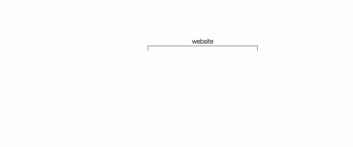
Minimalism doesn’t always need illustrations to show its magic. As stated from the word itself, the concept is about embracing the most necessary elements. You can design a powerful message through typography too. Look at the above images for instance, the designers have brilliantly used typography to create a design and communicate with the target audience.
Related Posts
16+ Graduation Banners - PSD, AI, Vector EPS ...
21+ Real Estate Brochure Designs, PSD Download ...
50+ Package PSD Templates - Premium PSD ...
15+ One Page Drupal Themes & Templates ...
20+ Bat Makeup Designs, Trends, Ideas - Premium ...
31+ Minimal Necklace Designs Jewelry Designs ...
20+ Space Saving Bedroom Designs, Decorating Ideas Design ...
9+ Best Architecture Logo Designs - Premium PSD ...
11+ Book Store WordPress Themes & Templates ...
19+ Rustic Living Room Designs, Decorating Ideas ...
10 Cool Tennis Bracelet Designs, Ideas - Premium ...
55+ Brochure Designs - Printable PSD, AI, InDesign, Vector EPS ...
15+ Workspace Mockups - Free PSD, PNG, Vector EPS Format ...
16+ Concert Flyers - Premium PSD, Vector ...
10+ Colorful Gift Card Designs - Premium PSD ...