
Minimalism is more a principle than a visual style. It is a commitment to only use the most essential elements, including basic shapes and limited color palettes, in order to create something that simple yet memorable. This design can be done with even the simplest tools and software, but no other art or design can compare to the impact that it can create. Understanding and utilizing minimalist design is a valuable skill that every aspiring or experienced graphic or visual designer can use to stand out…
Exploring Minimalism
Minimalist design is taking over because it works. The style is so simple that users don’t have to think much about it. They’re just pleased by what they’re seeing. The burden is carried by the designers who put a bit more thought and planning into creating something that looks so easy. However, its benefits are worth the sweat.
- Minimalistic designs are created around the content, which means that focus and purpose are key when it comes to making the style work.
- It works in responsive environments. You won’t have to worry about shrinking and stretching your elements to make it work, it just will.
- It’s fast. Since minimalism focuses on less information, your audience will be able to digest your data quicker.
- It’s timeless. Because minimalism is innately sophisticated, you won’t have to worry about it looking outdated seasons from now, since elegance will not be a trend.
- Simplicity can help you achieve better quality print, with less worry about colors or bleeds or improper cuts.
- Minimalistic designs will stand out against all the other clutter designs because it’s different. It’s fresh. It’s new to the public’s eyes. Stick your design beside others and witness how yours will grab the eye of passersby first.
How to Design Minimally
The most important thing when it comes to designing minimally is to always have a purpose, which might sound easy until you are faced with about a hundred design options from which you can’t seem to choose. Every element, color, and font in a minimalist design needs to have a reason for being there. There is no space for your whims here. Start your project with a goal, and proceed with these elements:
1. Contrast
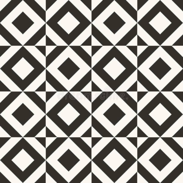
Black and white schemes are the most popular contrasting elements, which is why they’re a constant presence in minimalistic designs. Embrace the concept of yin and yang. Anything with high-level contrast works – large and small texts or images, open spaces and a single focused element, other colors with plenty of contrast, stark design with an elaborate typeface. You will need at least two of these to achieve an effective minimalist design.
2. Space
Minimalism is built on space. In fact, the concept revolves around the need for it. Of course, this doesn’t mean that you will have to include massive amounts of white space, but at least leave enough for your elements to breathe. Each piece in the design puzzle must have enough room to stand on its own in the design. Its own spotlight, if you must. This can’t be achieved if there are too many of the same elements in the big picture.
3. Organization
The roots of minimalism are founded by lines, rectangles, and stylish uniformity. Every line you will see in a design impacts how users will feel towards it. You should have some sort of grid to keep you organized and to make sure that your design remains harmonious.
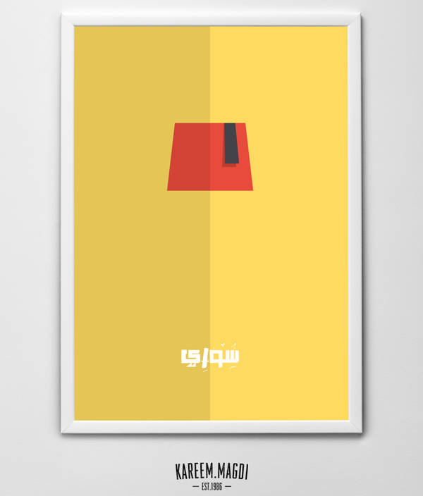
4. Color
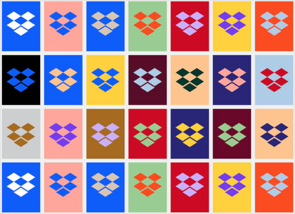
Contrast and color are often regarded as one when it comes to minimalist design, but they are actually separate visuals. Colors can create contrast, but it’s not the only element with that ability. There’s also the misconception that minimalism can only include black and white. The palette should be streamlined. Minimalist designers are encouraged to try to stick to a single hue or framework, but it doesn’t limit them to black and white.
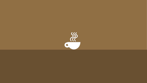
5. Dominant Visual

Pick one thing and make it dominant. Minimalism is as simple as that. Take one visual element, such as your brand’s logo, and make it your design’s main focus. It can be an image, a block of text, or a visual with a surprising color. This can help guide your audience’s eyes towards the part of your design that matters most.
6. Typography
The most common usage in most minimalist frameworks is sans serif typography font, which is a great option, but you don’t have to use it if you can find a type that will work better for you. Preferably one that has clean lines and simple strokes. Curlicues aren’t always the top choice for this, but if you can make it work, be our guest. If you are using type as the dominant element, consider a typeface with more personality and flourish for contrast.
Conclusion
In a world full of blatant excesses, minimalism is a breath of fresh air. This timeless design concept has been present in various eras throughout human history, but now it comes to us with a name. Minimalism offers a new perspective from which we can view design. Heavy textures, bright colors, and a plethora of visual elements are no longer the definition of style. Today, we embrace white space, unobtrusive boldness, and soft hues to achieve a light elegance that is both pretty and functional.
Related Posts
Beautiful Manga Designs
Top UX Design Trends to look for in 2016 Graphic
89+ Glass Textures, Patterns, Backgrounds
30+ Creative Pharmacy Logo Designs
30+ HD Water Wallpapers
20+ Dove Logo Designs
20+ Marble Textures
19+ Birthday Greeting Cards
16+ Galaxy T Shirt Designs
16+ Cotton Textures
Top 10 Restaurant Menu Designs
Best Web Designs Graphic s
60+ Photoshop Brushes
60+ T-Shirt Designs, Ideas
33+ Burger Logo Designs, Ideas