KKaraoke has gone a long way since it was first introduced in Japan during the 1970s, and it has also become one of the most common ways that a singing talent is discovered. The popularity of karaoke has reached the western parts of the world, and partly because it has become a good pastime for persons—including those who are not so gifted with the singing talent—and it has also been seen to be a very good method of bringing people from different generations together.
Let’s face it, who doesn’t enjoy karaoke? It’s fun, it’s entertaining, and some even find it either silly or amazing knowing that it brings out confidence to even the shyest people and those who actually have no talent in singing. So whether you are planning on opening a karaoke place or hosting a karaoke-themed party, we may just have a marketing tool just for you. Below is a collection of various karaoke poster designs that we have gathered from the Internet, and we will give you the freedom to scan through all of them. Go ahead and check them out when you’re ready.
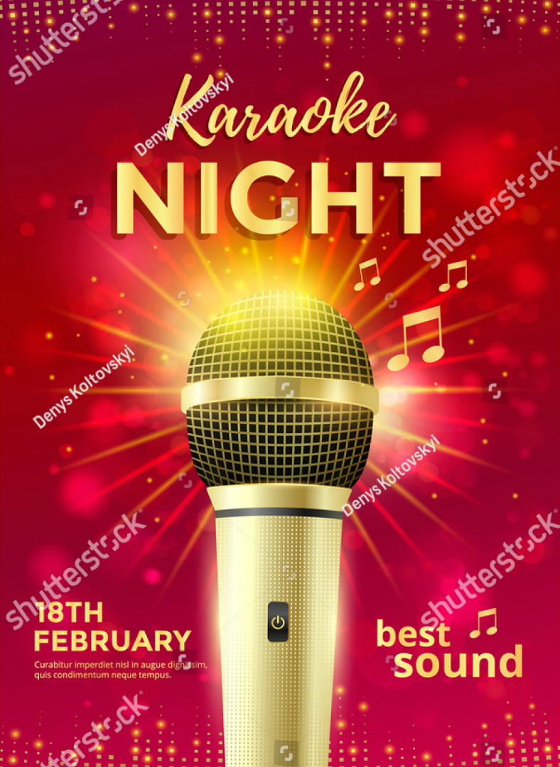
Golden Microphone Karaoke Poster Design
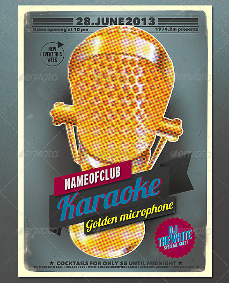
Let’s start off this collection with this vintage poster design that features a golden microphone. This is an effective poster design for inviting those with a golden voice to come and sing at this event, but it doesn’t mean that those who lack that gift are not welcome to attend. The entire golden microphone for a golden voice is merely a humorous figure of speech to catch the attention from people.
Flat Typographic Karaoke Poster Design
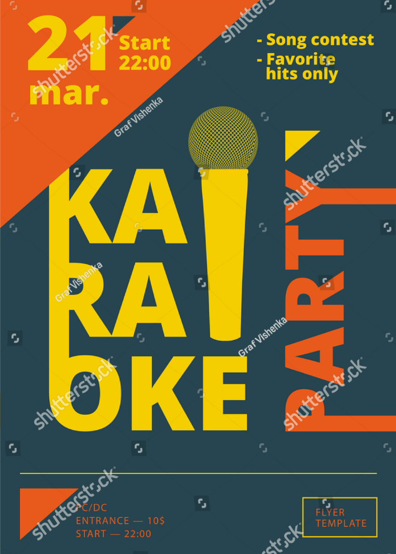
For those who prefer a simpler and easy-to-comprehend poster design, the one above should perfectly suit what you are looking for. It is a flat, typographic karaoke poster design that puts heavy emphasis on the type of event that is about to take place. What’s nice about this design aside from being minimalist is that readers will immediately get the message, which is a vital element to poster designs.
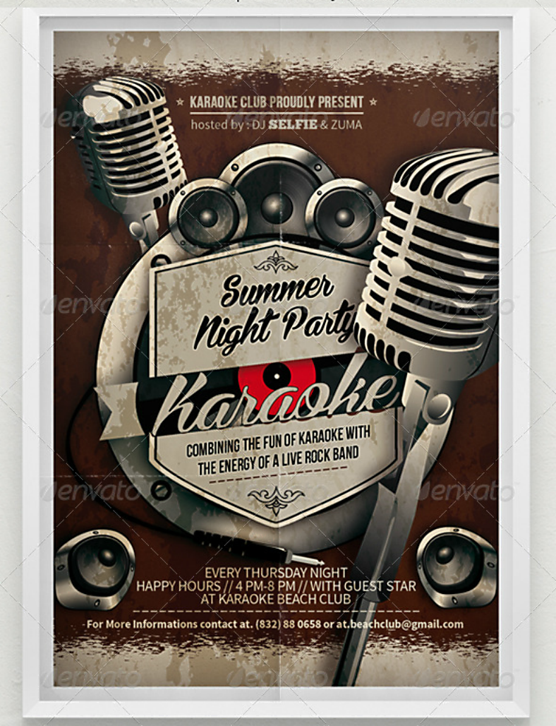
Rustic Summer Night Karaoke Party Poster Design
What Is the Importance of Using Posters?
The use of posters in businesses and the announcement of upcoming events have been proven an effective strategy since the ancient times, which is the reason why it is still being used up to this day even with all the digital alternatives available. Back in the days, posters were already used for public announcements, and it is even considered as the very first form of advertisement. But these posters were actually hand-made and required a lot of effort for them to be visually appealing.
The reason behind its importance is because other than just being effective in reaching its target, the process of making posters is actually easy and cost-efficient. The business or organization that wishes to use posters will only require a graphic artist or someone who has sufficient knowledge in creating designs, a printer capable of printing in large scale or they can also have their design printed at a printing company.
Another reason is that posters have been proven effective at encouraging those who view it into making a response. But this will depend on the design of the poster, which is why it is best not to take the design for granted. Below is a list of a few guidelines to help you out in the process of designing posters, make sure to read it first before you actually proceed to downloading any of these designs.
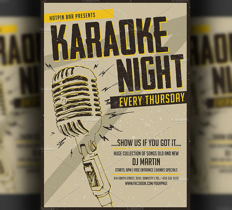
Dazzling Microphone Karaoke Night Poster Design
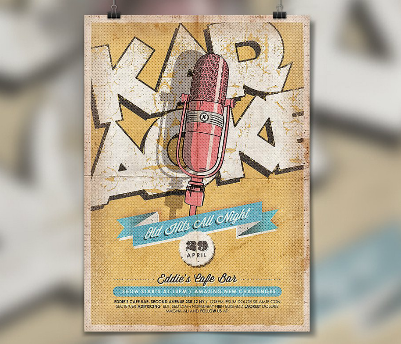
Retro Karaoke Weekend Poster Design
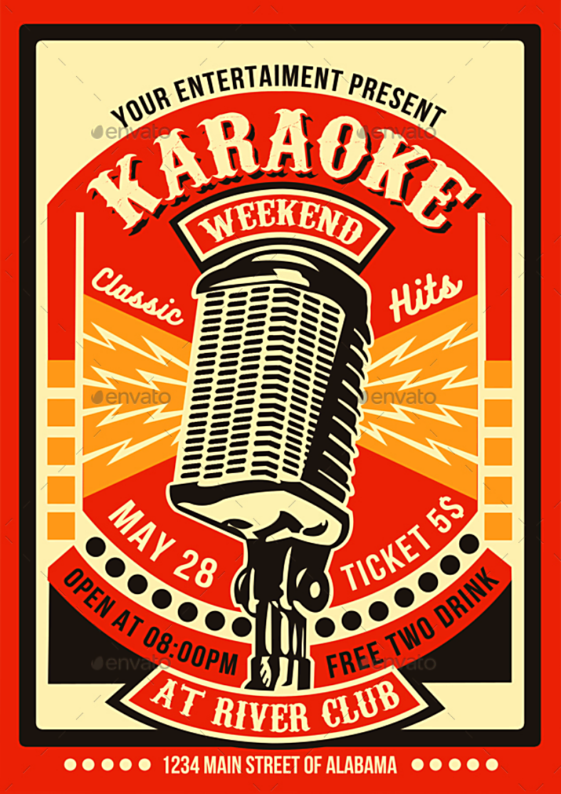
Here is an artistic retro-themed karaoke poster that effectively uses contrasting colors to create a depth in the design. Everything about this design just screams retro, from the color scheme used to the microphone illustration and the choice of font. This karaoke poster design is sure to capture people’s attention with its vibrant colors and the way the elements are being presented.
Vintage Microphone Karaoke Poster Design
What Is the History behind the Use of Posters?
The use of posters is actually the earliest form of advertisement, and its use began during the early 19th century. Since posters were intended to be clear and legible even at a distance, they heavily influenced the use of typography. After it was first introduced, its popularity spread quickly all over the world and it was then used by everyone who wanted to advertise something to the general public. Though the process of making posters was difficult during that time, the result was remarkable and it proved to be very effective in delivering the message.
During the start of the first World War, it also started a new purpose for using posters, which is for propaganda. The purpose of posters during the war ranged from raising funds to recruiting soldiers and volunteers, which also resulted in the opposing party’s outrage. In just a span of two years, the United States alone were able to produce an estimated 2,500 poster designs, and a total of around 20,000,000 copies.
The use of posters for artistic purposes became evident after the war, but the style adapted during this time was way different than that prior to the war. These posters were short-lived because of the rise of the second World War, but the posters used here shared a common concept with the media. Posters during this time were easier to create mainly because mass production companies were already in existence, and these companies were tasked at creating poster designs and printing them.
After World War II came the return of the more traditional posters, with its purpose mainly to advertise and promote. There were two distinct styles of posters during this time: consumer posters which were livelier and made use of bright colors, and the corporate posters which were more formal and emphasized heavily on the text, and this resulted to it being called the international typographic poster style. The consumer posters aimed to appeal to a broader audience with its lighthearted theme, and presented various products and services in a rather attention-grabbing manner. The corporate posters, on the other hand, were more structured and systematic in its presentation.
The 1960s saw yet another change in the style of poster designs, and these ones adapted heavily from surrealism, expressionism, and the pop art movement. These poster designs appeared to be more instinctive and relaxed than the previous styles. But by the 1980s, it paved the way to the post-modernist style which broke the norms that were first practiced with the corporate style of posters during the end of the second World War. These posters focused more on graphics but were highly experimental.
Today, the look and the role of posters in our society is very different than it was during its inception, and it still continues to evolve depending on the constant changing needs of the public.
Microphone Cone Summer Karaoke Poster Design
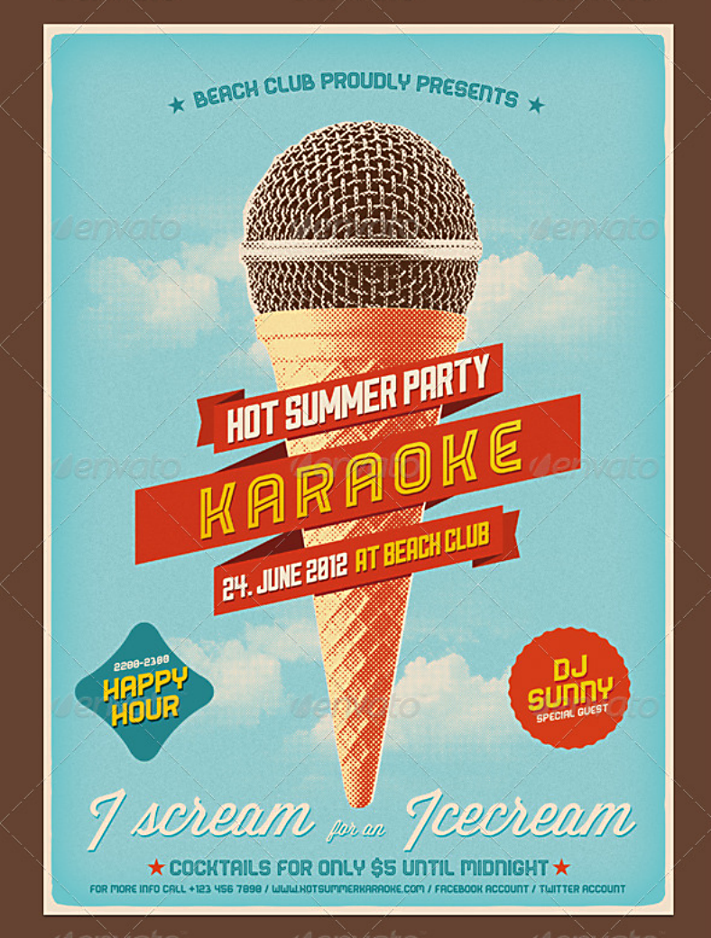
Here is a funny-looking yet sensible vintage poster design that uses a double entendre element to illustrate two concepts. The main purpose of this karaoke poster design is to promote a karaoke event just in time for the summer, and it is being illustrated here by showing a microphone with a waffle cone as its handle. The background of this poster design also supports the summer theme by showing a bright blue cloudy sky, which is something you’d commonly see during the summer season.
Hand-Drawn Microphone Karaoke Poster Design
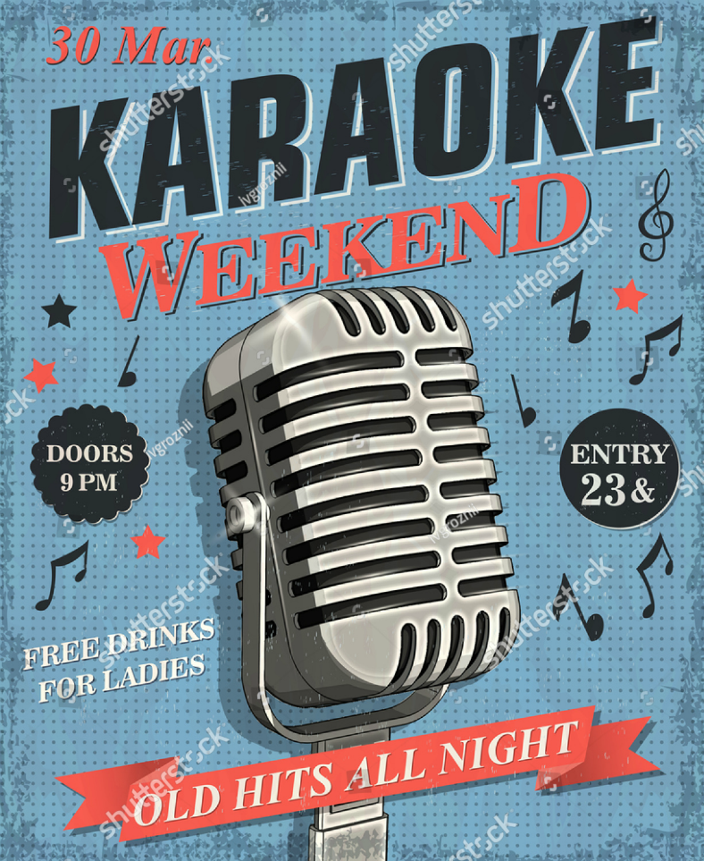
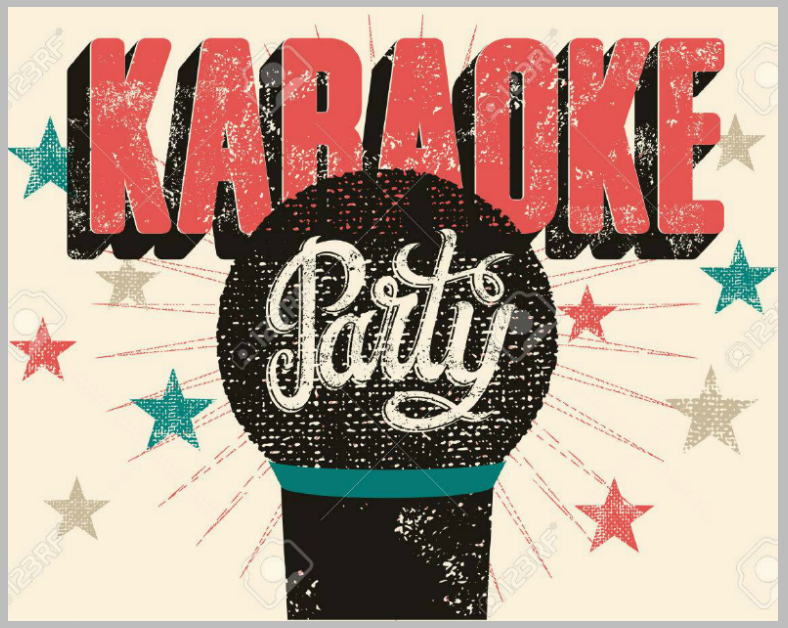
Vintage Dotted Karaoke Poster Design
What Is the Origin of Karaoke?
Ever since the ability to record music and sounds were introduced, the idea of creating studio-recorded music without the main vocal track was already in existence, and these were being used when artists find it impractical to perform with an actual live band. But the earliest and closest thing that resembled today’s karaoke came in the form of a television show called Sing Along with Mitch which ran from 1961 to 1966. This show featured superimposed lyrics at the bottom of the screen to encourage viewers to participate in the singing of their songs.
In 1971, a karaoke-like machine was invented by a Japanese musician and was produced by the audio company Clarion. This machine worked similar to a tape recorder and contained songs that can be played for a price. Though it initially received a negative impression because of the lack of a live performance and the price for playing a song was somewhat expensive during the time, it also became a highly popular form of entertainment and that popularity overshadowed its initial impression.
During the 1990s, after becoming famous in Japan, its fame soon spread all around Asia first before spreading to all the rest of the countries worldwide. Though karaoke machines for household use were already invented, it was not as successful in the United States and Canada as it was in Asia. Because of this, its creators marketed karaoke machines as a side feature to home theater systems. But as the number of music grew for karaoke machines, many from within the business saw it as a profitable form of entertainment at nightclubs and bars.
Jazz Microphone Karaoke Contest Poster Design
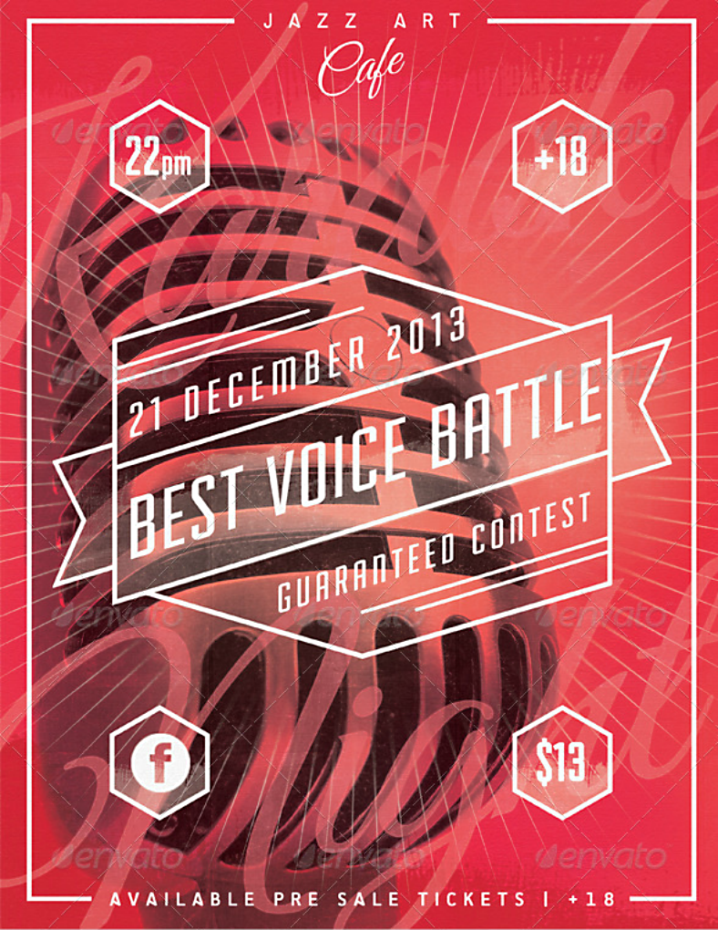
Check out this layered karaoke poster design which is intended for gathering an audience to witness a singing contest. This poster design features a semi-transparent layer where the text is written using a white-colored font. Behind that layer is an image of a vintage dynamic vocal microphone, which was a common type of microphone used during the 1930s, but this type of microphone is actually still being used today by jazz singers. If you choose to go with this karaoke/concert poster design, you will also be getting banners and cover photo designs for social media use, and all that for as low as $6.00.
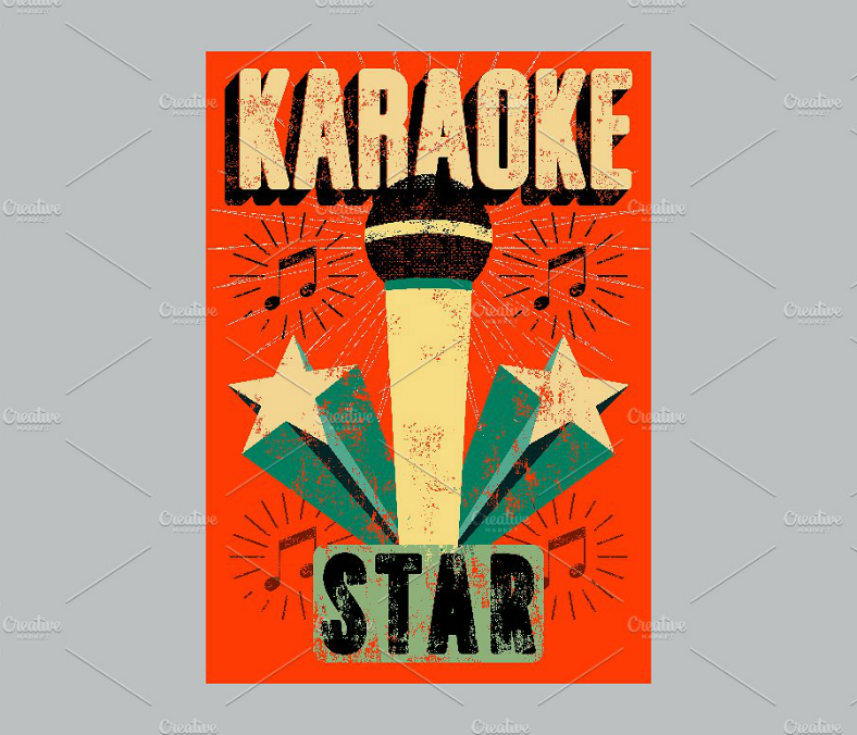
Starred Typographic Karaoke Poster Design
What to Do and What Not to Do in Poster Designs?
- DO make the message of the poster crystal clear, and we are not referring to the legibility but the clarity of the idea. The best way to do this is by focusing only on a single message. DON’T leave people scratching their heads after reading your poster.
- DO embrace simplicity in your design, and keep it clean by leaving enough white space. DON’T go over the top with the design since this will most likely result in making it appear cluttered.
- DO balance the use of color, graphics, and typography on the design. DON’T add elements just for the purpose of filling out the spaces.
- DO consider the use of the science of colors on the design. DON’T just add colors by random or by relying solely on your personal preferences.
- DO experiment with different font types, but keep your number of fonts limited to two or three for a single design. DON’T use every font type available in your collection.
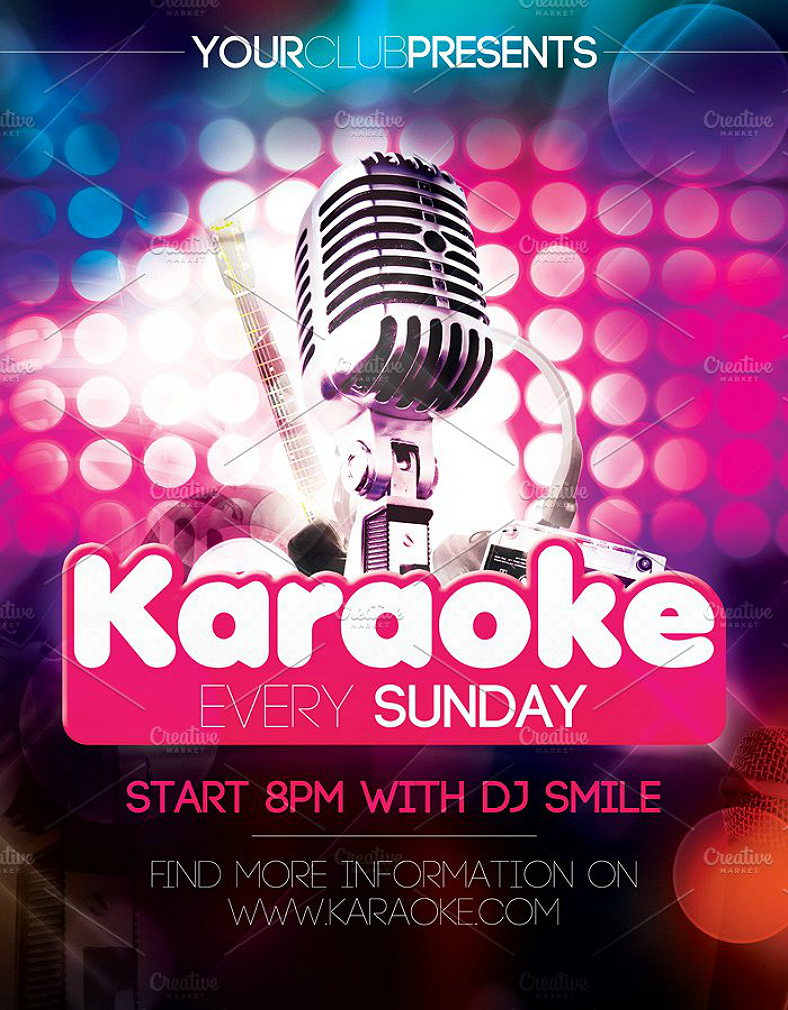
Sunday Karaoke Party Poster Design
Grungy Retro-Styled Karaoke Party Poster Design
Here is another retro-themed karaoke poster design that you may like, and this one also has an added grunge theme to it. Once again, this poster design leans more toward the simple side and places heavy emphasis on the typography.
How to Make the Most in Poster Marketing?
- Invest on high quality posters to get the impression of being professional and sincere.
- Connect with the people and understand their demands.
- The basis and inspiration from your poster’s design should be taken from the wants and needs of the target audience, not from your own.
- Don’t be afraid to experiment and become creative in your poster design, it’s always about taking the risk in order for you to stand out and be noticed.
- Proofreading is a must. It is very important to proofread your work if you don’t want to get the impression of being lazy and unprofessional.
Clean Minimalist Karaoke Poster Design
You can never have too much white space on a design, and the karaoke poster design above actually proves that. For those who want to create a minimalist poster design that encourages its viewers to place their focus on just the relevant details without any distractions, then the one above may provide you with what you need. Over all the white space used on this design, the right half simply shows an image of a microphone while the left half is where all the details regarding the party are written.
Retro Starred Karaoke Poster Design
Color Splash Karaoke Poster Design
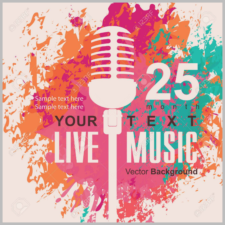
Lastly, a karaoke poster design that plays around with colors and negative space. The background of this design is simply a solid white surface that serves as the canvas for all the various color splashes, and most of the other elements on this design are illustrated using the negative space of the color splashes. Just by the colors alone, this awesome poster design is actually very appealing and is sure to get the attention it needs from the public.
Did you enjoy looking at our collection of colorful and artistic karaoke poster designs? We hope you did since these were created by some of today’s most talented professional graphic artists from all over the world who wish to make high-quality designs conveniently available for everyone. We carefully selected these designs from among the most impressive ones to make sure that we will be able to provide you with the best, and only the best.
Other than just being creative and having an outstanding quality, the editability should also be considered. Fortunately enough, these creative poster designs are fully editable, but you may only be able to enjoy that if you are using the editing software appropriate for it. Now that you know that these poster designs are also easy to edit aside from just being pretty, it makes you want to ask how much these designs cost. These karaoke poster designs are, in fact, priced at a very reasonable rate, and considering their quality, you will actually be getting more than what you’re paying for, which is a very good deal if you ask me. So what’s taking you? Download a design now so you can start making your own karaoke-themed posters.
Related Posts
22+ Quote Poster Designs
16 Vacation Poster Designs
14 St. Patrick’s Day Poster Designs
8+ Sumptuous Food Poster Designs
49+ Printable Christmas Template Designs – PSD, AI, Word
15+ Christmas Party Invitations
Key Elements of Brand Identity Design
Top Trending Designs for Typography in 2023
7 Blog Design Trends Dominating 2023
How to Create Appealing Instagram Stories that Grab Attention
Advertisement Design Trends 2023
Best Designs for Album Covers 2023
12+ Best Web Designs for 2023 – Word, PSD, AI, EPS Vector
Top Best Font Style that Can Be Used in 2023
Best Digital Design Trends of 2023