What does it mean to stay ahead of your competition? That is an important question to ask as the year draws to a close. When looking forward, the best thing to do as a designer would be to try and see which trends are going to dominate in the following year. Described as ‘the general direction that something changes towards,’ trends are significant things to track. They are everywhere and are closely involved with even the most minute of details. You may be certain of specific design elements, but it never hurts to know which ones will stay and which are bound to go.
Few trends that dominated 2017 are still dominant today in 2018, and you can be certain that things will be even more different by the time 2019 comes along. When experts begin making speculations, it may be a prudent decision to pay close attention. Those who want to remain head and shoulders above the competition may want to look into the following design trends:
Store Opening Flyer Template
Expect Vivid Colors to Pop Up More Often
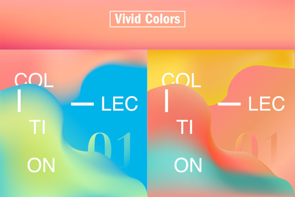
It has been noted by both designers and graphic design enthusiasts that many outputs are becoming more colorful in recent years. This is clearly one trend that is only going to get stronger as time passes, so in 2019 you may expect greater splashes of electric yellows, highly vivid blues, and brilliantly bright corals. When you look at this trend, it looks to stand in sharp contrast with past trends which favor reserved color palettes.
If you aren’t familiar with what is described as ‘vivid colors,’ then an apt description will be those with light hues intended to instantly grab the attention of viewers. The use of such colors are also noted for the sharp intensity increase that it provides. Prominent examples of these would include light shades of blue, pink, and red. Should you glance at graphic design trends outputs that employ such colors, you would no doubt feel a sense of awe wash over you.
Some of those who support this trend are also of the belief that this is an outright rejection of certain minimalism graphic design trends that made an earlier impression back at the turn of the decade. As a result, designers are now fighting to gain the unabashed attention of their audience, making colorful choices like these in the process. If you are of the same mindset, then this trend will surely please you; if not, then there are more for you to take up as revealed below.
The Preference of Function Over Designs
So color-related trends can capture your attention, another trend is looking to dive into the opposite direction. When it comes to the overall design, a rising trend comes in the form of designers apparently favoring a design’s functionality over its style. It becomes simple to the point where some may say designers are no longer concerned with what their logo designs actually look like. What they are concerned with, however, seems to be more on what direct impact a design has on people emotionally, as opposed to what can be called the project’s minute details.
Opponents of this train of thought will decry what looks like the loss of their individuality in for favor of options that can be seen as ‘classical’ at best or ‘boring’ at worst. Those who benefit the most out of this trend will be the industry giants or at least those brands that already have a sizeable following. As recognizable as they already are, these are the ones who can afford the loss of individualism in their designs. Brands that are less well-known may be at a greater risk, so perhaps they ought to keep this in mind.
Designs That Have Futuristic Elements
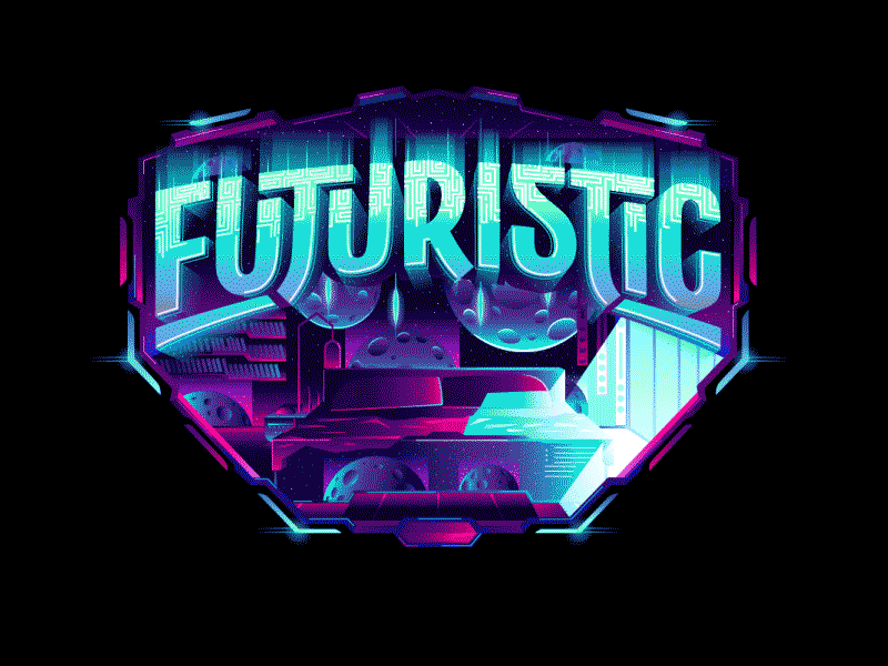
People just love looking into the future, don’t they? In fact, this article alone is proof enough of it. The future is such a tantalizing prospect, to the point where such elements are even taken right into the heart of many graphic design projects. As we head into 2019, you can expect the future to become more and more mainstream. Specifically, Colorful patterns, colors, and ideas that all seem like they are from a far off era will be seen more frequently. Such a trend will no doubt lead to the rise of more unique-looking outputs, which are sure to please those who value individualism over conformity and simplicity.
The Continued Use of Bold Fonts
When we think of trends for the upcoming year, we may think of those that have yet to really gain a lot of momentum. Well, this one is something that already began a few years ago and looks to continue growing stronger and stronger. As a matter of fact, you may have seen this already, particularly from brands like Samsung or Adidas. What is this trend, you ask? Bold fonts. It is as simple as that. Another thing that is simple is how much it can affect viewers as they come across designs that employ bold fonts on social media feeds, billboards, posters, and the like.
Such designs catch your eye and immediately send you its message in an instant. Take note that when it comes to this trend, bold fonts also started out as being a mere supporting element in designs. What does make this trend all the more special is the fact that as 2019 rolls by, it is expected to move out of that shadow and become the true focal point of many projects. Designers who are keen to convey a simple yet powerful and confident message with their designs can look no further than this trend to incorporate.
2018 still has a few weeks left, yet it isn’t too early to think about what is to come. As interesting as this year may have been, the next one is already getting people excited. Naturally, few things are set in stone and what’s been written here may not come to pass entirely as expected. That’s what makes things so wonderful and dynamic. If there is something certain, it is the fact that the aforementioned trends are going to set the design world ablaze, so watch out and stay vigilant.
Related Posts
The Best New Portfolio sites, March 2023
Best Poster Designs 2023: Ideas and Tips
Hit and Miss of Olympic Logo Designs from 1924 till 2023
10 Iconic Moments Photographed in 2023 Rio Olympics
Top 5 Logo Design Trends of 2023
2023 Packaging Design Pentaward Winners
Digital Design Trends for 2023
Best Travel Apps for 2023
9 Script Fonts for 2023
10 Best Free Fonts for 2023
10 Best Mobile Games of 2023
Logo Design Strategies for 2023
Top 9 Web Design Trends for 2023
10 Most Popular Graphic Design Trends of 2023
Visual Design Trends to Look Out in 2023