We all know that a logo largely forms the face of the brand amongst the masses. Along with carrying a unique identification and style, the logos tend to form a visual connect with the audience that is strongly based on the nature of the company or the brand. Whether it is your daily used social networking sites like Facebook or Instagram or the popularly utilized products like Budweiser or Kodak, all have been known to increase the reach with the help of the logos. But, in 2016 a lot of companies, much to the likes and dislike of people decided to refresh their logos either with a new typography, new colors or just changing their complete symbol. We have today compiled a list of 10 such logo re-designs that were successfully accepted by the people.
1. Uber
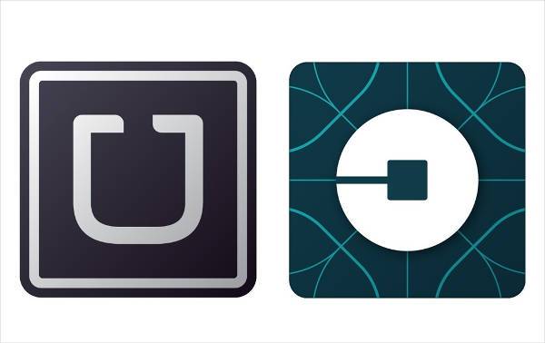
Though the symbols are not entirely different, the change is logo was released along with the launch of new services like Uber Rush, which as of now is only available in Chicago, San Francisco, and New York.
2. Instagram
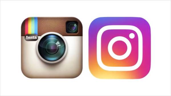
One of the most popular logo redesigns, Instagram went through a colorful rejuvenation in their logo. The colors of the new logo express and refer to the numerous number of new filters that the app offers.
3. The MET
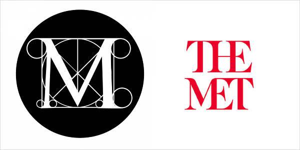
The MET museum changed its logo by rendering a strong visual identity with a bold typography. Although it went through a lot of controversies stating that the logo was copied from the magazine but the logo definitely carries a strong connective value.
4. Netflix
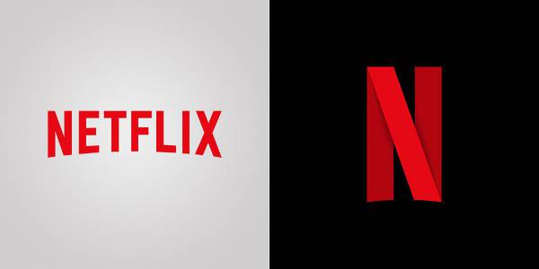
The new logo created with the effect of an N-shaped ribbon describes Netflix. The folded ribbon image lends an optical illusion which furthers the effect of depth in the logo.
5. Mastercard
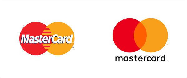
Redesigned with the removal of horizontal stripes from the intersection and the name placed beneath the concentric circles. The first letter of both the words is mentioned in lower case referring to the simplicity of the brand and the credit card.
6. Deliveroo
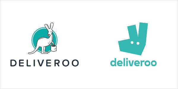
In order to go along with the progression, a new visual aspect of the logo was designed. Along with the new logo, the company also updated HD pictured of the different meals on the website as well as a reflective uniform for their delivery employees.
7. Mozilla
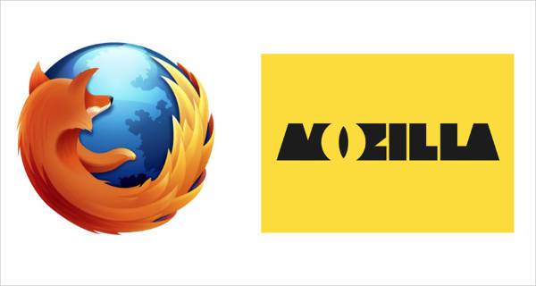
For the new visual identity of the brand, the company along with graphic designer Johnson Banks also called its users to give their opinion on the topic.
8. Kodak
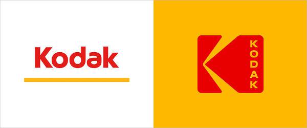
Keeping up with the standard and regular red and yellow color, the brand highlights the typography in its design with a giant K serving the double purpose of the logo and the casual image of the camera.
9. Budweiser
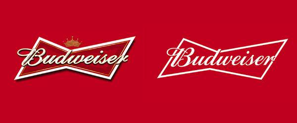
After 140 years of its creation, 2016 Budweiser design its logo with a sleek and a more refined style. The new logo still keeps the original bow tie shape as well as its red color.
10. Pitchfork
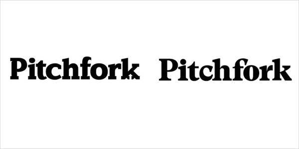
Staying very close to the original logo, Pitchfork decided to separate it from the previous style by eliminating the arrows placed at the base of the final K of the name.
Give a thorough look on the above-mentioned re-designs and let us know which one did you love the most.
Related Posts
Top 11 Email Marketing Trends for 2023
The Best New Portfolio sites, March 2023
Best Poster Designs 2023: Ideas and Tips
Hit and Miss of Olympic Logo Designs from 1924 till 2023
10 Iconic Moments Photographed in 2023 Rio Olympics
Top 5 Logo Design Trends of 2023
2023 Packaging Design Pentaward Winners
Digital Design Trends for 2023
Best Travel Apps for 2023
9 Script Fonts for 2023
10 Best Free Fonts for 2023
10 Best Mobile Games of 2023
Logo Design Strategies for 2023
Top 9 Web Design Trends for 2023
10 Most Popular Graphic Design Trends of 2023