With just a day to go, the internet is flooded with posts regarding the trends that are going to be a hit and miss in 2017. Taking a dive in the similar bandwagon, we have decided to share and predict the 10 individual colors and hued palettes that are going to be the trending favourites in the home interiors the coming year.
1. Intrepid
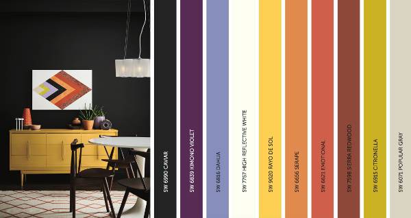
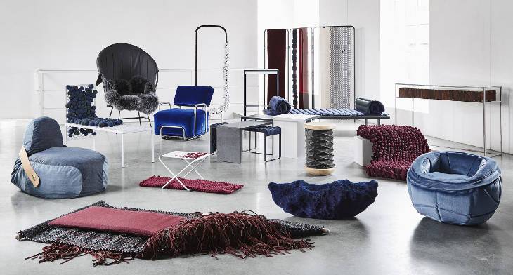
Blurring the virtual and real, the intrepid palette caters to self-expression and vibrancy. Infused with feisty energy, the palette features fiery and vibrant tones and kimono colors.
2. Unbounded
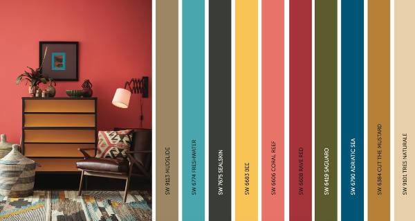
With a touch of dissolving borders and redefining borderlands, the unbound palette is more connective with nature. With everything around us highlighting towards being conscious driven, the palette too expresses just the same with earthy mustards, ocean blues, corals and mud.
3. Holistic
Holistic, along with incorporating a touch of positivity is bringing out the good with an environment-friendly travel and living. The palette beautifully expresses the same with arctic neutrals, blush rose and wild browns.
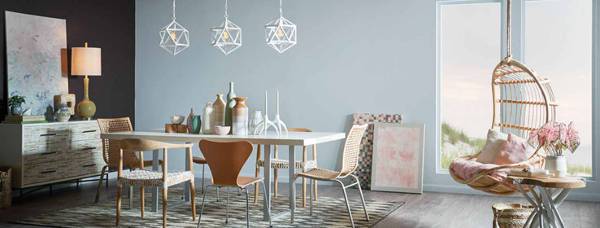
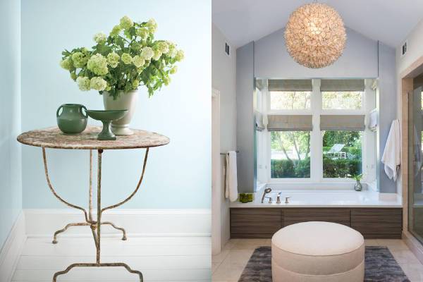
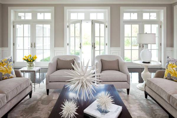
4. Gray
Gray, being one of the softest and neutral shades has started to gain prominence in the homes and the runways. It will continue its presence the coming year with a bit warmer hue. Mirroring the look of cement, new beginnings, and a clean slate, the color acts as a great complementing choice to bold and vibrant hues.
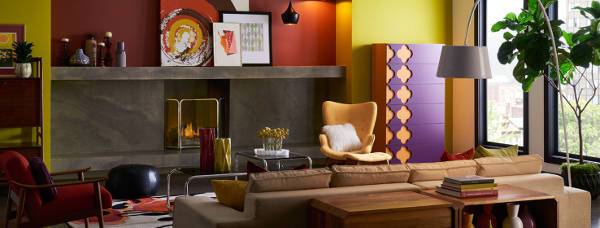
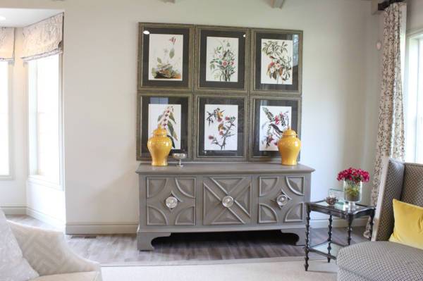
5. Forever Young
Design by Mercedes Corbell Design & Architecture
Expressing its very name, the palette is all about bringing a balance in two or more than two opposing tones. The palette will portray simplicity with a decorative design.
6. A Breath of Fresh Air
Bring natural colors and textures to the forefront, 2017 will see an increase in the use of organic tones that encourage connection, health, and considerate living. With a simple balance and disconnect from the digital arena, the palette talks about getting back to the basics.
7. Confident Blue Green
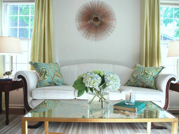
Green-hued with a hint of blue is the perfect color to opt if you are looking to bring a bit of drama and character to your home. Saturated with complementing tones, the color also expresses a connect with nature and the surroundings.
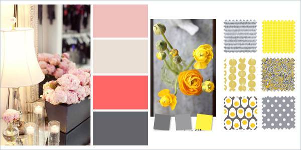
8. Sunshine Yellow
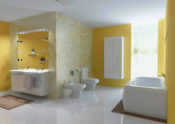
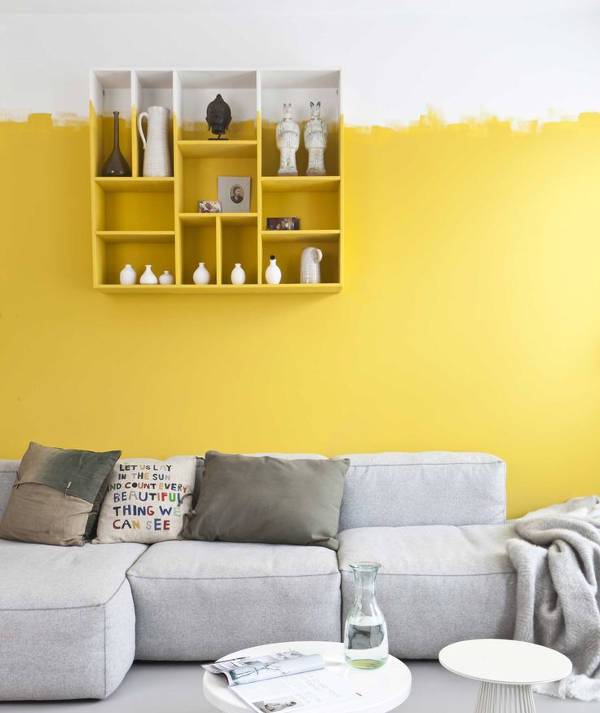
We agree that this might seem odd at the first glance, and painting your floor lemon yellow is certainly a huge risk, but trust us this is one risk that can completely transform the look of your space. If you are reluctant to try on the complete floor, try and begin with small corners and portions of your room.
9. Taupe Beige
Holding a close connection to soft and neutral tones, the taupe beige is one color alternative that will effortlessly add a timeless charm to your space. The simple neutral hue also gives you plenty of options to experiment with the decor.
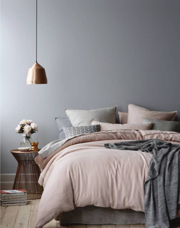
10. Pastel Pink
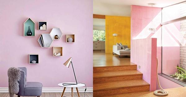
Rose is definitely not going anywhere whether it is with upcoming fashion or upcoming interior choices. The feminine shade holds the potential to accentuate the space’s natural light.
First, give a thorough thought to all the trending options and then choose the color palette that best complements the decor and personality of your space.
Related Posts
10 Mid Century Living Room Decor Ideas, Designs ...
10 Inspiring Zodiac Based Wall Art Designs ...
Best Travel Themed Home Decor Accessories ...
21 Interior Hacks - Premium PSD, Vector Downloads
6 Easy DIY Vase Designs to Try at Home - Premium ...
10 Amazing DIY Design Tools - Premium PSD ...
10 Ways To Cleverly Use Maps In Your Home Decor Design ...
21+ Bedroom Accent Wall Colour Designs, Decor Ideas Design ...
10 Dog Themed Home Decor Goods - Premium ...
9 Ways to Style Your Furniture With Washi Tape ...
35 Modern Interior 2016 - Premium ...
10 Ways to Revamp the Staircase in Your Home ...
10 Industrial Style Interior Ideas - Premium PSD ...
Elegant Crystal Light Decor Ideas - Premium PSD ...
7 Ways to Reuse Old Aluminium Cans - Premium ...