We know, we know, who would pay attention to the branding while having a glass full of beer. But, just for some fun and informational design purposes, we would like to inform you that there are many creative craft beer branding companies that are competing to push the graphical boundaries to make their product stand out at a visual level.
With several companies coming up with original designs to catch the attention of the viewer, has literally driven us to enlist the top ten visually interesting collection of beer branding images that actually sealed the bottle deal.
1. Flesh and Blood Title Branding
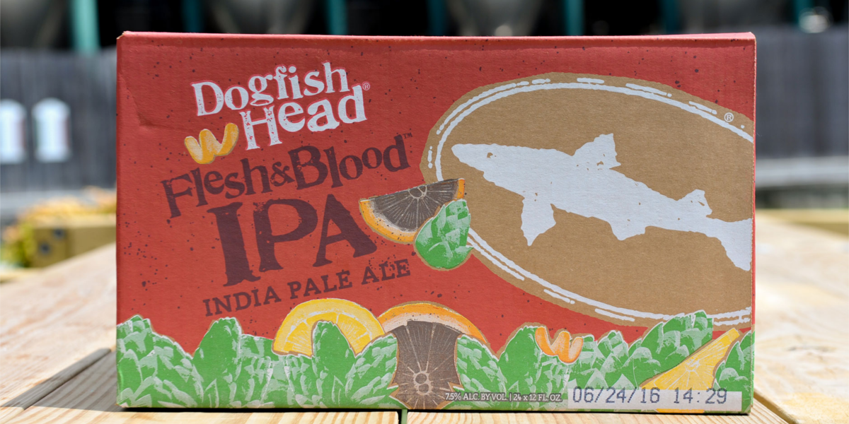
With the disconnected visual and unconventional name, the beer carries fruity illustrations of oranges, lemons and plants, none of which are equivalent to the name- Fresh & Blood. The illustrations on the bottles have an additional storytelling and experimental elements giving more information to the user about the beer.
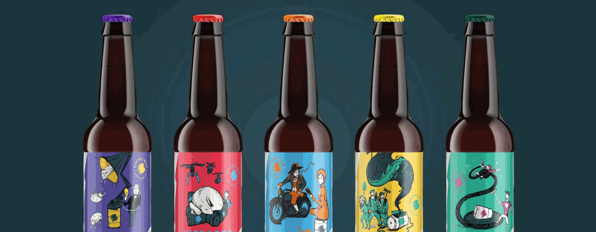
2. Cartoon Packaging Branding
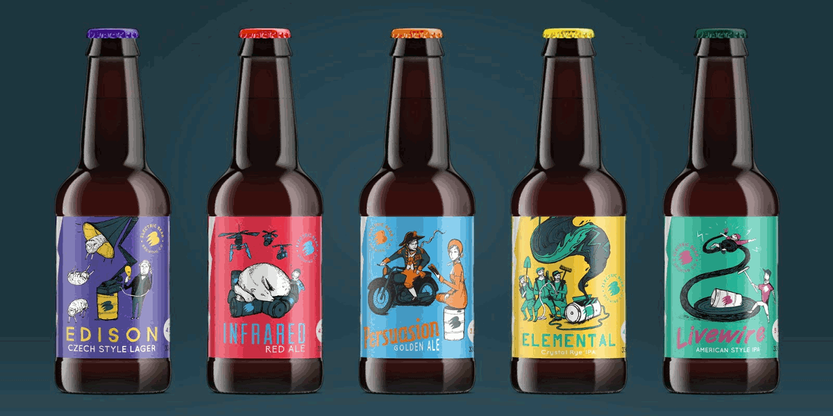
Electric Bear Brewing Company cartooned its branding route , with a line of bold and brightly coloured funky illustrations on the stickers of the alcoholic drinks. This Kingdom & Sparrow’s cartoon beer packaging with comical illustrations makes its product stand out amongst the vast range of brews. If you look closely you will see animated characters stuck in the dramatic setups. The pop of colours further makes the label more vibrant while also spurring conversations over drinks.
3. Vibrant and Contrasting Design Branding
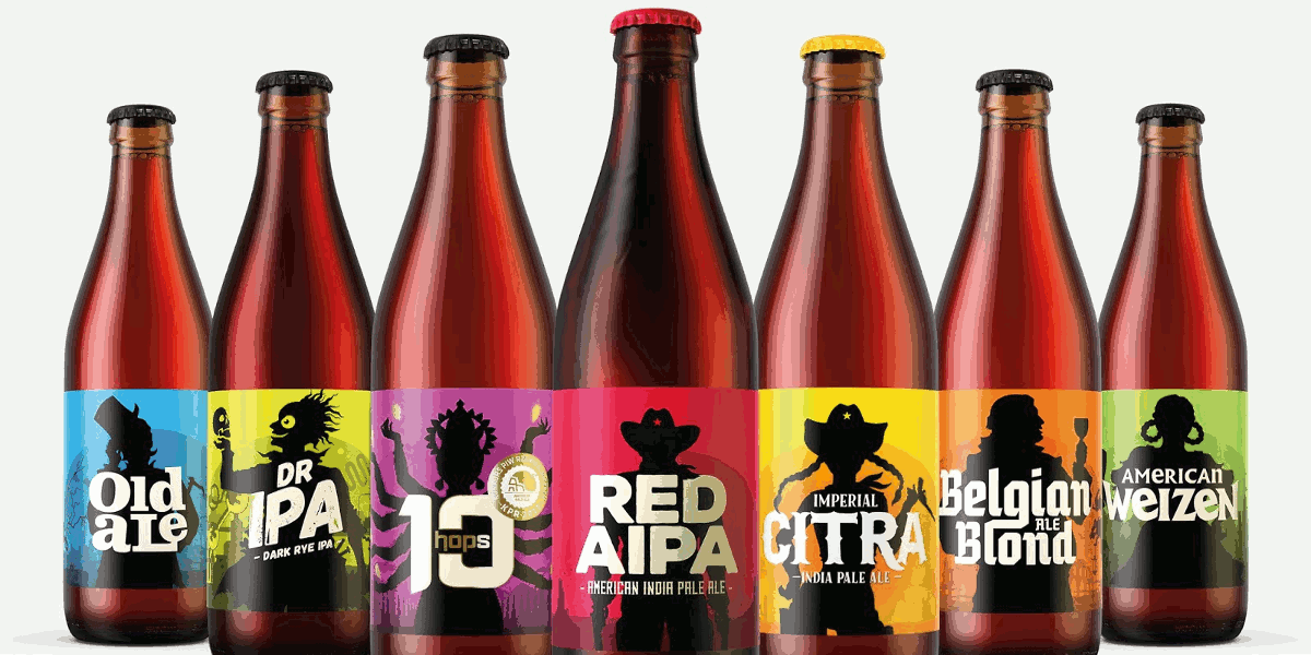
Created and designed by Birbant Brewery, the packaging of the beers features bright coloured labels with silhouettes that are made up of cowboys, cowgirls, monsters, Hindu goddess Durga and more. The design developed on red tinted bottles is kept plain and simple in its appeal. Another, not so simple series of labels designed by Birbant Brewery features unconventional vibrant designs with sailor inspired graphics and titles like Curry Wurst and Miss Big Foot.
4. Quirky Assembled Design Branding
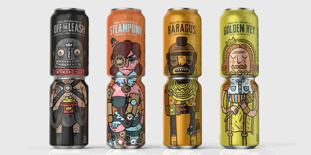
It is common knowledge that cans because of the small lip can be stacked on top of each other. Well, some packaging design companies have taken advantage of this common knowledge by making stacking a central feature of their design. For- Off the Leash, Baracus, Golden Rey and Steampunk beers, Noble Rey Brewing Co, the company decided to design a two-part design with one part illustrated in one can and the second in another. These quirky designs and characters can be completed after assembling one can on top of another.
5. Branding With the Element of Artificial Intelligence
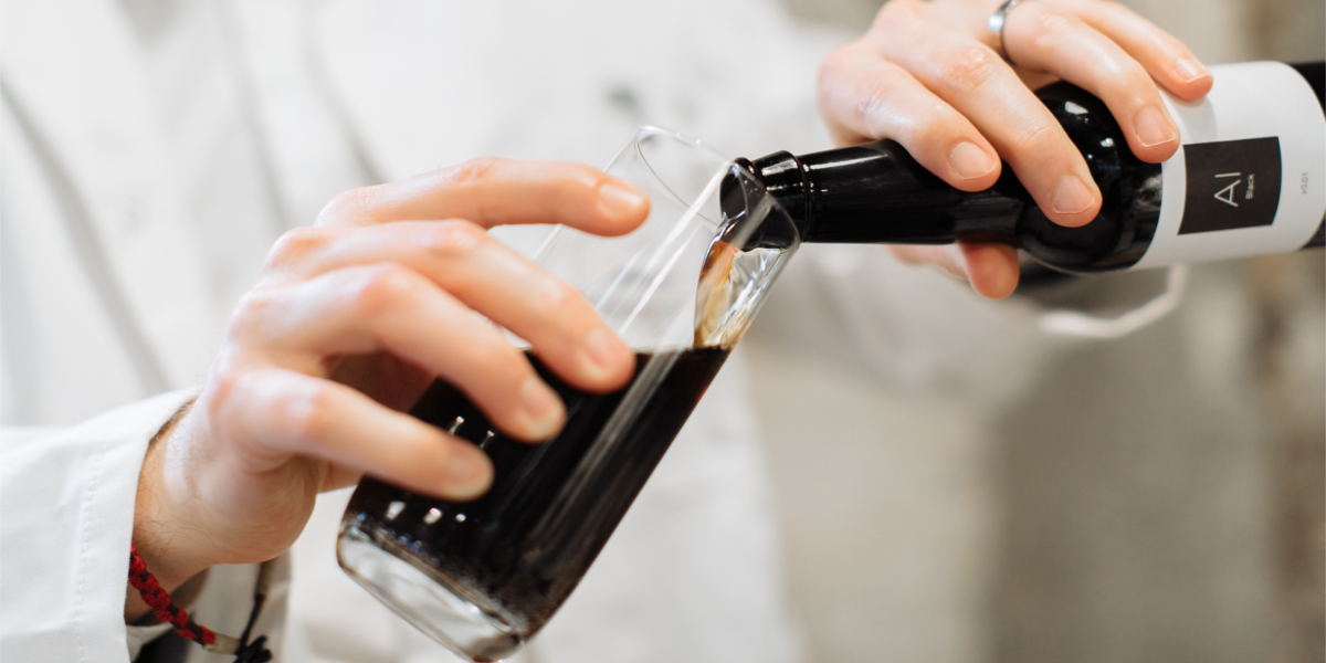
The IntelligentX Brewing Company in collaboration with start-up Intelligent Layer and the 10x agency has brought artificial intelligence to the design label of the beer brewing.
Until now, IntelligentX has created Amber, Black, Golden and Pale beer types using this cutting-edge AI technology. IntellegientX based on the feedback received from customers on Facebook messenger has developed an algorithm known as ABI and also regularly updates the design as per the demands.
6. Fictional Character Design Branding
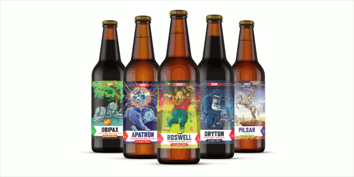
Poland’s ‘Probus Brewery’ created fictional characters for its beer labels. The labels were designed by ‘FLOV Creative Agency’ with an idea of evoking interest in lovers of craft beers. Each label carries an artistic and detailed design with a number of characters and settings. All the fictional characters featured on the label have taken inspiration from Sci Fi. These unconventional labels definitely catch the attention of the consumer with its specific and target-based design.
7. Seasonal Power Branding
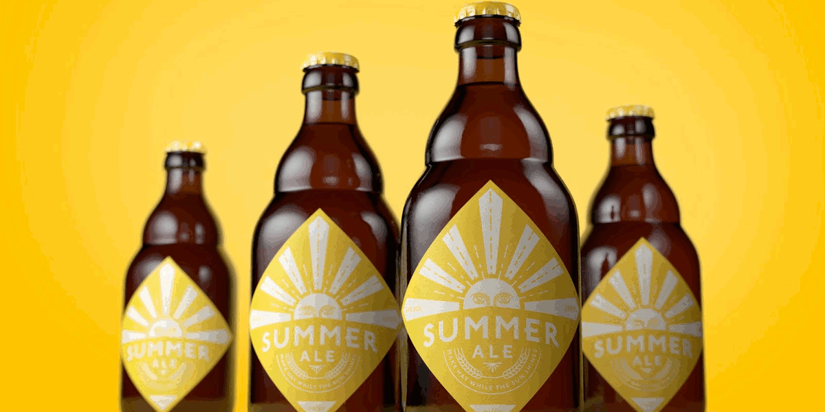
Perfectly reflecting the name, the design features a bright yellow, diamond-shaped sticker that symbolises the illustration of the sun. The Summer Ale bottles are bigger in size than the traditional bottles and carry an unusual curved design. The company with its very graphical illustration and colour reassures the idea of the best drink for summers.
8. Branding With Literal Interpretation of Graphic
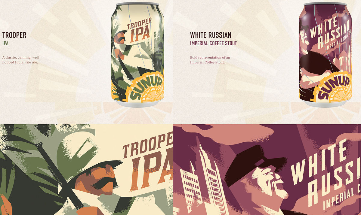
Partially graphical and textural, the packaging of North Carolina-based ‘SunUp Brewing Company,’ is as unique as vibrant. With titles such as “Bearded Blonde, Tanline Brown Ale, White Russian, Trooper IPA and Red Flash offering the literal interpretation of the graphics on the bottles and cans.
9. Sketched Beer Branding
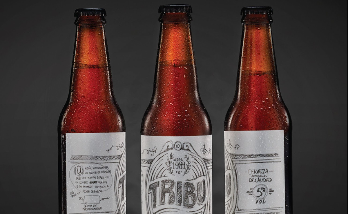
The playful Tribu beer features simple black and white box covered with hand drawn illustrations. Tribu DDBº created the design with the idea of displaying the sketch as the very first stage of executing the final idea. The design showcases how a simple sketch based illustration can carry a potential impact.
10. Sci-Fi Based Branding
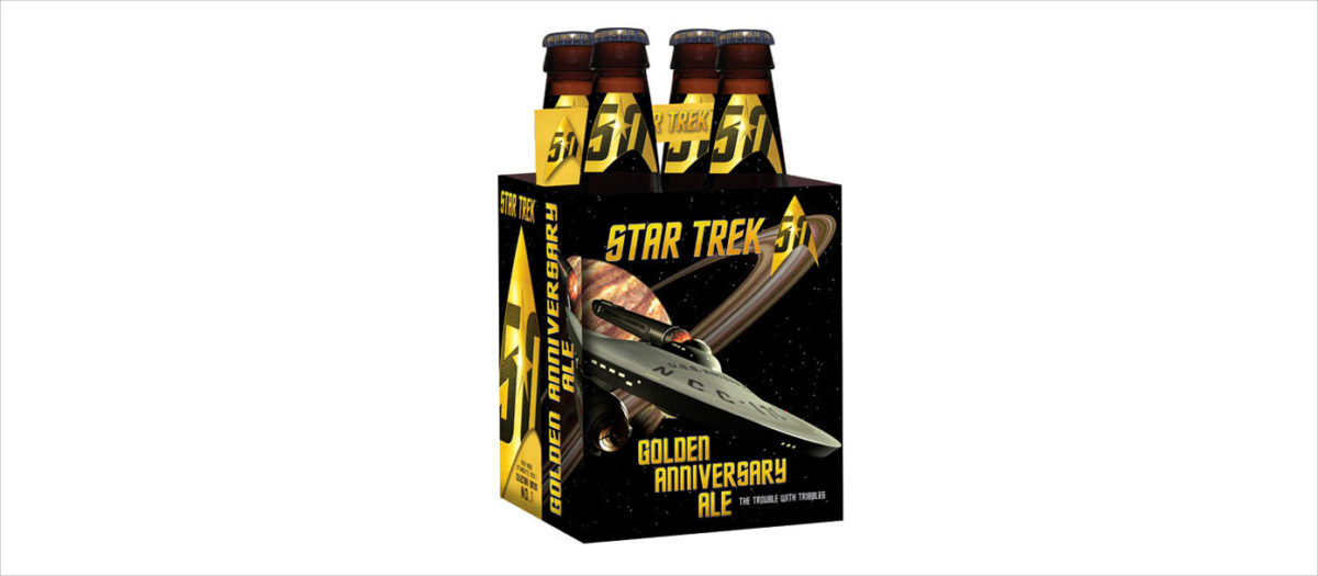
For the celebration of 50th Star Trek anniversary, the Shmaltz Brewing Company commemorated the occasion by designing the labels based on the sci-fi series with product names, packaging and flavour combinations that reflect the enterprise.
From cool and quirky graphics to hand drawn and elaborate graphical illustrations, these craft beer labels for sure have one thing in common and that is the passion for making their product visually captivating with just a single glance.
Related Posts
Top 11 Email Marketing Trends for 2023
The Best New Portfolio sites, March 2023
Best Poster Designs 2023: Ideas and Tips
Hit and Miss of Olympic Logo Designs from 1924 till 2023
10 Iconic Moments Photographed in 2023 Rio Olympics
Top 5 Logo Design Trends of 2023
2023 Packaging Design Pentaward Winners
Digital Design Trends for 2023
Best Travel Apps for 2023
9 Script Fonts for 2023
10 Best Free Fonts for 2023
10 Best Mobile Games of 2023
Logo Design Strategies for 2023
Top 9 Web Design Trends for 2023
10 Most Popular Graphic Design Trends of 2023