
Let’s begin with the basic definition of Negative Space. It is simply that space surrounding an object that constitutes an image. In modern design concepts, negative space assumes as much significance as the object itself and helps define positive space boundaries. This eventually balances the composition evenly. The current trend is the creation of positive shapes and spaces, that subsequently, carve out relevant shapes cleverly in the negative space and that too, intentionally. The results, it goes without saying, are stunning! The following examples will help illustrate the point. Enjoy!
1. Ben Farrow’s Depiction of the Titanic Disaster

One of the most brilliant designs from graphic designer and anthropomorphic artist, Ben Farrow’s design stable, this graphic tells the whole Titanic story on graphic details and brilliantly yet simply, uses negative space. This is also a good example of vector art: It cleverly combines negative space usage with art nouveau for the grand effect of the Titanic’ s hull splitting open as it hit the iceberg.
2. Painting the Universe

Designer Philipp Rietz uses the cosmos to illustrate his talents in making effective use of negative space. The stark white space matches the beautiful, yet eccentric colors of outer space that feels like a million fireworks going off at the same time. The designer uses his imagination and sense of color contrasts most brilliantly to create this memorable color vignette. Truly a visual delight!
3. The Logo of FedEx
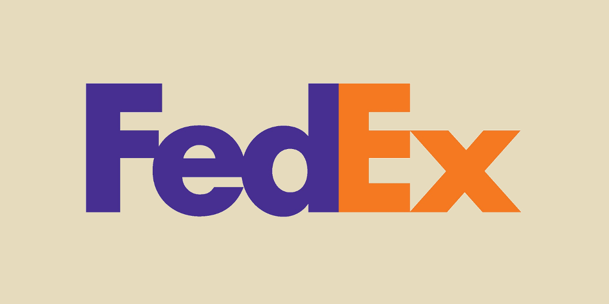
FedEx is the classic example of negative space usage for the maximum effect. Take a closer look at the space between the E alphabet and the X alphabet at the end. Do you see that prominent white arrow? The ‘hidden arrow’ is symbolic of FedEx’s dynamic attributes that permanently keeps its leadership in the courier business. Winner of numerous design awards, this logo features regularly in nearly all ‘best logo’ lists. Lindon Leader designed this “non-decorative, non-cosmetic” logo in 1994 with the objective that branding has to facilitate realization of any client’s strategic marketing objective.
4. Fiat
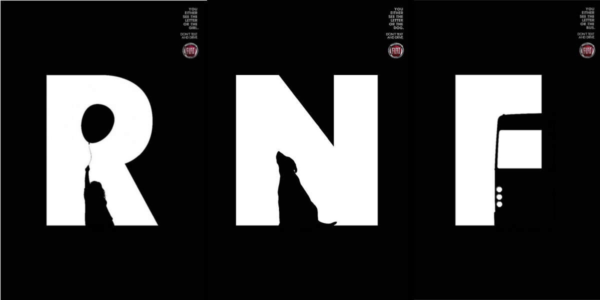
Designed by world famous advertising agency, Leo Burnett’s Brazil office, this logo for auto manufacturer Fiat cleverly uses negative space with maximum impact. The logo was created to make drivers aware that sending text messages while driving is best avoided. Leo Burnett created a 3-print series with the alphabets F, N and R being accompanied by the graphic of a bus, dog and little girl, respectively. Each illustration creates a defining shape of a letterform. The sheer starkness of the black-white contrast has created well defined silhouettes of the dog, girl and bus that managed to hide within the font type. Truly an innovative idea for driving home the perils of texting and driving together.
5. Criminal Underworld
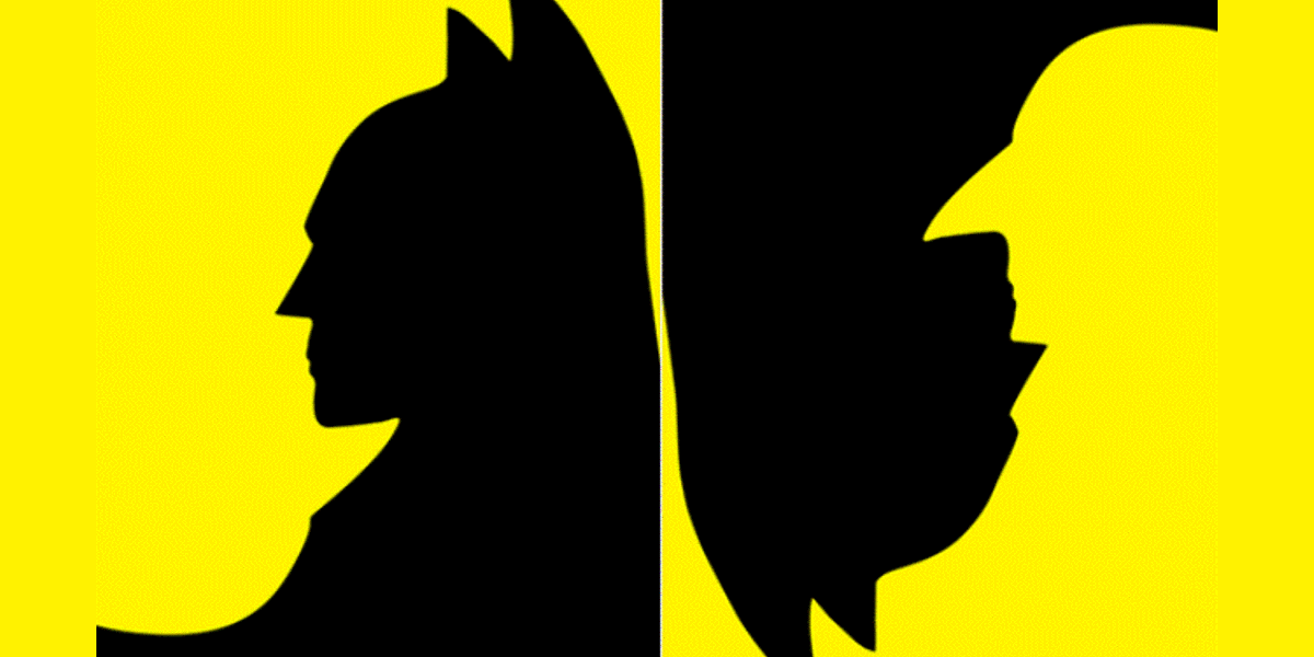
This stark contrast between canary yellow and black sure is eye catching and designer Simon C. Page depicts the relationship between Penguin and Batman to maximum effect using negative space trickily. This is part of the series titled Criminal Underworld and Batman’s bold silhouette has been cleverly inverted in jet black, replete with its bat ears and eye mask while Penguin’s baldness and hawk like nose can be instantly identified also. Sheer genius at work, one would say!
6. The Kama Sutra
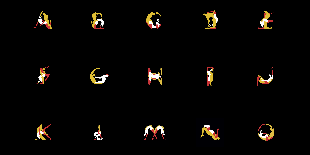
One of illustrator and artist, Malika Favre’s most famous works, this cover design of the “official treatise on love’’ or the Kama Sutra finally came through after much trial and error. Bold colors and graphic shapes take precedence here and Favre gets to the core of her subject by making use of the fewest possible colors and lines as it needed to get the main idea across. All popular sexual positions are clearly depicted through clever incorporation of negative space with the overall design.
7. Edgar Rubin’s

vase in stark black and white has made it to the list of all time classics on negative space usage. The silhouettes of the faces in black is also indeed a prime example of how negative space can be used to create that perfect optical illusion. In fact, no feature on use of negative space is complete without this classic Edgar Rubin vase. Created in the first decade of the 20th century, Rubin tried to give the image a secret meaning by imbibing characteristics of a human face that was printed on the vase.
8. Glad
Take hard look at the space between the elephant’s legs. Do you see the outline of the African map? The logo for Safari Into Africa incorporates Africa in the negative space and most intelligently, too. Created by the UK-based design firm, Glad, this logo design has caught the fancy of graphic designers and was done for the branding of Safari Into Africa, a safari operator from Zambia.
9. Yorokobu Magazine
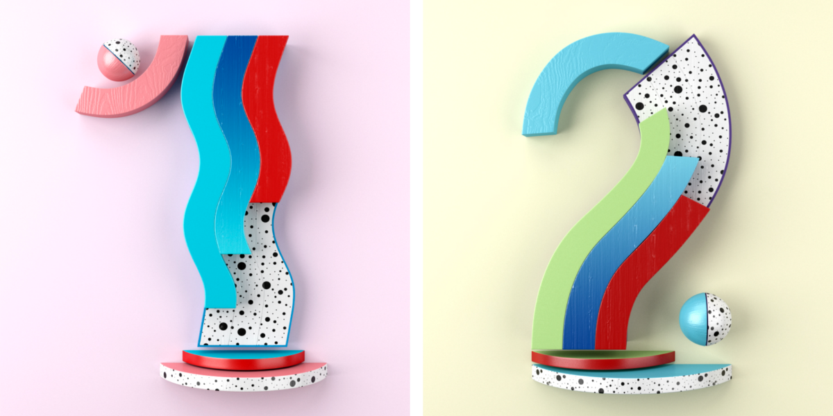
This magazine commissioned the Barcelona-based illustration, graphic design & motion graphics firm, Forma and Co to churn out some absolutely original number typography which would be used for the magazine’s latest issue. The intelligent use of primary combined with innovative negative space usage created not only a stunning 3D effect but has led to the production of a unique font for numbers as well.
10. Arts Magazine

Negative space usage gets the highest prominence when plain black and white are used to create designs because white complements black like nothing else and vice versa. This logo for Arts Magazine too, makes clever use of fonts with the M alphabet fitting in snugly under the A alphabet, creating the illusion of a house or a one-stop shop for the arts. The white on black or reverse treatment makes the logo all the more prominent and eye catching.
Related Posts
Top 11 Email Marketing Trends for 2023
The Best New Portfolio sites, March 2023
Best Poster Designs 2023: Ideas and Tips
Hit and Miss of Olympic Logo Designs from 1924 till 2023
10 Iconic Moments Photographed in 2023 Rio Olympics
Top 5 Logo Design Trends of 2023
2023 Packaging Design Pentaward Winners
Digital Design Trends for 2023
Best Travel Apps for 2023
9 Script Fonts for 2023
10 Best Free Fonts for 2023
10 Best Mobile Games of 2023
Logo Design Strategies for 2023
Top 9 Web Design Trends for 2023
10 Most Popular Graphic Design Trends of 2023