Logos- the loved or hated visual identifications of the brands, form a conscious or subconscious relationship with the consumer. We all have had a can of coca-cola or a meal at McDonalds and owned a pair of Nike shoes. But have you ever wondered the story behind the creation of the logos of the popular brands
Today at DesignTrends we bring to you 7 logos and the story behind the invention of their designs
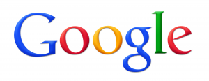
The logo of one of the most popular search engines Google was first envisioned by co-founder Sergey Brin in 1998. The logo was designed using the graphics program GIMP (the very program we use at DesignTrends, hope you get how visionary are we :p). It had an added exclamation mark Google! to mimic the yahoo! Logo. In 1999, designer Ruth Kedar came up with the polished version of the logo without the exclamation mark. This logo stayed with the company till 2010 and made it one of the most iconic logos of all times. In 2015 Google updated the logo with slightly more orange ‘O’ but the concept and the design remained the same.
McDonald
From the time it was founded in 1920, the changes in McDonald’s logos are a case study in itself, and we are not going to tire you out with the logo history of the company. Instead, we are going to tell you about the most popular and successful campaign in McDonald’s history by Heye & Partner GmbH in 2003. ‘I’m Lovin’ It’ launched in Munich on 2 September 2003(‘Ich liebe es’), with English language phrase introduced in UK, Australia and USA soon after. It will be hard to believe but McDonald’s paid Justin Timberlake an estimated $6 million to sing the “ba-da-ba-ba-bah” jingle in the first U.S. “I’m Lovin’ It” TV spots in 2003. Today the official logo exists in few shapes and sizes but all feature the back yellow arches accompanied by the official motto
Nike
The iconic swoosh logo of nike was designed by Carolyn Davidson at the time when she was a student at Portland state. She was reportedly paid $35 for her logo, but was later given stock (now worth $643k). The logo is inspired by the namesake Greek goddess of victory, so the Swoosh implied movement and speed. The logo was accepted half-heartedly by co-founder Philip Knight who said “I don’t love it, but it will grow on me.’’ Well, Mr Phillip we at DesignTrends on the behalf of all our readers would like to say, It grew on all of us. The logo became so popular that in 1995 the company removed the brand name from the logo leaving the Swoosh the sole symbol of the company. So, never underestimate the small things, sometimes the small things offer the big payoffs
Coca-Cola
The most recognizable beverage brand, Coca-Cola logo was created in 1885 by Frank Mason Robinson. He was John S Pemberton, bookkeeper. John finalised the formula for the drink and Frank suggested the name Coca Cola, thinking the two C’s would work well in advertising. The company experimented with a new and complicated logo in 1890, which had swirls and cherries hanging from the “Cs” of “Coca-Cola”. It was not very successful and was changed eventually. Robinson’s design remained evergreen and today we still see his design on every Coca-Cola product.
Apple
Rob Janoff created the first rainbow Apple logo in 1977, after being instructed by Steve Jobs to design something not ”too cute”. The colors were included to appeal youth and highlight the computer’s ability to reproduce colors. There were two options presented to Steve Jobs one with and other without the bite jobs chose the one with more personality. The logo also features the iconic bite apparently to distinguish it from a cherry
FedEx
Walter Laundauer founder of Landor Associates is the man behind the iconic FedEx logo. The final logo was the product of creating and reviewing 200 designs. The CEO of FedEx spotted the arrow in the logo right away. If you haven’t, spot it right now.
In 1971 the company’s logo was its full name- Federal Express, in blue and red. The colors were chosen intentionally to make it look patriotic by linking it to U.S. government.
Audi
The first logo of Audi was designed in the Art Nouveau style and since the company’s foundation, Audi’s logo had remained the same till 1919. In 1919, Lucian Bernhard re-invisioned the design with a modern logo that stuck with the company till 2009. The iconic four interconnected rings came into existence in 1932, when Audi merged with DKW, Horch and Wanderer to cut costs in depression. The rings were meant to symbolize the unity of company.
Related Posts
Top 11 Email Marketing Trends for 2023
The Best New Portfolio sites, March 2023
Best Poster Designs 2023: Ideas and Tips
Hit and Miss of Olympic Logo Designs from 1924 till 2023
10 Iconic Moments Photographed in 2023 Rio Olympics
Top 5 Logo Design Trends of 2023
2023 Packaging Design Pentaward Winners
Digital Design Trends for 2023
Best Travel Apps for 2023
9 Script Fonts for 2023
10 Best Free Fonts for 2023
10 Best Mobile Games of 2023
Logo Design Strategies for 2023
Top 9 Web Design Trends for 2023
10 Most Popular Graphic Design Trends of 2023