Illustrations on websites have become a trend over the recent years, but it doesn’t mean that actual still images have become outdated. It only means that many web designs have went with adding more illustrations since it allows the designers to express more freely. When we think of illustrations, we usually associate it with cartoons. With regards to the trend, you may also want to read about the trends in web designs for 2017.
Below is a list of some of the best cartoon style web designs that can inspire designers and developers on how they can include cartoon art and themes on to their websites. This way, not only will your website look trendy, it will also be able to gather enough visitors because of its level of visual appeal. Go ahead and scroll down to see screenshots of the websites and read some relevant information about them.
Alex Hallatt
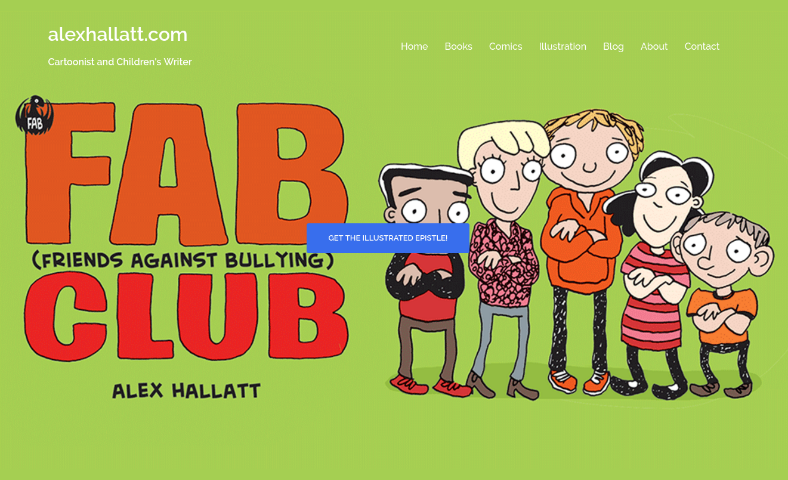
Here is a very good example of a website that exhibits the masterpieces of a very talented and creative cartoonist. When you get to the landing page of his website, you can immediately see a slideshow presentation of some of his most famous cartoons, character illustrations and comic strips. The website may be quite simple, but it is packed with cartoon illustrations which is actually what this article is about; to provide readers with inspiration from web designs that contain cartoon-themes. From this website alone, we assure you that you will already be able to gather enough ideas before you even start to proceed to the next websites on this list.
Memrise
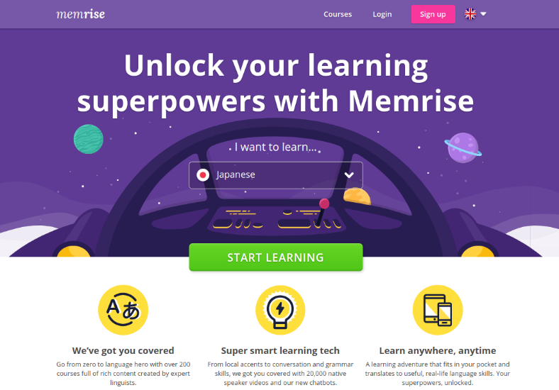
Memrise is actually an award-winning website and mobile app for those who want to learn other languages for free, and it makes the process convenient since it allows you to learn languages anytime and anywhere. But that is not the reason why we included Memrise on this list, the point is that the website is presented in a very creative way, with colorful illustrations filling the entire website. The vibrant colors of this website is sure to inspire web designers to follow the same route with their websites.
Mango Languages
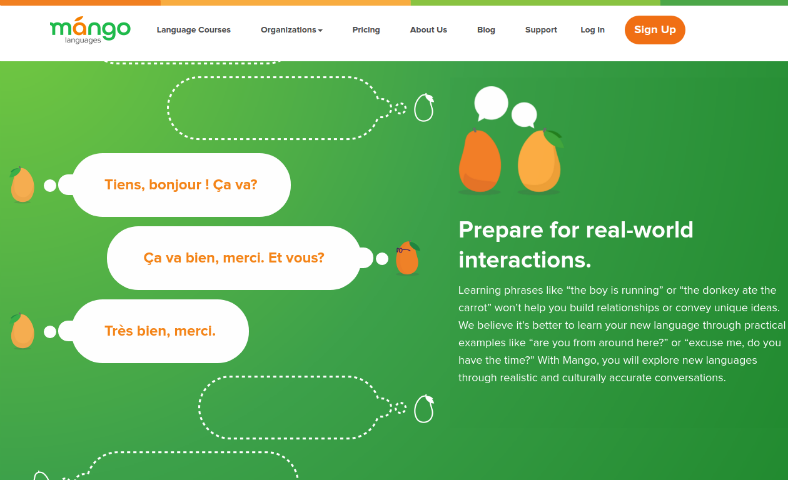
Speaking of websites for learning languages, here is another one which is also being used and so loved by millions of people from around the world. This website allows learners to explore not just on the language itself, but also the culture of the people who speak that language and makes sure that the process is fun. From the name of the website itself, the mascot here is a little yellow mango who, if you look around the website, is fond of interacting with other types of fruits and vegetables. It’s not all the time you get to see a cartooned fruit trying to talk in different languages, and from this, you might also be inspired to follow a similar route in using food or inanimate objects as cartoon characters.
Kawa Kawa Learning Studio
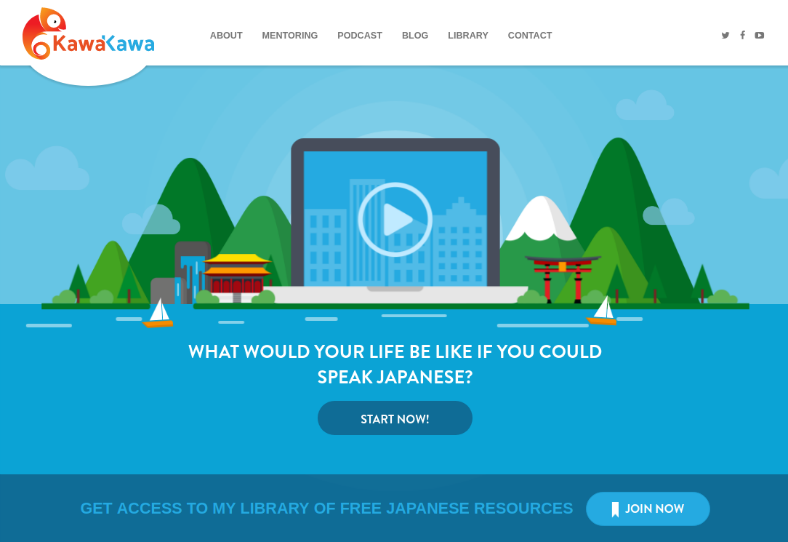
Kawa Kawa Learning Studio is another resource website that offers lessons to subscribers, but unlike the previous ones that gave users a choice on which language to learn, this one focuses entirely on Japanese. While the previous learning sites were all about languages, Kawa Kawa includes other matters such as the culture in general. For this website, you can see that the representing mascot is an orange colored reptile who is trying to learn Japanese language hacks, job opportunities, travel destinations, and many more. We sincerely hope this website is able to provide you with inspiration for your website, and we also hope that the determination of the reptile to learn about Japan is able to inspire you to work hard to make your website successful.
Fritula
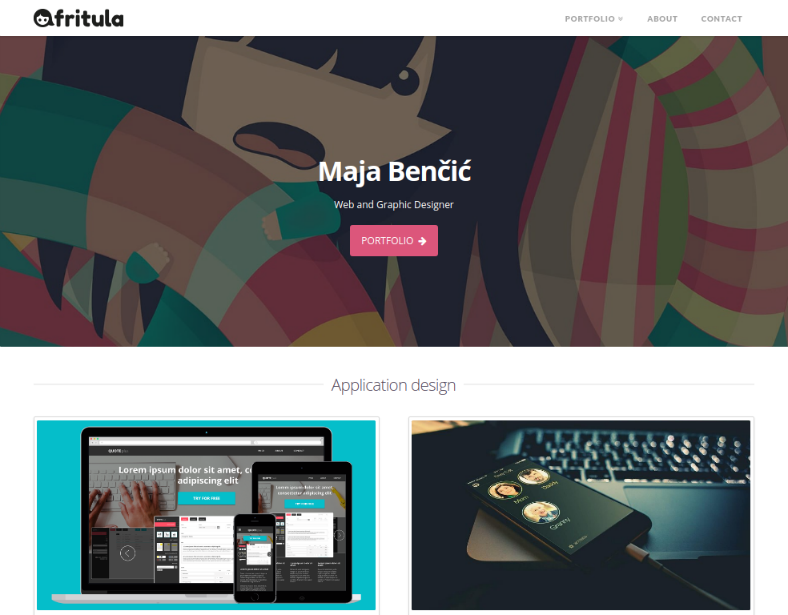
Fritula is a portfolio site from web and graphic designer, Maja Ben?i?, who is experienced in designing websites, logos, illustrations, prints and even mobile applications. With regards to tools, she is skillful in using Autodesk Sketch and Adobe programs such as Photoshop, Dreamweaver, Indesign, and Illustrator. On her website, you can see that her art style involves washed out colors, some realistic drawings of people, and a lot of caricatures of people with big heads or exaggeratedly long limbs. But what makes her designs stand out the most is the use of solid colors with minimal shading, and this results in making the designs appear flat. For added reference, you may want to check out our list of trendy pre-built websites.
Hunger Crunch
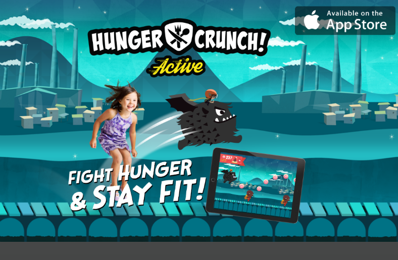
The website for Hunger Crunch is actually for promotion of the game which can be downloaded on both Android and Apple mobile devices. Instead of the usual way of controlling your character in the game by using your hands, the game uses the device’s camera and microphone to detect the player’s movement. This means that the game requires the player to actually jump and clap their hands to be able to control their character. On the website, you can see illustrations of the game, as well as stick figure illustrations on how the game is played. Out of this website, you will be able to gather enough ideas on how you should incorporate cartoon images on to your website.
Juno Team
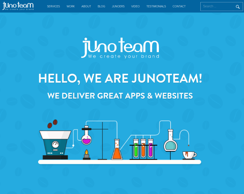
For a website that helps create a brand for others, Juno Team is able to give you what you need from designing a logo to creating a responsive website. The website is being developed by a small team of very talented and creative graphic artists, and from looking at the website, you can definitely say that they have worked hard on it and that they really mean business when providing their clients with what they need. Check out their use of contrasting colors that are vibrant enough to grab people’s attention, but not too much that it can hurt the eyes. The illustrations on the website have a flat design, and the background is textured with what seem to look like coffee beans. Even if you are taking advantage of easy website templates, you may use this website as an example if you plan on making a colorful marketing website to advertise art products, or you can also use this if you have a blog site.
Blackmoon Design Studio
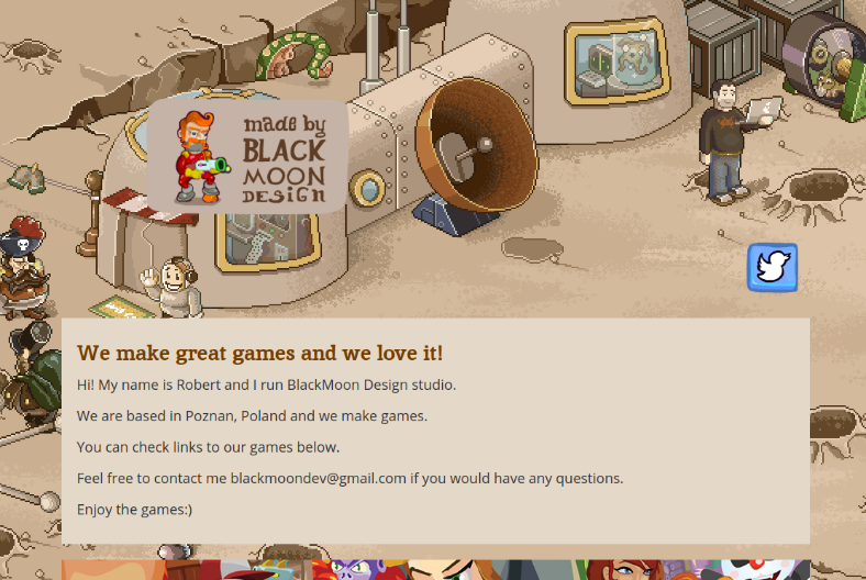
If cartoons inspired by game graphics (or the other way around) tickle your interests, then the art style on this website may be what you are looking for since the illustrations on the website range from 8-bit style to caricature drawings, though they also have photorealistic ones as well. The reason why they use these styles for their illustrations is that Blackmoon Design Studio, or Blackmoon Dev for some is actually a Polish game developer’s website. The developers on this website are responsible for over 60 HTML5 games on the web, some for mobile devices, and some that can be downloaded from Steam. If you check out the website, you can find different art styles that the developers have used in their games, and these varying styles are also very helpful to provide you with ideas if you wish to include cartoon illustrations on your website.
Handmade Interactive
Many websites today have gone the unconventional route with how their content is presented to their visitors. Instead of the usual vertical scrolling, there are websites that do away with the norm, and choose to go with horizontal scrolling. This is a good choice for websites that let visitors read comic books or graphic novels, or those websites that present their content in comic book style. The website above is a little bit of both, it contains clippings from comic books, and it also has other kinds of contents which are surrounded by illustrations of comic book or cartoon characters. That said, we hope this website is able to inspire you not only on how you can present your website’s contents, but also the kind of illustrations that you can incorporate on your website.
Pete Nottage
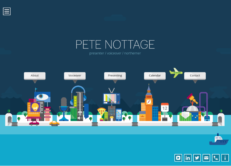
Here is probably one of the best landing pages on this list, or if not, one of the best that I have ever seen, and it’s because of the elements used and its responsiveness to actions that you do to them. Here, the structures adjust depending on the size of the screen, and there are little but noticeable animations when you hover your mouse on the different structures. These elements, most especially the vehicles constantly move around even if you are inactive on the page. The elements on the page are colored in a way that they appear flat, and having flat illustrations have already become a trend nowadays. So there’s absolutely no problem on that aspect. And for a very minor but nice to know fact about the website, if you look at the structure for the calendar, the Big Ben and the sign with the number actually corresponds to the current date. How cool is that? The developer of this website really knew how to make his website stand out, and how to inspire others to be creative on theirs.
Kidd81
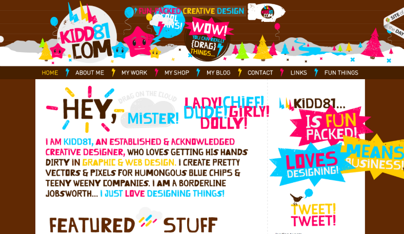
While I wouldn’t really say that the website is heavy on the cartoon elements, since it leans more on fun and colorful typography, but there are still cute cartoon characters evident even on the landing page, and these characters resemble starfishes. On this website, the use of different vibrant colors for the typography effectively helps in enhancing the overall appearance of the website, and this doesn’t make it look cluttered because the background for the text uses a contrasting color. Other elements on the website are presented like comic book balloons and those explosive text balloons that were heavily used in very old cartoon shows. One show that I can think of, that made use of these text effects was the old Batman cartoons that was based on the show that starred Adam West and Burt Ward as the Caped Crusaders. To make this website even more interesting, you may be able to drag certain elements around the page, “cool beans”!
Minding Monsters
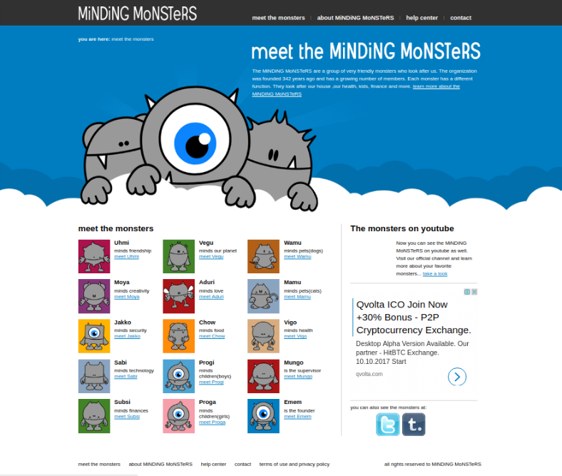
When we hear the word monsters, we usually think of those creatures that are big and terrifying who hurt people and hide inside closets. This stereotyped image is the result of what we read from books and those that we see on the television. But that shouldn’t be the case since not all monsters are scary and violent, or so they say. Take this website for example, it introduces us to the Minding Monsters (stylized as MiNDiNG MoNSTeRS), which are a fictional species of monsters that are actually friendly and who look after people, homes, health, money matters and more. As stated on the website, these monsters are unique from each other and that they have different function. We strongly recommend that you proceed to the website so you will be able to meet the Minding Monsters yourself, and be inspired to make your own fictional and adorable creatures for your website.
Made By Few
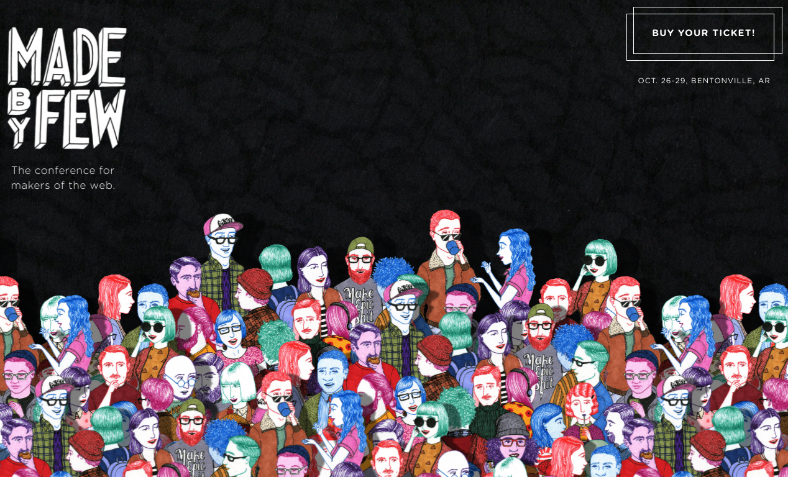
Made By Few, or MxF, is a tech conference website which invites designers, developers, and even entrepreneurs to attend various gatherings and conferences that exhibit talents, cultures, and other people. On its landing page, you can right away see illustrations of various people that are interacting with each other. This resembles the interaction made between the attendees in the conference. In my own opinion, the first thing that popped into my mind upon seeing the illustrations is the Yellow Submarine movie. It is probably because of the way the people are being drawn, and the unusual way the colors are used. But nevertheless, we hope that the captivating illustrations are able to inspire you in a way, especially with the added parallax effect that you can see when you move your mouse cursor.
Natrashka
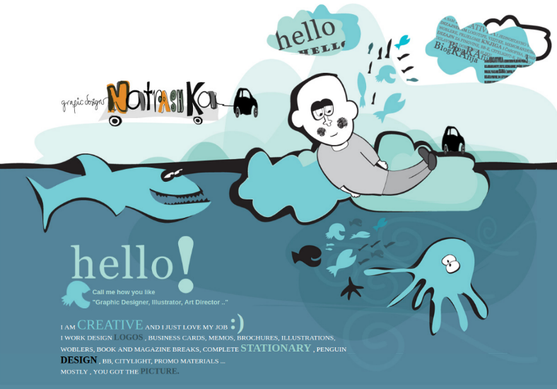
It is always wonderful to hear someone proudly say how much they love their job, and that they have no regrets regarding the path that they chose. When people love their job, they are always willing to go the extra mile, without even paying attention to the number of extra miles that they have already gone. On this website, you can definitely read how much this graphic designer loves her job, which is very evident as seen on the vector illustrations on the website, and the amount of experience she has gained over the years of being a graphic designer. After looking at the drawings on her landing page and the images on her portfolio gallery, you will surely learn to love your job as well.
Denis Zilber
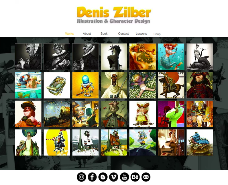
The final website that we have on this list is from a very talented freelance illustrator and character designer. Denis Zilber is an imaginative visual storyteller who has had over 8 years of experience under his credentials, and have used his work for advertisement purposes, as well as for video games, animated movies and children’s books. You can definitely see on his website his style of illustrating his characters, which involves photorealistic color schemes but with exaggerated facial features. It somehow reminds me of characters from Disney movies. Let this website and his creations give you inspiration on how to do your characters, and how to incorporate them to your website. If you want more illustrations of characters, you may refer to our gallery of character vectors.
Related Posts
Best Digital Design Trends of 2023
Magazine Design Trends 2023
Top UX Design Trends 2023
Evolution in Graphic and Print Design Trends 2023
Exceptional Packaging Ideas in 2023
Visual Design Trends 2023
Branding Design Trends 2023
Top 11 Email Marketing Trends for 2023
The Best New Portfolio sites, March 2023
Best Poster Designs 2023: Ideas and Tips
Hit and Miss of Olympic Logo Designs from 1924 till 2023
10 Iconic Moments Photographed in 2023 Rio Olympics
Top 5 Logo Design Trends of 2023
2023 Packaging Design Pentaward Winners
Digital Design Trends for 2023