
In digital marketing, a landing page is a web page created specifically for the purpose of a marketing or advertising campaign. It’s where a visitor lands, thus the name, when they click on an advertisement or anything similar. They are designed with a single focused objective – to serve as a call to action.
10 Best Landing Pages
To give you more ideas on how to make or better your own landing page, below are examples of ten most effective landing pages, and the characteristics that make them effective.
1. Shopify
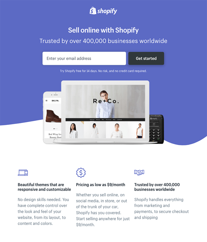
Shopify’s landing page will show you exactly what simplicity means. Its user-oriented headline which is only made up of a few words will give you the gist right away. The page also uses bullets, instead of paragraphs, to communicate the details and benefits that await the customer. All these elements make it easier to get right to the point.
2. Muzzle
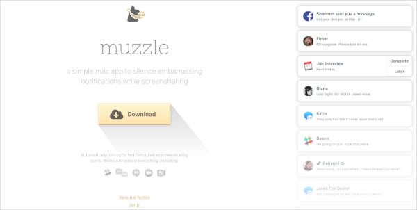
Muzzle app, that silences on-screen notifications, has one of the most amusing landing pages out there. They have embraced and gave justice to the show don’t tell mentality. Instead of paragraphs and texts, visitors to the page will be greeted with a rapid-fire assault of embarrassing notifications in the upper left side of the screen. Not only is the animation hilarious, but it also manages to convey the usefulness of the app without the use of lengthy descriptions.
3. TransferWise
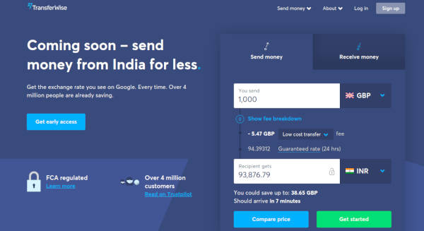
TransferWise site allows you to send and receive money in different currencies, and its landing page makes it easier for you to do so. The page is separated into two individual actions so that you won’t be distracted by options that don’t apply to you. If you want to send money, the transfer form is right there on the right for you to fill out. To receive money, you need to simply click the middle tab. Each tab on this landing page produces a different call to action based on what you’re signing up for. A perfect example of user-friendly functionality.
4. Airbnb
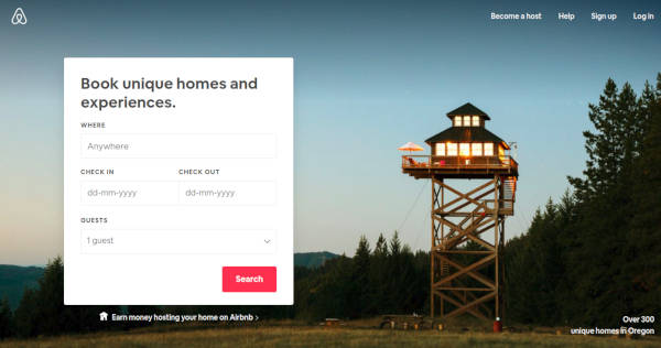
Airbnb’s landing page focuses on converting visitors into hosts by offering pretty enticing personalization: it shows an estimated weekly average earnings projection based on your location. You can also enter additional information in the fields provided to get an even more customized estimation. Showing your customers how you can be beneficial to them even before they commit to your services is a trait you would want to display in your landing page.
5. Teambit
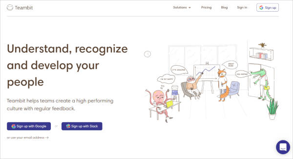
Teambit gives you a refreshing unorthodox landing page. Its simple, one-field form is illustration-heavy and filled with images of an office full of animal characters who all seem to be very happy with Teambit. Aside from this fun greeting, more animal cartoons will also appear beside each informational section of the landing page, which encourages visitors to scroll down to learn more. Teambit’s landing page is perfect proof that nothing should stop you from creating a playful atmosphere for your customers.
6. Wistia
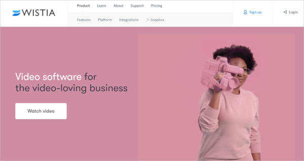
Wistia’s landing page is straight to the point. The first thing you will notice is a one-field form to create your account. The boxes that you will fill out are in a bright white set against a minimally patterned background, which contrasts nicely. Below this section, you can read answers to top FAQs if you’re having doubts about signing up. As simple and seemingly pointless as the design may seem, Wistia is actually intentionally separating the two sections using color contrast in order to make it easier for the customer to focus on signing up.
7. Webflow
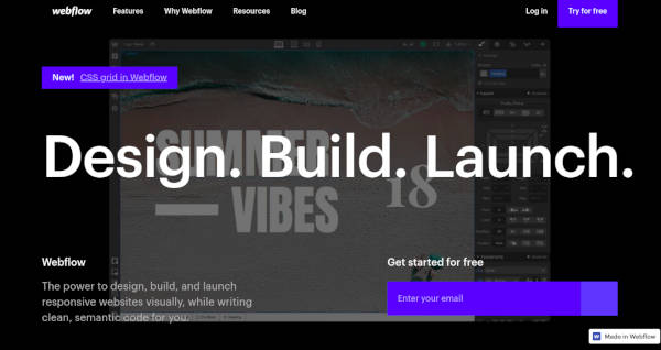
Webflow is a design tool for web developers. Its landing page was able to pack a lot of information into just a GIF and three form fields. It also conveniently includes the entire sign-up form on a single line, which makes the page much shorter and intact. The animated GIF below the form is visible in the same frame on the website, so users can see how the product works without scrolling or clicking over to a new page. Webflow gives convenience a whole new different meaning.
8. Nauto
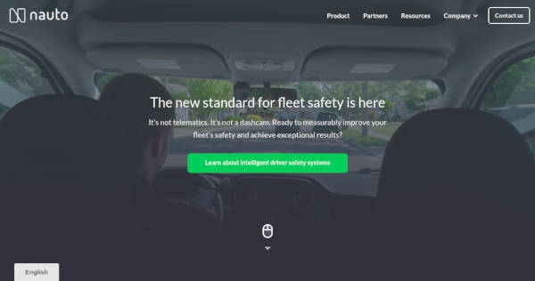
Nauto, a data platform for self-driving cars, help make autonomous driving safer for companies who manage fleets of self-driving vehicles. Naturally, its customers would need all kinds of information to sell them on this platform. Nauto has it, packaged into a simple ebook whose landing page gives you both a brief contact form and some preview statistics to prove why this resource is so important.
9. Industrial Strength Marketing
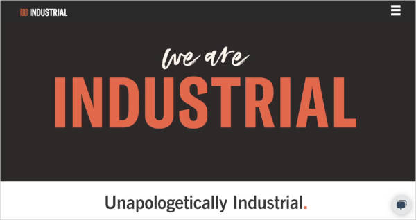
Industrial Strength Marketing landing page makes use of headers the only way they should be used: compelling and punchy with a little dash of sassy. But that’s not the only thing that keeps people interested in this landing page. It also uses the color red so strategically that customers can’t help but be drawn closer to it. The design is also meta to boot, which means that it works great on both mobile and desktop screens, which will come in handy since a lot of visitors nowadays access landing pages on their smartphones and tablets.
10. Inbound Emotion
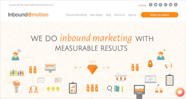
No hablo español? Don’t worry, you will still appreciate the conversion capabilities of this HubSpot partner site. The form stays in a fixed, prominent position as you scroll through the site, which is one of the best features of the page. There will also be adorable tiny hands that serve as directional cues toward filling out the form and sharing the page with others. Inbound emotion landing page is neat and easy-to-use, qualities customers always look for.
Conclusion
A landing page is a proven and tested tool in driving traffic and improving your SEO, which can all help in building your brand. It is also equally effective in generating leads for future conversions. But you won’t be able to enjoy these benefits if you don’t do your part in creating it. Hopefully, these great landing page designs have given you an idea on where to start.
Related Posts
10+ Form Designs
9+ Free Logo Creation Websites
Education Banner Designs
Best Examples of Material Design in Mobile Apps
21+ SEO and Internet Marketing Icons
19+ Marketing WordPress Themes & Templates
19+ Tourism Banners
15+ College Brochures
15+ Lawn Care Flyer Templates
14+ Best Email Newsletter and Marketing Tools
10+ Email Designs
Printable Banner Designs
51+ Best Collection of WordPress Themes
20+ Call To Action Buttons
10+ Landing Pages