Users usually have a goal when visiting a website be it purchasing a product, viewing content, etc. Visitors do not want to get distracted or to be frustrated by not finding what they’re looking for. The avoid less traffic on your website, a structured navigation menu is a solution.
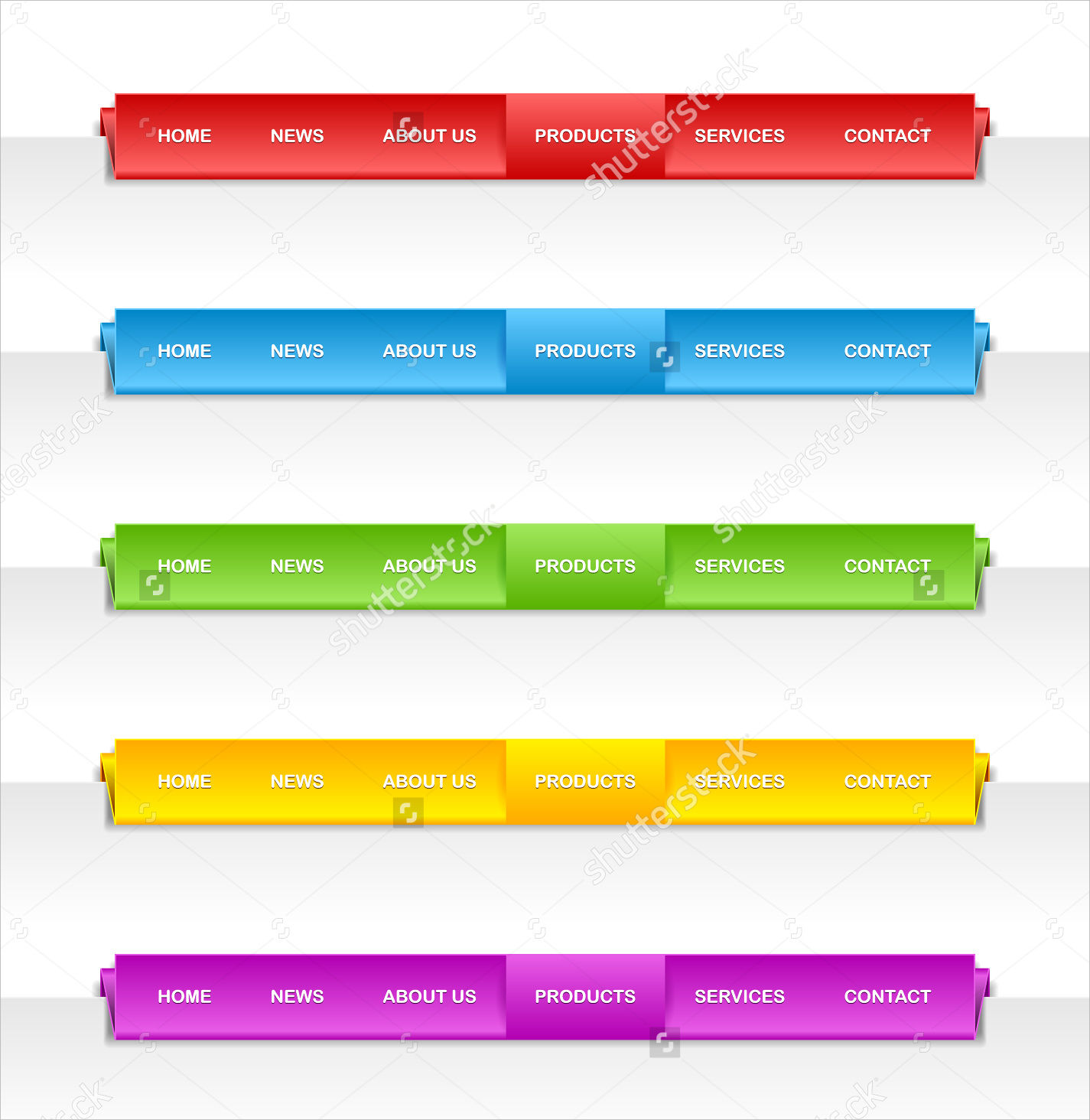
One thing to consider for a smooth flow in user experience is its navigation menu bar. Users should have an obvious access in the navigation menu. A navigation menu bar is a set of buttons either laid out in a row or column when clicked directs users to other segments on a website. If you are to improve your website navigation, click to view our navigation menu bar designs for your next website project.
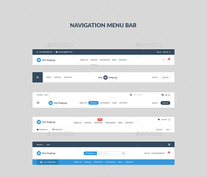
Navigation Menu Bar
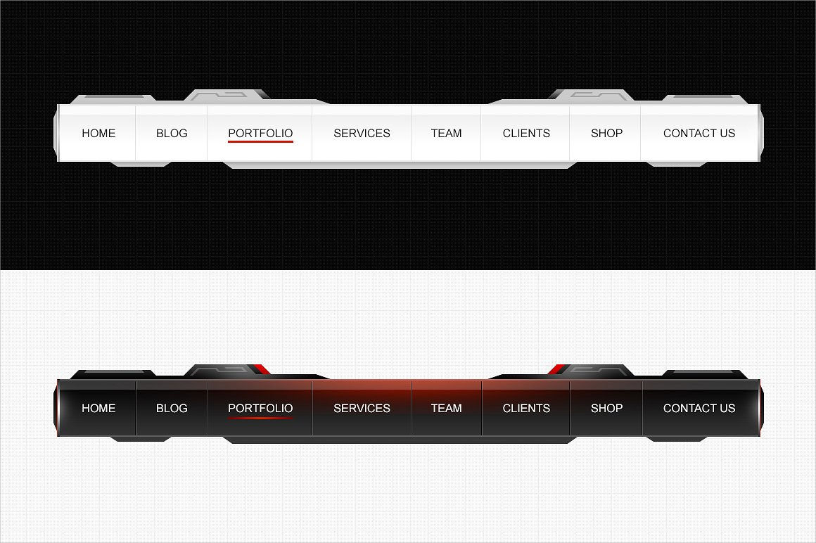
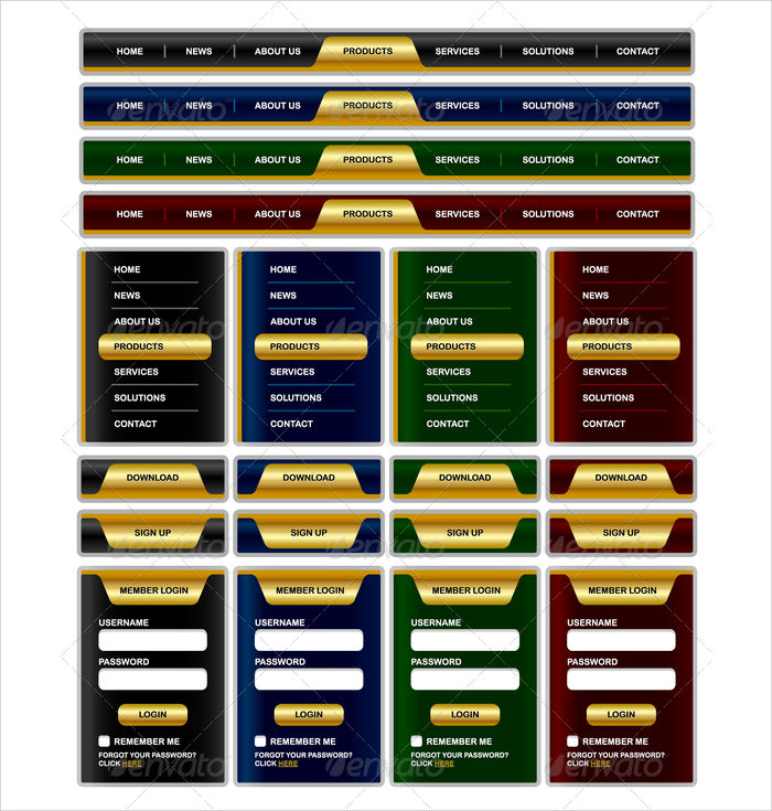
Custom Navigation Menu
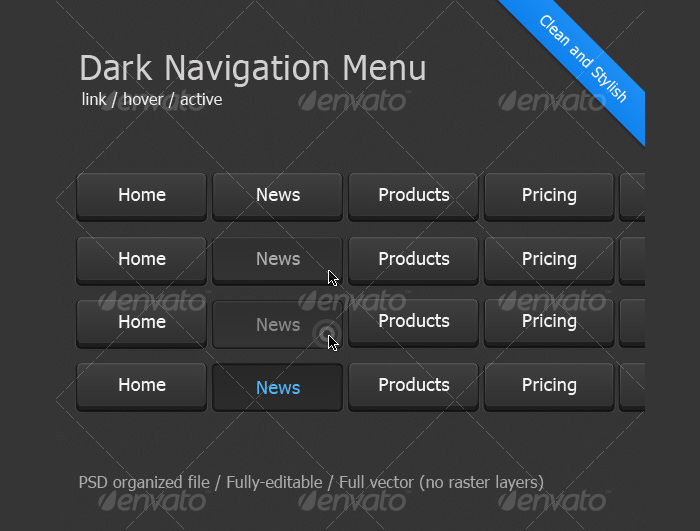
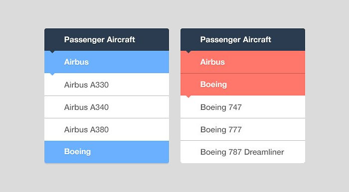
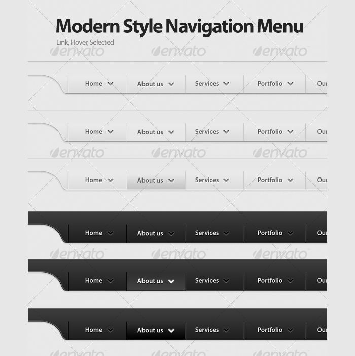
Dark Navigation Menu
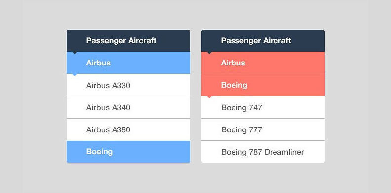
Vertical Navigation
Customize Your Navigation Menu
User experience is the main goal for every website. Here are best practices to apply to your navigation menu.
Be descriptive. Exclude those usual terms like “Products,” or “What We Do“. Instead, use descriptive key phrases; they are good for search engines and for visitors giving you a higher chance of ranking.
Keep it small. Provide six to seven categories (Examples: About, Portfolio, contact etc.) for your menu items. These are enough to organize all of the website’s content.
Sticky menus. We’ve all experienced this type of feature. This kind of navigation menu even when you are scrolling down, it is still visible for users. This is encouraged for longer web pages so users would have an ease of going to another segment of the website.
Consider being responsive. Responsive is the opposite of fixed width specifically navigation menus. A responsive design follows the size of your mobile device or computers so that the UI (User Interface) doesn’t get compromised.
Stick to three levels deep. As a visitor, it is annoying to be given more options when you click a segment. Keep in mind not to dive in more than three levels deep. Let the visitors access your website with ease.
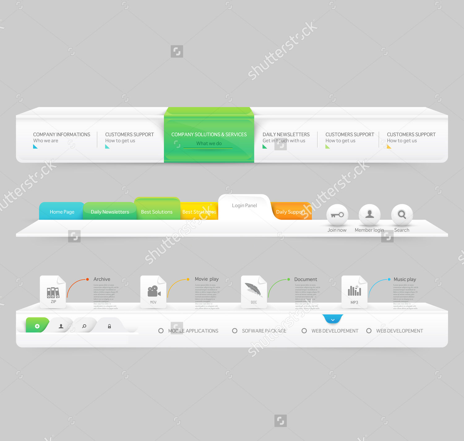
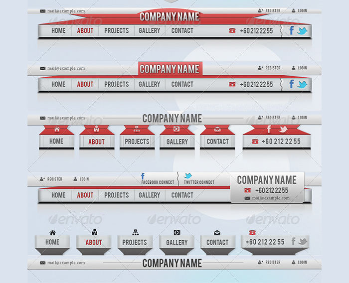
Navigation Menu & Website Elements
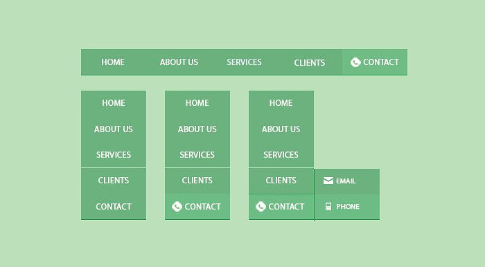
Clean Navigation Menu Set
Flat Navigation
Modern Navigation
Glossy Navigation Design
Retro Navigation
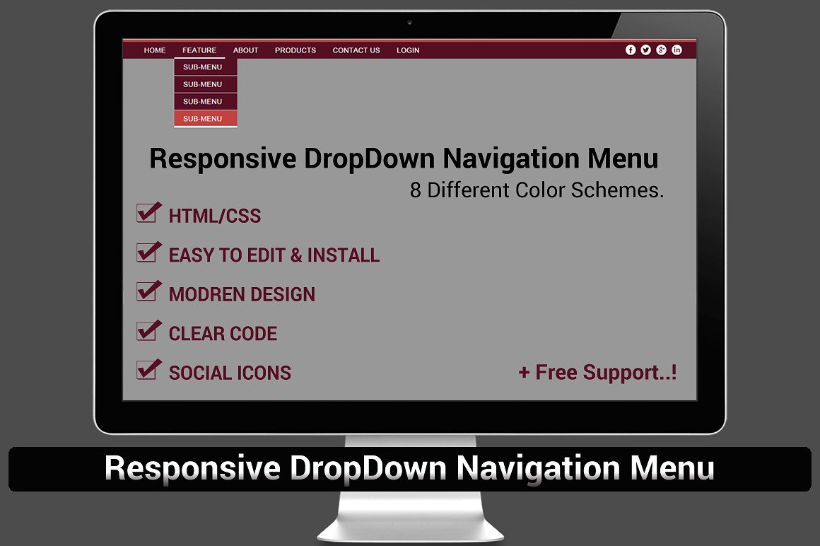
Drop Down Navigation
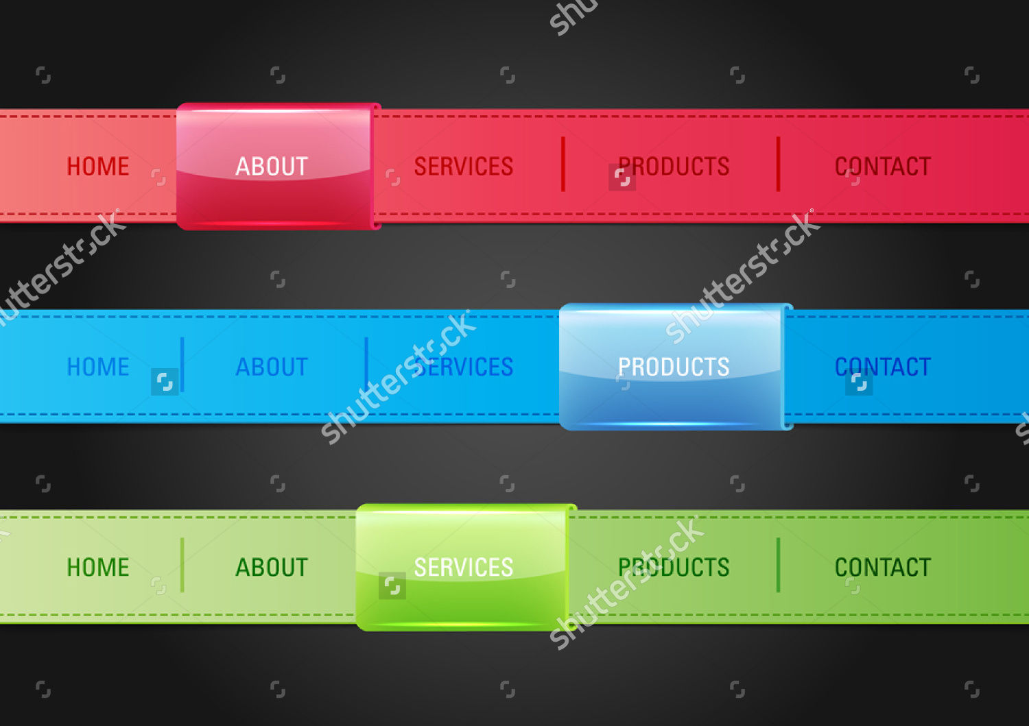
Horizontal Website Navigation Vector
Part Two!
Okay, there is more to the navigation menu. Let’s continue with part two.
Consider the brand logo.The brand logo should always direct to the home page. When visitors click the brand logo, it must redirect them to the homepage. If nothing happens when the brand logo is clicked, that makes your visitors bounce out of your site.
Always on top. Place your navigation menu on top. Whether it is in, above or below the header. In perspective, there are different dimensions to a website unless the latter is programmed to a responsive layout. When the navigation menu is placed on the bottom, the navigation menu is not entirely visible and accessible.
Drop down navigation menus are also great design options to use for your navigation bar. This is a direct link to a specific sub-page on your website. It takes visitors immediately to what they are looking for.
While it is good to do a custom navigation menu, having these samples saves time and offers consistency to users. We have picked sample Navigation menu and all are provided in a downloadable format. These samples of Navigation menus are in PSD and HTML formats. Feel free to customize it to your needs and intent. Always save your work to ensure all those creative labor will not be wasted.
Related Posts
17+ Deck Lighting Designs, Ideas - Premium PSD ...
17+ Deck Lighting Designs, Ideas - Premium PSD ...
50 Top Magazine WordPress Themes 2016 ...
21+ Event WordPress Themes & Templates ...
Top 10 Web for 2017 - Premium ...
Google Material Design Awards 2016 - Premium ...
19+ One Page Parallax WordPress Themes & Templates Design ...
BMW Unveils The Motorrad Concept Design ...
31+ Home Icons - PNG, EPS, SVG Format ...
24+ Modern Deck Ideas Outdoor Designs ...
18+ Travel Vectors - EPS, PNG, JPG, SVG Format Download ...
1000+ Flat Icons - PSD, Vector EPS - Premium PSD ...
18+ Map Icons - PSD, Vector EPS Format Download Design ...
10 Ways To Cleverly Use Maps In Your Home Decor Design ...
18+ Flat Design Portfolio WordPress Themes & Templates Design ...