It is not uncommon for companies to constantly change their business logo designs over time, and while we have said in our other articles that logos should be able to stand the test of time, there will come a time when a company will really need to update their logos to be able to gather a new set of customers. Some may do minor updates to their logos, while some may also do a total redesign of their logo while still keeping the essence of their previous logo design, which may have helped in the success of their company.
Listed below are twenty of the most widely recognized professional logo designs from famous businesses that underwent a lot of changes. If you are curious what these companies are, and how their logos were when they started, feel free to scroll down and look around.
Computer Companies
Apple Incorporated
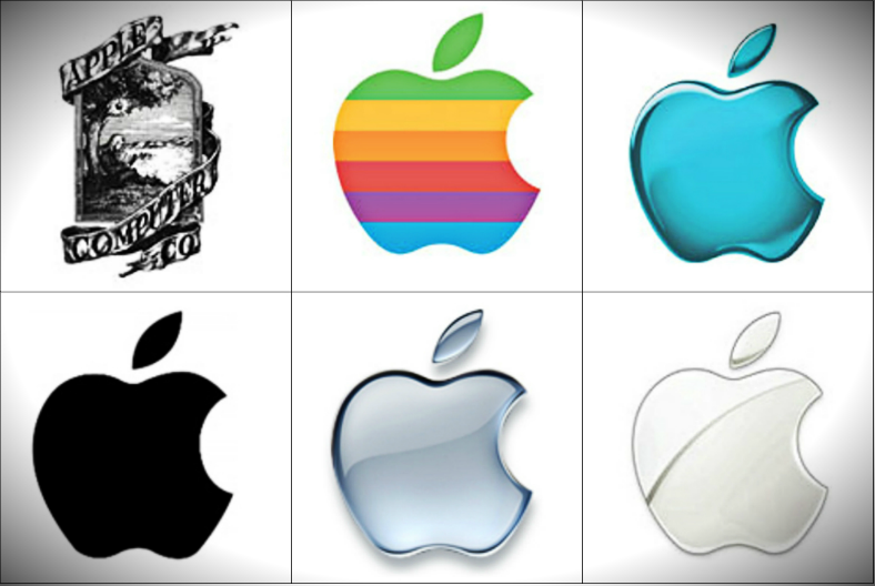
Top, from left to right:
- 1976. The original logo used by Apple Inc., which illustrates the story of Sir Isaac Newton sitting under the apple tree (and I think most of us already know what happened next).
- From 1977 to 1998. When Apple Inc. finally decided to put emphasis on the apple symbol rather than other features on their logo.
- 1998. Apple Inc. decided on using just one color for their logo instead of the multicolored stripes as seen on their previous design.
Bottom, from left to right:
- From 1998 to 2000. During the time when they went with a single-colored logo, they also had an alternate, monochrome version of that design which showed us a flat logo, which simply depicted an icon of a black apple.
- From 2001 to 2007. Apple Inc. updated their logo once again with a simple yet shinier version of their 1998 design, but this time, in grayscale.
- Current. The current logo of Apple Inc. takes away most of the shine and makes it simpler and more flat.
Microsoft Corporation
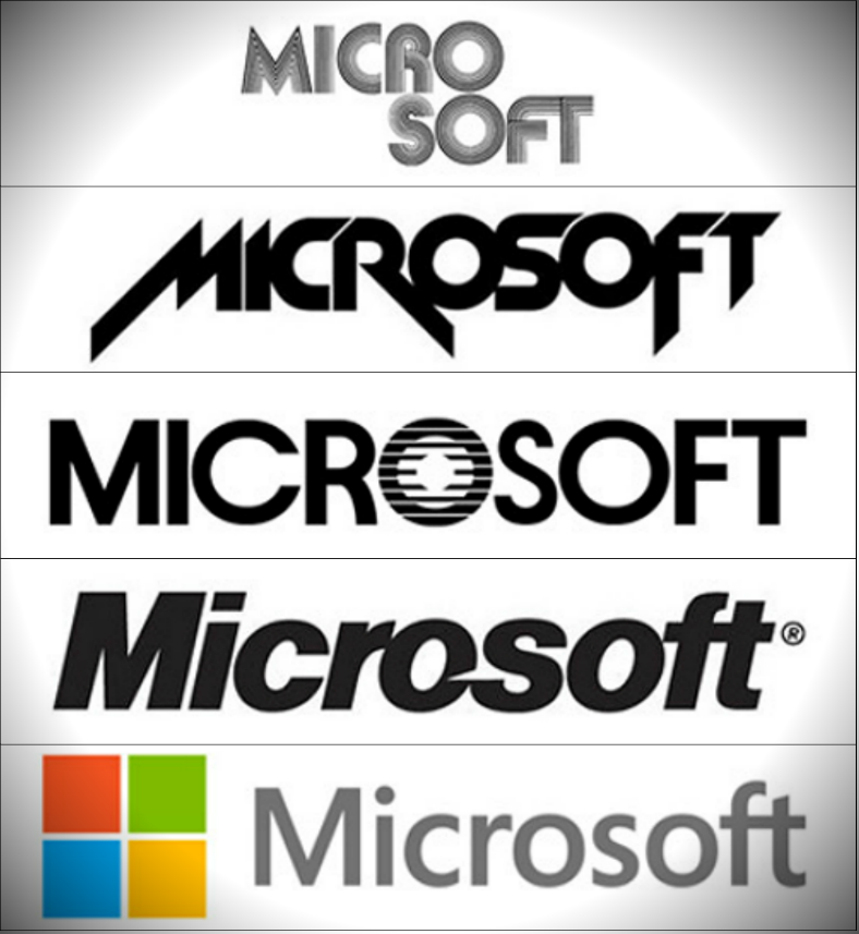
From top to bottom:
- From 1975 to 1979. Microsoft’s first logo noticeably separates the two words and makes use of a rounded typeface that is composed of thin lines.
- From 1980 to 1981. Microsoft got rid of the rounded typeface in favor of sharp edges. Also, this time around, the words micro and soft are being combined to make up only one word.
- From 1982 to 1987. This logo went for a much simpler design and makes use of a Sans Serif typeface with the letter O written in an artistic way.
- From 1987 to 2012. From the logo design in which all are in capital letters, Microsoft changed their logo that only has the letter M in upper case.
- From 2012 to current. Microsoft’s logo today shows us a simpler typography that is written beside the symbol of their most popular product, the Windows.
IBM (International Business Machines, Corporation)
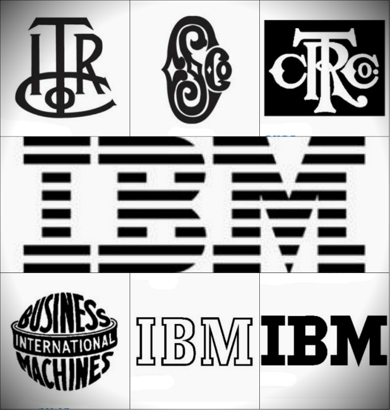
Top, from left to right:
- 1888. This logo, which shows us the initials ITR Co., was being used when the company was still called International Time Recording Company.
- 1891. After the company’s name was being changed to Computing Scale Company, the logo was also changed to an artistic illustration of its initials, CS Co.
- 1911. Twenty years later, the name was once again changed to Computing-Tabulating-Recording Company, and similar to their previous logo designs, this one also shows the initials of the company’s name being written in an artistic way.
Bottom, from left to right:
- 1924. When the company’s name was finally changed to what we are now familiar with, their logo showed us a sphere with the company’s complete name written all over it.
- 1947. During this time, the company finally realized how long their company name is, so they decided to use only the initials of their name for their logo design.
- 1956. From the typography with hollow letter, they updated their logo by simply filling up the letters to make it more solid and noticeable.
Middle:
- From 1972 to current. IBM’s logo today only has minor modifications, wherein the letters are written with alternate black (or sometimes blue) and white stripes, which is done to make it look like a television or computer monitor screen.
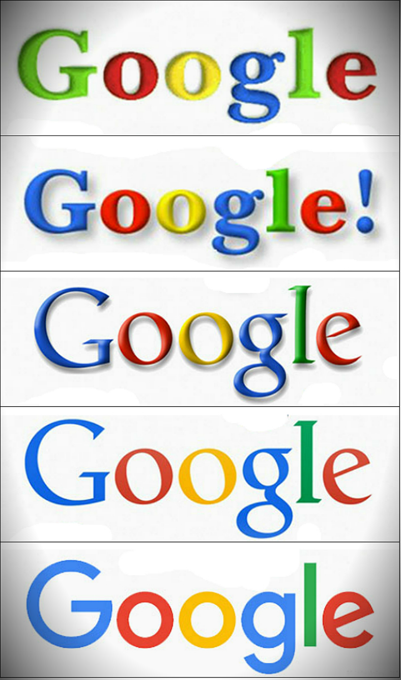
From top to bottom:
- 1998. Google’s first logo simply went for a straightforward, vibrant typography with noticeable shadows around the edges.
- From 1998 to 1999. During the same year, the company slightly updated their logo, and the most noticeable change is on the first letter, which went from green to blue, and the addition of an exclamation mark at the end of the logo.
- 2010. More than ten years later, the company modified their logo by making it appear glossier while still retaining the colors.
- 2013. When flat icons and designs became popular, Google adapted to this trend and made their logo flat by getting rid of the shading effects.
- From 2015 to current. The logo Google is using today is almost similar to the one they used in 2013, with the only difference being the typeface, which went from Serif to Sans Serif, and also the slightly washed out colors.
Mozilla Firefox
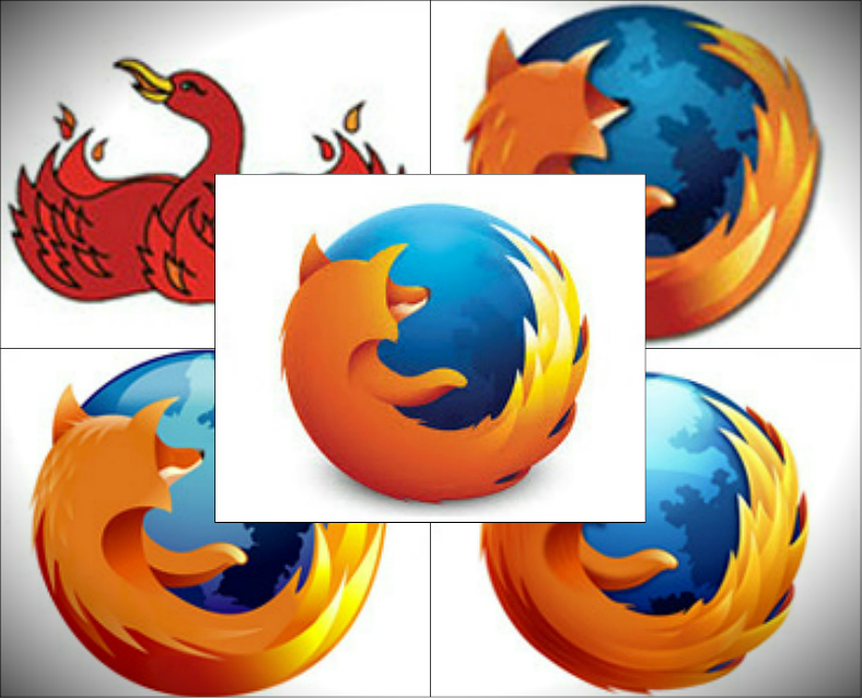
Back layer, clockwise from top-left:
- 2002. The first company logo used by Mozilla for their Firefox Web browser shows what seems to be a phoenix or a flaming bird rather than a fox.
- 2003. A year later, Mozilla changed their logo that resembles the flaming fox similar to the one being used today.
- 2009. The logo they used during this year is a slight update to their previous one wherein the reflection on upper portion of the globe is emphasized, and the texture on the fox is smoother.
- 2004. We wouldn’t really say that there are changes made from their 2003 logo to this one, except for the noticeable higher image resolution.
Middle
- From 2013 to current. The current logo used by Firefox continues the design that shows a fox surrounding a globe, but this time, the logo design appears more flat than the previous versions.
Amazon.com, Incorporated
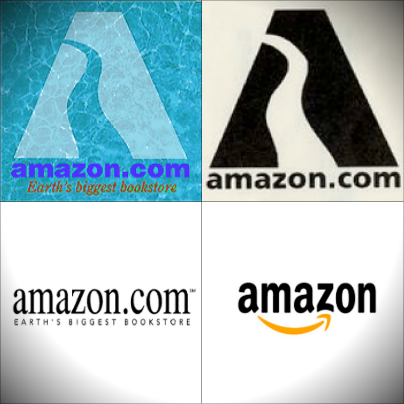
Top-left:
- 1995. Amazon’s first logo shows a symbol that appears submerged underwater, and this symbol has dual meanings. It can be interpreted as a letter A for Amazon, and it can also be interpreted as the Amazon River.
Top-right:
- 1997. The next logo being used by Amazon is a slight update to their first logo, wherein the color scheme of the symbol is changed to black-and-white, and the textured background is removed.
Bottom-left:
- 1997. In the same year, another version of the logo design was made, and this one makes use of a wordmark type of logo.
Bottom-right:
- Current. The current logo used by Amazon still uses the wordmark type, but this logo has a hidden meaning behind it. The arrow under the text symbolizes that you can find anything from A to Z in Amazon.
Food Companies
Starbucks Coffee
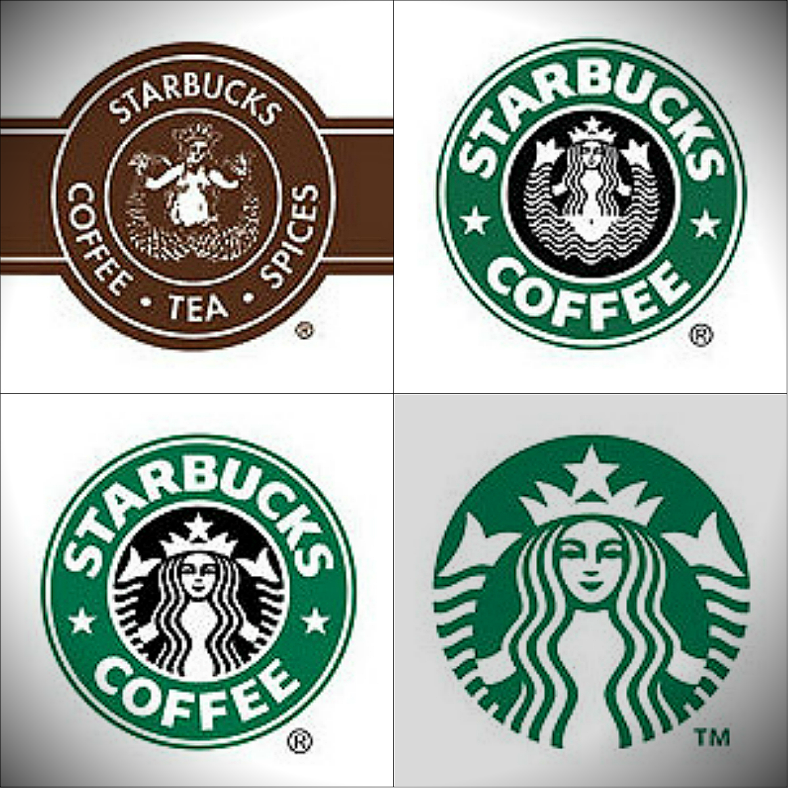
Top-left:
- 1971. The first logo used by Starbucks shows the entirety of the mermaid, and the color scheme being used is brown and white.
Top-right:
- 1987. The updated logo for Starbucks changes the color scheme to the now known green, black, and white, and though the whole mermaid can still be seen on this design, it is being drawn differently.
Bottom-left:
- 1992. Here, the design still resembles the previous one, the only difference with this updated logo design is that the center image is being zoomed in a little bit.
Bottom-right:
- From 2011 to current. The logo that Starbucks is using since 2011 removes the black from the color scheme, and retains the green and white. Another feature removed from this design are the typography, to put more focus on the symbol, which still is the illustration of a mermaid.
Pepsi Cola
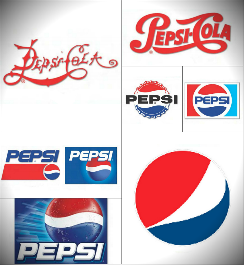
Upper half, clockwise from left:
- 1898. Pepsi’s first logo design bears the brand name being written artistically with sharp points at certain areas of the letters.
- 1905. Pepsi updated their logo by removing the sharp points on the letters, and made the entire typography thicker and bolder.
- 1973. The company made a lot of changes with their design and kept the color scheme at blue and red. The circle shape that surrounds the brand name is also made smooth as opposed to their previous design, which will be explained on the next bullet point.
- 1962. Here, the icon appears to be a bottle cap with the color red and blue on the top and bottom area, respectively, and the brand name can be seen in the middle.
Lower half, clockwise from upper left:
- 1991. The logo design here continues the circle icon as seen on the previous version of their logo but places more emphasis on the brand name by enlarging it and placing it over that icon.
- 1998. A slightly updated and modernized version of the previous logo, wherein the backdrop is in blue, the typography is in white, and some shading is applied to the icon/symbol.
- Current. The current logo that Pepsi is using keeps everything simple by just using the circle icon, seemingly taken at a different angle than the previous ones. And on this version of their icon, there is no presence of the typography.
- 2003. A much more modernized version of their 1991 design, wherein the background for this one is textured, and there is moisture on the icon.
Coca-Cola
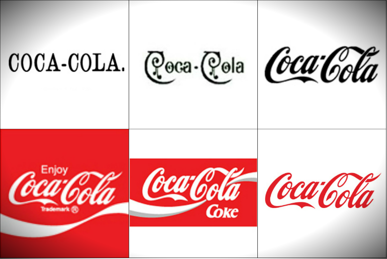
Top, from left to right:
- 1886. The company’s very first logo simply showed their brand name, which seems to be written using a typewriter.
- 1890. The next design that Coca-Cola used was more creative than their previous one, and the typeface used for this logo appeared a little on the Gothic side with all the decorative lines on the letters.
- 1940. Half a century after their previous logo, they changed it to something similar to what we all know today, though this one is solely in black-and-white.
Bottom, from left to right:
- 1969. Almost thirty years later, the logo was updated by adding the color that the company is most associated with—red.
- 1987. For this logo, it still uses the same typography from previous design, though one easy-to-spot difference with this one is the the curved lines that was once below the text is now across it.
- Current. The current Coca-Cola logo still uses the same typography, but the colors are being reversed this time around.
If you want to read some information about making logos, then you may refer to our article regarding logo strategies and other informative matters.
Nestlé
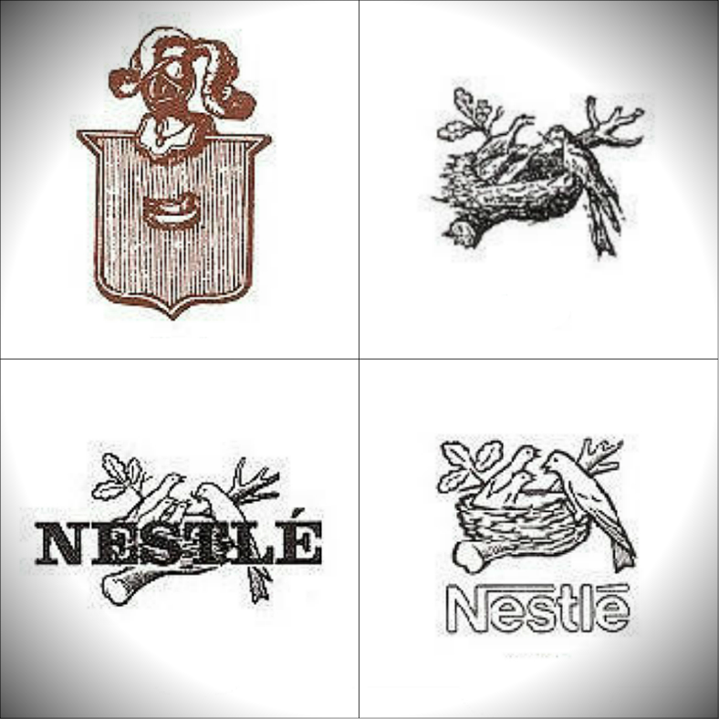
Top-left:
- 1868. Nestle’s first logo shows us a wooden sign with a small image of a bird’s nest in the middle, and on top of this sign, and armor’s bust can also be seen.
Top-right:
- 1875. Seven years after their first logo, Nestle decided to put more emphasis on the bird’s nest rather than on the sign, thus the creation of this logo.
Bottom-left:
- 1966. An updated version of their previous logo simply adds the name of the company in the middle area.
Bottom-right:
- Current. The logo that Nestle has been using since 1988 still bears the image of the bird’s nest with a bird feeding her hatchlings, but the typography is moved to an area below the image of the nest.
KFC (Kentucky Fried Chicken)
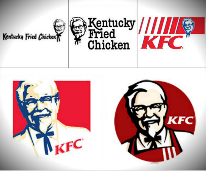
Top, from left to right:
- 1952. The Kentucky Fried Chicken’s first logo makes use of a combination type of logo, wherein the full name of the company is written beside the symbol of the company, which is an illustration of Colonel Sanders’ face.
- 1978. The company still makes use of the combination type of logo, but the face of Colonel Sanders is moved to the left of the company name, and the typography is written with a different, more rounded typeface.
- 1991. The first time when the logo only uses the initials of the company instead of the entire name, the addition of the colors red and blue, and the return of Colonel Sanders’s illustration to the upper right-hand corner of the design.
Bottom-left:
- 1997. The entire logo design has been revamped, enlarging the illustration of Colonel Sanders to include his shoulder area as well. This design gives emphasis to the founder of the company, while also retaining the color scheme from the previous logo design.
Bottom-right:
- Current. Today’s logo design for KFC features a similar illustration of Colonel Sanders, but with a smoother effect and slightly washed out colors. This logo design shifts its color scheme from the previous blue and red to a darker red and black, and the lettermark for this logo is written as a negative space to maximize the use of every area on the design.
Burger King
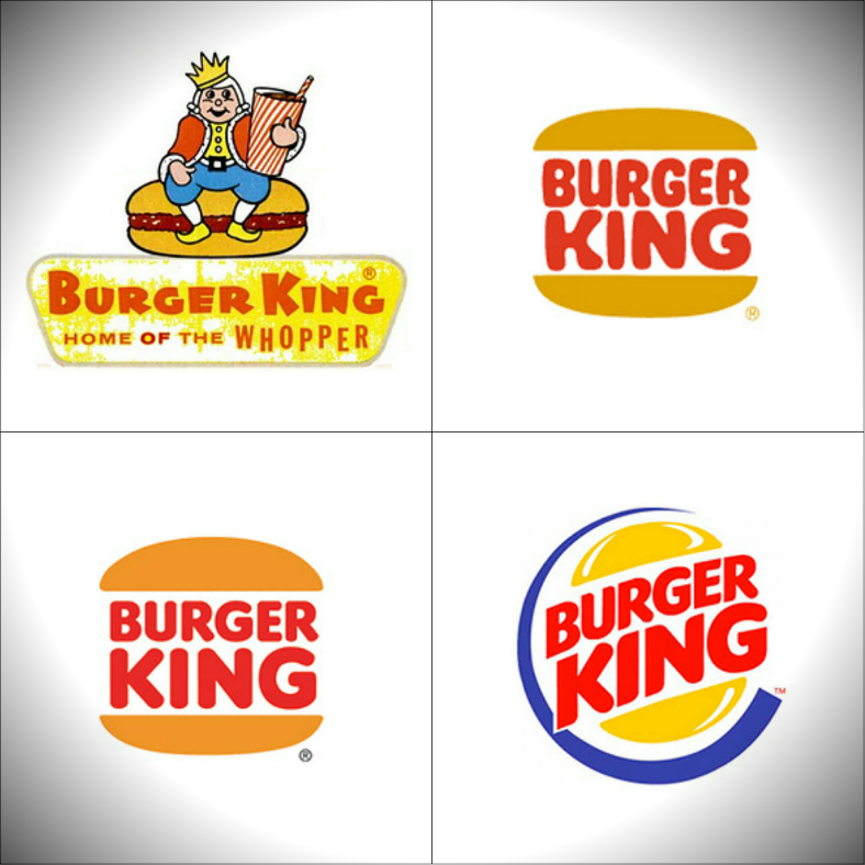
Top-left:
- 1955. Burger King’s first logo clearly illustrates the king sitting on a burger and holding a cup of soda. Below the company’s name, you can see a short slogan of the company that mentions the best selling dish of this industry, which is the Whopper.
Top-right:
- 1969. The company decided to redesign their logo into something simpler yet still catchy, and they did this by writing the name of the company in between two burger buns.
Bottom-left:
- 1994. During this time, the company only made slight modifications to the logo design, and they simply changed the typeface for the name, as well as make the colors a little bit lighter and softer.
Bottom-right:
- Current. The current Burger King logo continues the concept being used from previous designs, wherein the name is being sandwiched between two burger buns, but for this one, the design is modernized and made shinier while also being placed inside a blue circle.
Designing a logo is not an easy task, but if you’re up for the challenge, you may want to read our article about the steps on creating a logo.
Automotive Companies
Ford Motor Co.
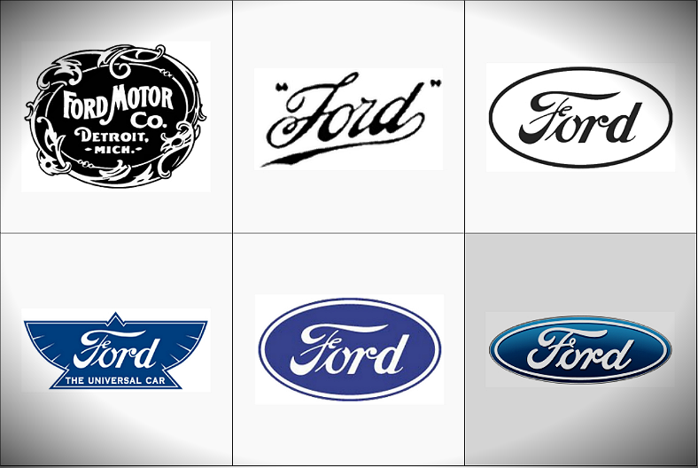
Top, from left to right:
- 1903. When the company started, the first logo they used features a sign that indicates not just the name of the motor company, but also the state where the company originated. To enhance the quality of this logo, the edges of the sign are decorated with some abstract and ornate lines.
- 1909. Instead of having to write the complete name of the company and their place of origin, the company opted for a shorter and easier way by simple making use of Ford, and this is written in longhand.
- 1912. For this version of Ford’s logo design, the name is still written in longhand but is in a slightly different typeface.
Bottom, from left to right:
- 1912. During the same year, the company made another design for their logo, which shows the name of the company written inside an illustration of a blue bird symbol.
- 1927. Fifteen years after the previous change of the logo, the company went back to the rounded emblem that was first used in the 1912 black-and-white logo, but continues the blue color scheme from the previous design.
- Current. Ford’s current logo features a similar design to the one they used in 1927, but the color scheme for this one is darker and has two tones.
Volkswagen
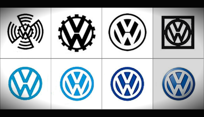
Top, from left to right:
- 1937. From the very first logo used by the company, the presence of the initials, VW, is already present, but is being surrounded by lines that give the illusion of a spinning object that symbolizes either the engine of the vehicle, or its spinning wheels.
- 1939. The first time the logo for Volkswagen was updated, the symbol was simply zoomed in to feature only the initials and the gear-like emblem that surrounds it.
- 1945. For this logo design, the pattern surrounding the circle that gives it the gear-like appearance is removed and the colors are reversed to emphasize the use of negative space for the logo.
- 1960. The colors are once again reversed back to its original style for this logo, and a box is added to the design, surrounding the entire circle where the initials of the company is found.
Bottom, from left to right:
- 1967. For this logo, the square that was added from their previous logo design is removed, and the color scheme went from black and white to blue and white.
- 1978. This logo is similar to one they had in 1945 (top, third from left), but for this one, the color used for the logo is blue, and the surrounding border is obviously a bit thicker.
- 1995. The company decided to continue the use of their 1978 logo design, with the only difference being the darker shade of blue used.
- Current. The current logo that Volkswagen is using still makes use of the same logo design that the company had since 1978, but with a slightly different shade of blue, and a little bit metallic in appearance.
Peugeot
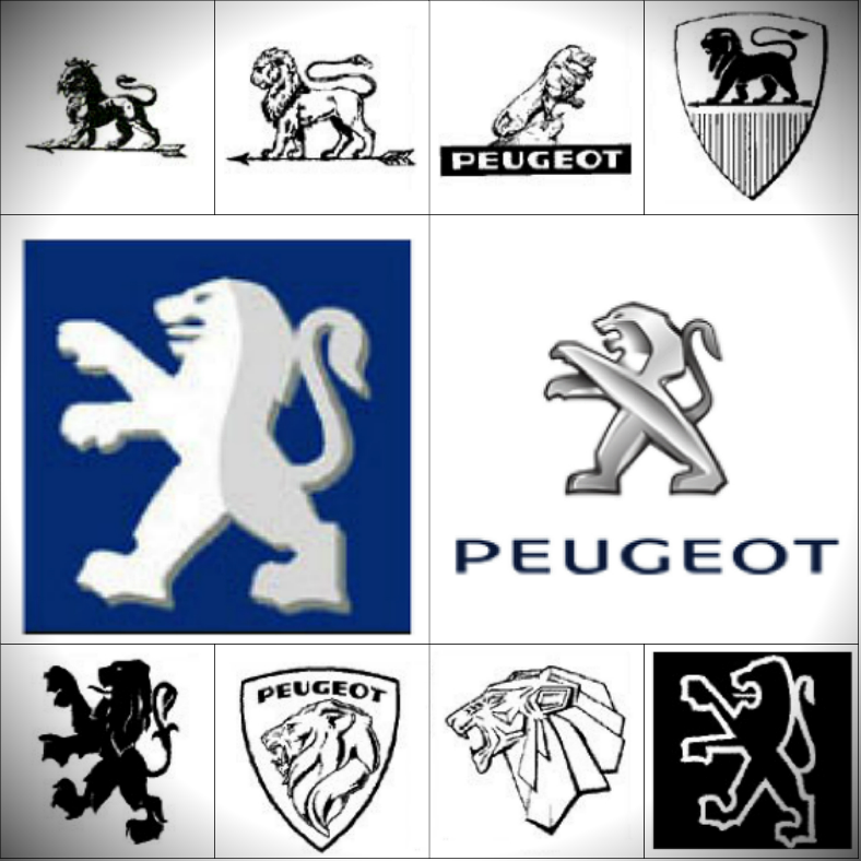
Top, from left to right:
- 1850. Peugeot’s very first logo used depicts a solid image of a black lion standing on what seems to be an arrow, and this image is all in black and white.
- 1882. More than thirty years after their original logo was released, the company made slight changes to the design, which only involved making the image hollow to emphasize the white space.
- 1927. For this logo design, the company got rid of the arrow that the lion was standing on and redesigned the lion itself for a more dramatic look. In fact, among all the other versions for the company’s logo, this is the only one wherein the lion is seen facing the right side.
- 1936. The company went again with their first logo but placed it inside a shield emblem with some decorative horizontal lines below it.
Bottom, from left to right:
- 1950. The company once again removed the arrow for this logo design and made the lion look like it is only standing on its hind legs.
- 1960. A decade passed after their previous logo design, and Peugeot went again for the shield emblem concept, except this one focused on the head area of the lion.
- 1965. The company continued to put emphasis on the face of the lion, but this one appears more symbolic than realistic, and the shield is removed from the design.
- 1980. This marks the return of the standing lion that was first used on the company’s logo design thirty years ago, but the lion illustration for this one is flat and done via line art.
Middle-left:
- 1998. Peugeot continues with the idea of the standing lion but is now more layered with the two-tone effect, and the lion is placed over a blue backdrop.
Middle-right:
- Current. Today, Peugeot still uses the same lion symbol, but is made to look glossier and more metallic than its previous versions.
For more information on how and what you should do when making a logo, you may refer to our list of guidelines to logo designs.
Mazda
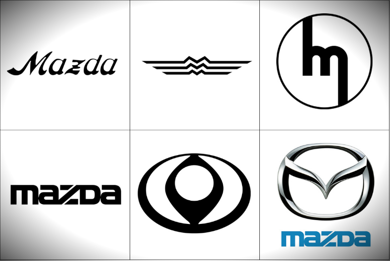
Top, from left to right:
- 1934. Mazda’s first logo simply depicts the name of the company written in a brushstroke-inspired typeface.
- 1936. The company then decided to use only the first letter of their company, and came up with this artistic design that shows three horizontal lines with curves in the middle area, making the letter M.
- 1962. Mazda then opted for a simpler logo by writing a small letter m inside a circle, with the letter’s edges extended to reach the circle border.
Bottom, from left to right:
- 1975. During this year, the famous wordmark logo for this automotive company was born, which once again simply spells out the name of the company but in a more artistic way than their 1934 logo design.
- 1992. Mazda then, once again, tried for a very symbolic approach with their logo that seems to look like a diamond shape inside an oval. But if you look at the negative space, you can see that it resembles the letter M, but in a very symbolic way.
- Current. Mazda went back to the wordmark logo that they used in 1975, but now incorporates the stylish and metallic letter M over it.
Television Companies
MTV (Music Television)
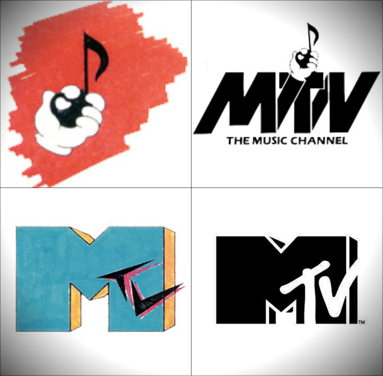
Top-left:
- For MTV’s first logo, it simply depicts a hand holding a musical note over a red background.
Top-right:
- 1980. MTV continues the use of the hand with a musical note for this logo but is incorporated to the initials of the company. This is also the time when the MTV initials was first used, instead of having to write the entire brand name.
Bottom-left:
- The logo is redesigned to something similar to the one being used by the company today, but still slightly different. The letter M for this logo design is emphasized, and the letters TV is written around the right area.
Bottom-right:
- Current. For MTV’s logo design today, it still makes use of the the big letter M with the letters TV on its side, but the latter is now written as a negative space of the former.
The Discovery Channel
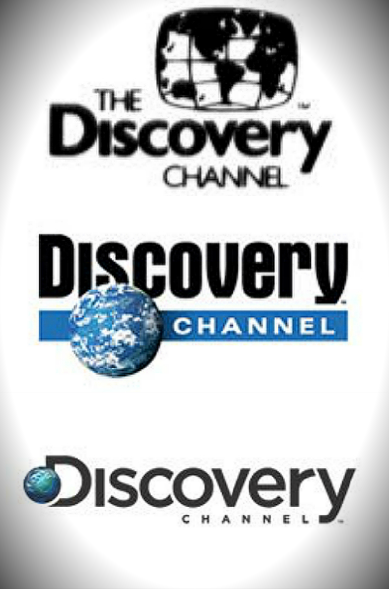
From top to bottom:
- Discovery Channel’s first logo involved the entirety of their brand name, with an image of a TV screen that displays the map of the world on top of it.
- The second logo used by Discovery Channel got rid of the the TV icon in favor of the globe, which is written within the typography.
- The logo used by Discovery Channel today still uses the globe but is now placed at the beginning of the text, which is obviously different and simpler than their previous design.
You may be asking, what should be present on a logo design to make it effective and memorable? You won’t have to worry anymore since you may read about it on our article about the five elements of logo designs.
Telecommunication Companies
Nokia Corporation
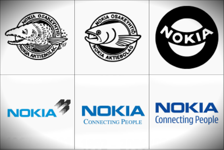
Top, from left to right:
- 1871. Before the company started selling phones and accessories, they were first selling paper, and for this logo, it depicts a fish since the original Nokia office was located near the Nokiavirta river.
- 1965. A slight update to the previous logo, which still depicts the fish but is now illustrated more smoothly.
- From 1965 to 1966. The company decided to keep things simple with their logo and remove the image of the fish to give more emphasis to the name of the company, which is also a place in Finland.
Bottom, from left to right:
- From 1967 to 1991. Nokia then decided to go for a wordmark type of logo and went with the color blue for the typography.
- From 1992 to 2006. A slight update to the wordmark logo, wherein they simply added a short slogan below to give emphasis on what the company is about.
- From 2006 to current. For this one, no change has been made to the wordmark itself, the only modification involved is toward the slogan, which now uses a different typeface.
AT&T (American Telephone and Telegraph Co.)
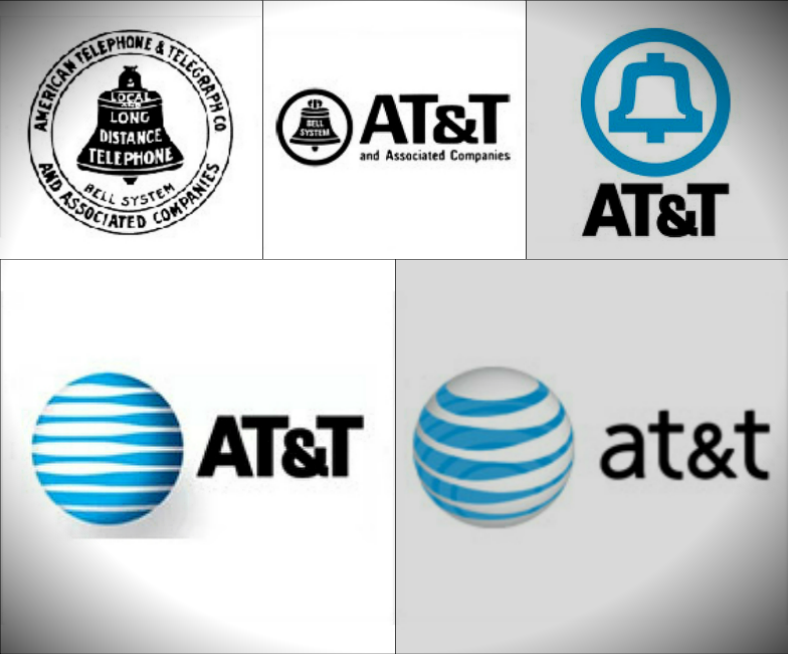
Top, from left to right:
- 1889. AT&T’s first logo depicted an image of a bell to give people an idea on what their business is about, which is providing people with means to communicate at long distances. Surrounding this bell is a circle, where the complete name of the company is written.
- 1964. The company realized how long their company name is, so they decided to shorten it on the logo by using only its initials. The only thing kept on this logo from its previous version is the image of the bell, which is now shrunk and moved to the left side.
- 1969. For this logo, the image of the bell is still present but is now illustrated via line art and in the blue color, and placed over the initials of the company.
Bottom-left:
- 1996. During this time, the company got rid of the bell symbol in favor of the globe, to symbolize the services done by the company, which is aimed to cater all people around the world.
Bottom-right:
- Current. Finally, for AT&T’s business logo design today, it still has the globe symbol but is now illustrated differently than on the previous ones, and the typography now went from upper-case to lower-case for a softer appearance.
Related Posts
The Best New Portfolio sites, March 2023
Best Poster Designs 2023: Ideas and Tips
Hit and Miss of Olympic Logo Designs from 1924 till 2023
10 Iconic Moments Photographed in 2023 Rio Olympics
Top 5 Logo Design Trends of 2023
2023 Packaging Design Pentaward Winners
Digital Design Trends for 2023
Best Travel Apps for 2023
9 Script Fonts for 2023
10 Best Free Fonts for 2023
10 Best Mobile Games of 2023
Logo Design Strategies for 2023
Top 9 Web Design Trends for 2023
10 Most Popular Graphic Design Trends of 2023
Visual Design Trends to Look Out in 2023